Colour is the fastest signal your brand sends. Consumers form initial judgements about a product within 90 seconds, with 62% to 90% of that snap assessment driven by colour alone. That is not a design preference. That is a business outcome. The role of colour in branding extends far beyond aesthetics. It shapes perception, builds memory, and drives purchase decisions before a single word is read. Brand strategists who treat colour as a late-stage visual choice are leaving recognition and revenue on the table.
How does colour psychology shape consumer perception in branding?
Colour psychology in marketing is the study of how specific hues trigger emotional and cognitive responses that influence behaviour. The industry term is chromatic signalling, though colour psychology remains the widely used working phrase. Colour acts as a mental shortcut that guides perception before any rational evaluation of product features or price takes place. Your audience does not consciously decide how they feel about a brand’s colour. The response is immediate and largely automatic.

The common shorthand, blue means trust and red means urgency, is only partially correct. Colour meaning depends on perceived appropriateness for the brand’s personality and category context, not on fixed universal associations. A red logo works for a fast-food brand because urgency and appetite align with that category. The same red on a financial services brand reads as risk and alarm. The question consumers ask, even subconsciously, is: does this colour fit this brand?
Here are the most consistent category-level associations brand strategists rely on:
- Blue signals trust, reliability, and professionalism. Common in finance, healthcare, and technology.
- Red signals energy, urgency, and appetite. Common in food, retail, and entertainment.
- Green signals health, sustainability, and growth. Common in wellness, organic food, and environmental sectors.
- Black signals premium quality and authority. Common in luxury goods and high-end fashion.
- Yellow signals optimism and accessibility. Common in consumer goods and youth-oriented brands.
These are starting points, not rules. The competitive landscape and audience expectations always override generic colour emotion charts.
Pro Tip: Before selecting a brand colour, audit your top five competitors’ palettes. If four of them use blue, choosing blue makes you invisible. Differentiation within your category is as important as emotional fit.
What strategic considerations shape effective colour choices for brand identity?
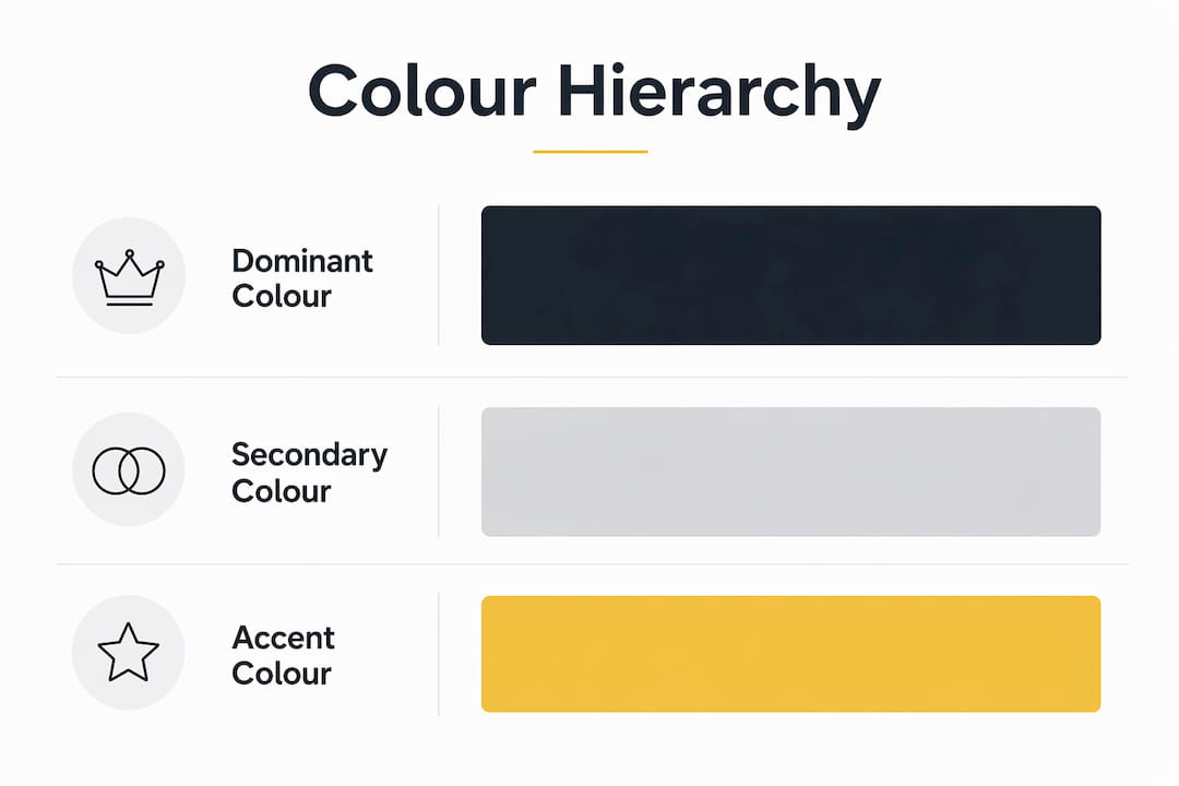
Colour choices for branding require a framework, not a mood board. The most practical structure is the 60/30/10 rule, which manages colour dominance across a brand palette. Sixty per cent goes to the dominant brand colour, thirty per cent to a secondary supporting colour, and ten per cent to an accent colour. The accent colour carries the most commercial weight because it is used for calls to action, highlights, and conversion points.
Consistency is the multiplier. Consistent use of a signature brand colour can increase overall brand recognition by up to 80%. That figure reflects the power of repetition across every touchpoint, from your website header to your business cards. Recognition is not built in a single campaign. It accumulates through consistent application over time.
Differentiation within your competitive landscape is equally critical. Colour choices can be trademarked and defended strategically. T-Mobile’s magenta is a clear example. In a telecom market dominated by blue and red, magenta created instant visual ownership. That is not an accident of taste. It is a deliberate strategic decision to claim a colour position no competitor held.
Here is a practical process for selecting brand colours:
- Audit your category. Map the dominant colours used by your five nearest competitors.
- Identify the gap. Find the colour territory that is underused but still appropriate for your audience.
- Test emotional fit. Check whether your shortlisted colours align with your brand personality and audience expectations.
- Apply the 60/30/10 rule. Build a palette with clear hierarchy, not a collection of equally weighted hues.
- Document your palette. Specify exact hex codes, Pantone references, and CMYK values to maintain consistency across print and digital.
The table below shows how colour hierarchy functions in practice across brand touchpoints.
| Palette role | Percentage | Typical application |
|---|---|---|
| Dominant colour | 60% | Website background, primary packaging, main brand assets |
| Secondary colour | 30% | Navigation, supporting graphics, secondary text |
| Accent colour | 10% | Call-to-action buttons, highlights, key messages |
Pro Tip: Never choose a brand colour because it is trending. Millennial pink and Gen Z yellow both peaked and faded. A colour that feels current today can date your brand within two years.
What are common mistakes marketers make with brand colour?
The most damaging mistake is choosing colour based on personal preference rather than audience research. A founder who loves navy blue does not represent their customer base. Colour decisions made without data create a brand that resonates with the leadership team and no one else. Understanding brand identity and colour as interconnected strategic assets, not separate design choices, prevents this from the outset.
Cultural context is a second major blind spot. White signals purity in Western markets and mourning in several East Asian cultures. Green carries environmental associations in Europe but has religious significance in parts of the Middle East. A brand expanding across markets without auditing colour meaning in each region risks serious misalignment. The essential branding elements that work in one market do not automatically transfer to another.
Inconsistent application is the third failure point. Many brands define a colour palette in their guidelines and then ignore it in practice. Social media graphics use off-brand shades. Print materials use a slightly different version of the primary colour. Each inconsistency chips away at recognition. Consistent application of brand colours across all touchpoints strengthens recognition and aids memory encoding among consumers. Every deviation costs you.
The fourth mistake is skipping real-world testing. Colour decisions validated only in static mockups frequently underperform in live environments. Screen calibration, ambient lighting, and surrounding content all affect how a colour reads in practice. Testing must happen in context, not just in a design file.
How can colour improve engagement and conversion across digital channels?
The 10% accent colour in your palette is your most commercially active asset online. Testing CTA and background colours can shift engagement significantly when validated against real user behaviour. A call-to-action button that contrasts sharply with the surrounding page draws the eye faster and converts at a higher rate than one that blends in. The principle is simple: contrast creates attention, and attention drives action.
Colour consistency across digital channels also supports social media recognition at a platform level. When your Instagram feed, Facebook ads, and website all use the same dominant colour, consumers begin to recognise your brand before they read your name. That pre-verbal recognition is the commercial value of consistent colour application. It reduces the cognitive effort required to identify your brand in a crowded feed.
The table below outlines how colour functions across key digital touchpoints.
| Digital channel | Colour application | Primary goal |
|---|---|---|
| Website | Dominant colour in header and hero sections | Brand recognition and trust |
| CTA buttons | Accent colour with high contrast | Conversion and click-through |
| Social media | Consistent dominant and secondary palette | Recall and feed cohesion |
| Email marketing | Secondary colour for structure, accent for links | Engagement and click rate |
| Display advertising | Accent colour for key message | Attention and response |
Approximately 85% of consumers state colour is a primary reason for purchasing a product. That figure underlines why digital colour decisions deserve the same rigour as any other conversion rate optimisation exercise. Colour is not decoration on your website. It is a conversion tool.
Pro Tip: Run A/B tests on your primary CTA button colour before committing to it across your site. Test it against your accent colour and a high-contrast alternative. Let user behaviour data make the final call, not design instinct.
Key takeaways
Colour is a primary driver of brand recognition, consumer perception, and purchase behaviour, not a visual afterthought.
| Point | Details |
|---|---|
| Colour drives rapid judgement | 62%–90% of a consumer’s first impression of a product is based on colour alone. |
| Consistency builds recognition | Consistent use of a signature colour can increase brand recognition by up to 80%. |
| Context determines meaning | Colour associations are category-specific, not universal. Fit matters more than convention. |
| 60/30/10 structures palettes | Use 60% dominant, 30% secondary, and 10% accent colour to create clear visual hierarchy. |
| Test before committing | Validate colour choices against real user behaviour, not static mockups or personal preference. |
Colour strategy is still the most underestimated asset in branding
I have worked with brand strategists and marketing teams across a wide range of sectors, and the pattern is consistent. Colour gets decided in the final hour of a brand project, squeezed between font selection and logo sign-off. The conversation is almost always aesthetic. Does it look good? Does the client like it? Those are the wrong questions.
The right question is: what does this colour signal to the specific audience we are trying to reach, in the specific category we compete in? That question requires research, competitive analysis, and a willingness to choose differentiation over comfort. Most teams skip it because it feels like extra work at the end of a long project.
The brands that get colour right treat it as a strategic input from the very beginning of the brand development process. They audit the competitive landscape before they open a design tool. They test colour options against audience panels, not just internal stakeholders. They document their palette with the same precision they apply to their tone of voice guidelines. And they enforce it consistently across every channel, every campaign, and every piece of collateral.
The role of social media in branding has made colour consistency more visible and more measurable than ever before. A brand that applies its palette with discipline across digital channels builds recognition faster than one with a beautiful but inconsistently applied identity. In 2026, the tools to test, measure, and refine colour choices are accessible to businesses of every size. The only barrier is treating colour as a strategic priority rather than a finishing touch.
— tibor
How Fyldedigital can support your brand’s colour strategy
Colour strategy only delivers results when it is built into your visual identity from the ground up and applied consistently across every channel.

Fyldedigital works with businesses to create brand identities where colour is a deliberate, researched, and consistently applied asset. From graphic design services that build structured brand palettes to web design in Blackpool that translates those palettes into conversion-focused digital experiences, the team ensures your colour choices work as hard as the rest of your marketing. If you want your brand to be recognised, remembered, and chosen, get in touch with Fyldedigital for a free review.
FAQ
What is the role of colour in branding?
Colour is a primary signal that shapes consumer perception, builds brand recognition, and influences purchase decisions. Research shows 62%–90% of a consumer’s first impression is driven by colour alone.
How does colour psychology affect marketing?
Colour psychology in marketing explains how specific hues trigger emotional and cognitive responses that guide behaviour before rational evaluation occurs. The effect is immediate and operates below conscious awareness.
What is the 60/30/10 rule in brand colour?
The 60/30/10 rule divides a brand palette into 60% dominant colour, 30% secondary colour, and 10% accent colour. The accent colour is the most commercially active, used primarily for calls to action and conversion points.
Why does colour consistency matter for brand recognition?
Consistent use of a signature brand colour can increase brand recognition by up to 80%. Every inconsistency across touchpoints reduces the cumulative recognition effect that repetition builds over time.
How should I choose colours for my brand?
Audit your competitors’ palettes first, identify underused colour territory that still fits your category, then test shortlisted options against your audience rather than internal preference. Differentiation within your market is as important as emotional alignment.