A website redesign is defined as a structured process of rebuilding your site’s architecture, content, and visual design to improve performance and user experience. The most common website redesign mistakes, such as ignoring SEO, neglecting mobile users, and inconsistent branding, directly damage your search rankings, reduce conversions, and erode visitor trust. Businesses of all sizes make these errors when they treat a redesign as a purely visual exercise. Shopify and Search Engine Land both document how skipping technical fundamentals during a revamp causes lasting harm. Getting your redesign right from the start protects your investment and drives measurable growth.
What are the top common website redesign mistakes businesses must avoid?
Website redesigns often fail when treated only as visual refreshes without prioritising SEO and content structure. The following mistakes appear repeatedly across businesses of every size, from sole traders to large enterprises.

1. Ignoring SEO during the redesign process
SEO is not something you add after launch. Skipping information architecture and on-page SEO during a redesign causes immediate drops in search visibility. Your existing pages carry ranking signals built up over months or years. Stripping those signals away without a plan destroys organic traffic you cannot easily recover.
Before touching a single page, audit your current rankings, identify your top-performing URLs, and map every URL change you plan to make. This gives you a clear picture of what you stand to lose.
2. Failing to implement 301 redirects correctly
Proper 301 redirects preserve link equity when URLs change during a redesign. Using 302 redirects or creating redirect chains tells search engines the move is temporary, so they do not pass ranking authority to the new URL. The result is lost rankings and broken user journeys.
Pro Tip: Map every old URL to its new destination in a spreadsheet before development begins. Test every redirect on a staging environment before going live.
3. Neglecting mobile-first design
Ignoring mobile users with desktop-first designs creates small tap targets, horizontal scrolling, and frustrated visitors who leave immediately. Mobile traffic dominates most business websites. A design that works beautifully on a 27-inch monitor but breaks on a smartphone loses the majority of your audience before they read a single word.
Mobile-first design means building the smallest screen layout first, then scaling up. This approach forces clarity and removes unnecessary elements that clutter the experience.
4. Overlooking page speed
Slow loading speeds frustrate users and push sites down in search engine rankings. Sites with poor performance experience higher bounce rates, meaning visitors leave before your page fully loads. Every second of delay reduces the chance a visitor will enquire, buy, or contact you.
Compress images before upload, use a content delivery network, and audit your third-party scripts. These three steps alone remove the most common causes of slow load times.
5. Cluttering the design with intrusive pop-ups
Intrusive pop-ups and overcomplicated UX severely harm user experience and conversion rates. A pop-up that fires the moment a visitor lands on your page signals desperation, not professionalism. Visitors close the pop-up and often leave the site entirely.
Design must prioritise clarity and coherent storytelling for trust and profit. If you use pop-ups, trigger them based on exit intent or time on page, and make them easy to dismiss.
6. Inconsistent branding across pages
Consistent branding across all pages and digital channels builds trust and increases conversions. Inconsistent branding confuses visitors and erodes potential conversion rates. When your homepage uses one colour palette and your service pages use another, visitors question whether they are still on the same site.
Establish a clear brand style guide before the redesign begins. Define your fonts, colours, button styles, and image treatment. Apply them without exception across every page.
For practical guidance on keeping your brand cohesive, the branding services guide from Fyldedigital covers how to align visual identity with business goals.
7. Poor navigation structure
Confusing navigation is one of the most damaging yet overlooked redesign project missteps. Visitors who cannot find what they need within two or three clicks leave and do not return. Common navigation errors include unclear menu labels, too many top-level options, and hidden menus that work on desktop but disappear on mobile.
Keep your primary navigation to five or six items maximum. Use plain language that matches what your customers actually search for, not internal jargon.
8. Broken functionality after launch
Broken or unreliable website functionality undermines trust and suggests a website is poorly maintained. Non-functioning buttons, broken links, and forms that fail reduce user confidence immediately. A visitor who fills in your contact form only to receive an error message will not try again.
Pre-launch staging QA and real user testing detect functionality failures before they reach your customers. Retest every interactive element, including forms, checkout flows, and calls to action, on multiple devices before going live.
9. Removing content that was ranking well
Deleting or consolidating pages without checking their organic performance is a frequent redesign error. A page that looks thin or outdated may be generating consistent enquiries from search. Removing it without a redirect or replacement wipes out that traffic permanently.
Check Google Search Console before removing any page. If a URL receives organic clicks, either keep it, redirect it to a relevant replacement, or rewrite it as part of the new site.
10. No clear calls to action
A redesigned site with beautiful visuals but no clear calls to action fails at its primary job. Your website is your most available salesperson. If visitors cannot immediately see what to do next, whether that is calling you, requesting a quote, or making a purchase, they will do nothing.
Every key page needs one primary call to action, placed above the fold where possible. Secondary actions should support, not compete with, the primary one.
How do redesign mistakes impact user experience and SEO?
Each redesign blunder creates a specific, measurable consequence. The table below maps the most frequent errors to their UX and SEO outcomes.
| Mistake | UX Impact | SEO Impact |
|---|---|---|
| Missing 301 redirects | Broken user journeys, 404 errors | Lost link equity, ranking drops |
| Slow page speed | High bounce rate, low engagement | Lower search engine placement |
| Poor mobile design | Unusable on smartphones, lost visitors | Reduced mobile search rankings |
| Inconsistent branding | Reduced trust, lower conversions | Indirect drop in dwell time |
| Broken forms and buttons | Failed enquiries, damaged credibility | Crawl errors, poor user signals |
| Removed ranking pages | Lost content, confused visitors | Immediate organic traffic loss |
SEO and user experience are not separate concerns during a redesign. A page that loads slowly frustrates users and receives lower rankings simultaneously. Fixing one problem almost always improves the other.
What processes prevent redesign mistakes during planning?
Thorough audits, SEO preservation, user testing, and staging environments are the four safeguards that prevent the most damaging redesign errors. Follow these steps before and during your redesign.
- Conduct a full SEO audit. Export your current rankings, top pages by organic traffic, and all existing URLs from Google Search Console and Google Analytics before any work begins.
- Catalogue all redirect requirements. Map every URL that will change to its new destination. Include category pages, blog posts, and product pages.
- Build on a staging environment. Never develop directly on your live site. A staging server lets you test changes without affecting real visitors or search rankings.
- Run real user testing. Ask people unfamiliar with your business to complete key tasks on the new design. Watch where they hesitate or fail.
- Test all interactive elements. Check every form, button, link, and checkout flow on desktop, tablet, and mobile before launch.
- Recheck your redirects post-launch. Confirm every redirect resolves correctly and that no chains have formed.
Pro Tip: Set up Google Search Console monitoring immediately after launch. Watch for crawl errors and ranking changes in the first two weeks. Catching problems early prevents long-term damage.
For a broader view of redesign planning steps, Fyldedigital’s complete guide covers the full process from audit to launch.
Which branding and navigation pitfalls are most often missed?
Inconsistent branding and confusing navigation are the hidden blunders that quietly kill conversions long after launch. They rarely trigger an obvious error message, so businesses often miss them entirely.
Branding inconsistency appears in subtle ways. A different button colour on the checkout page, a mismatched font on a blog post, or a logo that resizes incorrectly on mobile all chip away at the professional impression your site creates. Design must prioritise clarity at the component level, consistency across pages, and coherence between digital channels to create trust and profit.
Navigation pitfalls follow a predictable pattern. Businesses add menu items over time without removing old ones, creating bloated menus that overwhelm visitors. Dropdown menus with three levels of sub-pages force visitors to make too many decisions before reaching their goal.
Common navigation mistakes vs. ideal practice:
| Navigation mistake | Ideal practice |
|---|---|
| Vague labels like “Solutions” | Plain labels like “Web Design” or “SEO” |
| Seven or more top-level menu items | Five or six focused items maximum |
| Hidden hamburger menu on desktop | Visible navigation on all screen sizes |
| No breadcrumb trail on inner pages | Breadcrumbs showing page hierarchy |
Practical steps to fix branding and navigation issues:
- Create a single brand style guide document and share it with every person working on the site.
- Audit your navigation by asking three customers to find your most important service page. Time them.
- Remove any menu item that does not directly serve a visitor’s primary goal.
- Test your navigation on a smartphone with one hand. If it requires pinching or zooming, simplify it.
Understanding what makes a website convert is directly tied to how clearly your branding and navigation guide visitors toward a decision.
Key takeaways
Avoiding common website redesign mistakes requires equal attention to SEO preservation, mobile usability, and brand consistency from the very first planning stage.
| Point | Details |
|---|---|
| Protect SEO from day one | Audit rankings and map all redirects before any development work begins. |
| Use 301 redirects correctly | Redirect chains and 302 redirects lose link equity and drop rankings. |
| Design for mobile first | Build the smallest screen layout first to avoid losing the majority of your visitors. |
| Test before every launch | Staging QA and real user testing catch broken forms and navigation failures early. |
| Keep branding consistent | A single brand style guide applied across every page builds trust and lifts conversions. |
Why I think most redesigns fail before a single line of code is written
Working with businesses across the Fylde Coast and beyond, I have seen the same pattern repeat itself. A business decides the site looks dated, books a designer, and jumps straight into colours and layouts. Nobody asks what the current site is ranking for. Nobody checks which pages are generating enquiries. The redesign launches, it looks great, and then the phone goes quiet.
The uncomfortable truth is that most redesign failures are planning failures. The visual work is often excellent. The SEO groundwork simply never happened. I have seen businesses lose a third of their organic traffic within weeks of a well-intentioned revamp because redirects were skipped or content was deleted without a second thought.
The businesses that get redesigns right treat the process like a business decision, not a creative project. They audit before they design. They test before they launch. They monitor after they go live. The creative work matters, but it sits on top of a technical and strategic foundation. Get that foundation wrong and the best-looking site in your sector will still underperform.
My advice is to slow down at the start. Spend as much time on the audit and planning phase as you do on the design itself. The results will be measurably better, and you will not spend the following six months trying to recover lost ground.
— tibor
How Fyldedigital helps you avoid costly redesign errors
Fyldedigital builds websites that look great and perform from day one. Every redesign project starts with a full SEO audit, redirect planning, and a clear content strategy so nothing is left to chance.
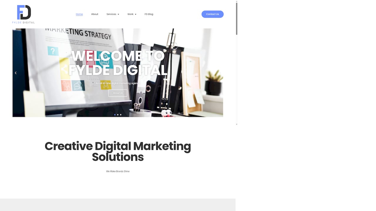
The team at Fyldedigital handles UX improvements, branding consistency, and mobile-first design as standard. Clients across Blackpool and the Fylde Coast have seen measurable increases in enquiries and organic visibility after working with the agency. If your current site is underperforming or you are planning a revamp, explore Fyldedigital’s web design services to see how a properly planned redesign can drive real business growth.
FAQ
What is the biggest mistake in a website redesign?
Ignoring SEO is the single most damaging redesign error. Skipping redirect planning and removing ranking pages causes immediate and lasting drops in organic traffic.
How do 301 redirects protect my site during a redesign?
301 redirects tell search engines that a URL has permanently moved, preserving the ranking authority of the old page. Without them, link equity is lost and rankings drop.
Why does mobile design matter so much in a redesign?
Mobile traffic dominates most business websites. A site that does not work correctly on smartphones loses the majority of its visitors before they reach your key content.
How can I test my redesigned site before launch?
Build on a staging environment and run real user testing with people unfamiliar with your business. Test every form, button, and link on desktop, tablet, and mobile before going live.
How does inconsistent branding affect conversions?
Inconsistent branding confuses visitors and reduces their confidence in your business. A clear, consistent visual identity across every page builds trust and increases the likelihood of an enquiry or sale.