Poor user experience is quietly costing SMEs customers every day. Visitors land on your website, struggle to find what they need, and leave within seconds, often heading straight to a competitor. Your website is frequently the first salesperson your business has, and if it confuses or frustrates people, those potential leads are gone before a conversation even starts. This guide walks you through a practical, step-by-step process to identify UX problems, gather the right tools, and make targeted improvements that build trust, increase enquiries, and keep visitors coming back.
Table of Contents
- Identifying core user experience problems
- Establishing requirements and tools for a UX upgrade
- Improving navigation and accessibility
- Executing UX improvements: From planning to reality
- Why small, steady UX improvements achieve more for SMEs
- Partnering for improved website UX and digital growth
- Frequently asked questions
Key Takeaways
| Point | Details |
|---|---|
| Diagnose UX issues | Pinpoint user experience challenges using strategic frameworks and clarity tests. |
| Prepare requirements first | Gather the necessary resources and tools before jumping into upgrades. |
| Enhance navigation and accessibility | Focus on mobile-friendly menus and inclusive design for better results. |
| Prioritise incremental improvements | Make regular, small changes instead of risky full redesigns. |
| Verify changes with users | Test and measure your improvements continuously with real user feedback. |
Identifying core user experience problems
Before you can fix anything, you need to know exactly what is broken. Many SME websites suffer from the same recurring issues: confusing navigation, unclear calls to action, inaccessible content, and a lack of meaningful feedback when users complete tasks. The challenge is that business owners are often too close to their own site to spot these problems objectively.
A structured approach helps here. A UX strategy framework gives you a reliable method: diagnose the current state of your site, set guiding principles for improvement, build an action plan focused on high-value projects, and embed that process into your business culture through workshops and measurable metrics. This is not a one-off audit. It is an ongoing discipline.
To get started, work through these four diagnostic areas in order:
- Navigation clarity — Can a first-time visitor find your key pages within two clicks?
- Content comprehension — Is your copy written for your customer, or does it assume too much knowledge?
- User feedback — Does your site confirm actions clearly, such as form submissions or purchases?
- Accessibility — Can users with visual or motor impairments use your site without barriers?
For content specifically, content testing methods like banana testing and Cloze tests are remarkably effective. Banana testing works by replacing labels or headings with the word ‘banana’ to reveal whether the surrounding context makes the content understandable. If it still makes sense, the label was doing little work. Cloze tests remove key words from sentences and ask users to fill in the gaps, revealing whether your copy matches how your customers actually think.
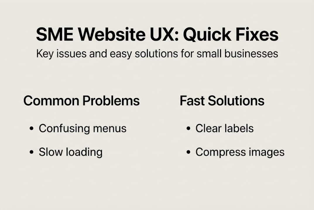
| Diagnostic area | Quick test method | Common SME issue |
|---|---|---|
| Navigation | Two-click rule check | Too many menu items |
| Content clarity | Banana testing | Jargon-heavy copy |
| User feedback | Task completion observation | No confirmation messages |
| Accessibility | Contrast checker tool | Low colour contrast |
Pro Tip: Map out the three most common journeys a visitor takes on your site, then walk through each one yourself on a mobile device. You will almost certainly find unexpected drop-off points that analytics alone would not reveal. Pairing this with graphic design tips for layout and visual hierarchy can make those journeys far smoother.
Establishing requirements and tools for a UX upgrade
Once you have a clear picture of your UX problems, the next step is gathering the right resources. Many SMEs assume this requires a large budget or a dedicated team. It does not. What it does require is the right tools, a clear set of priorities, and a willingness to involve your staff.
Start with three core requirements that every SME website must meet:
- Responsive design — Your site must adapt cleanly to all screen sizes, particularly mobile.
- Clear navigation — Menus should be consistent, labelled plainly, and easy to use on touch screens.
- Accessible content — Text, images, and forms must be usable by people with a range of abilities.
For tools, you do not need to spend heavily. Google Analytics 4 is free and shows you where users drop off. Microsoft Clarity provides free heatmaps and session recordings. Hotjar offers a free tier for feedback widgets. These platforms give you real behavioural data without requiring technical expertise to get started.
Building your UX action planning process around high-impact, low-effort changes first is the most efficient approach. Prioritise the changes that affect the most visitors and require the least development time. This keeps momentum going and builds confidence across your team.
| Requirement | Basic approach | Advanced approach |
|---|---|---|
| Analytics | Google Analytics 4 (free) | Custom event tracking |
| Heatmaps | Microsoft Clarity (free) | Hotjar paid plan |
| User testing | Staff walkthroughs | Recruited user panels |
| Design feedback | Google Forms survey | Usability testing platform |
Pro Tip: Run a short internal usability workshop with two or three members of staff who do not work on the website daily. Ask them to complete specific tasks and observe without guiding them. Their confusion points are invaluable. You can explore what a well-structured site looks like by reviewing successful web design projects for practical inspiration, or speak with a team offering website design services to scope what improvements are realistic for your budget.
Improving navigation and accessibility
Navigation and accessibility are the two areas where SME websites most frequently let users down, and they are also the areas where targeted improvements deliver the fastest results.

For navigation, the principle is simple: make it obvious and consistent. Every page should have the same menu structure. Labels should describe what the user will find, not what the business calls it internally. Avoid hidden or hamburger-style menus on desktop, as they reduce discoverability significantly.
Accessibility is broader than many business owners realise. The web accessibility guidelines from the W3C Web Accessibility Initiative cover ten essential areas: sufficient colour contrast, avoiding colour as the only means of conveying information, clearly identifiable interactive elements, consistent navigation, associated form labels, identifiable feedback messages, logical headings and spacing, responsive design, alternatives for images and media, and controls for any auto-playing content.
Here are the top accessibility improvements for SME websites:
- Ensure text-to-background contrast meets a minimum ratio of 4.5:1
- Add descriptive alt text to every image
- Label all form fields clearly and associate them programmatically
- Make all interactive elements reachable and operable via keyboard
- Avoid using colour alone to indicate errors or status
“Accessibility is not a feature. It is the foundation of a website that works for everyone.”
On mobile, the stakes are even higher. Mobile traffic on SME sites accounts for around 65% of all visits, meaning the majority of your potential customers are on a phone when they first encounter your business. Touch targets should be at least 44×44 pixels, menus should be thumb-friendly, and page load times must be fast. Pairing strong mobile navigation with a considered approach to effective social media UX ensures a consistent experience across every digital touchpoint.
Executing UX improvements: From planning to reality
With your diagnosis complete and your tools in place, it is time to act. The temptation for many SMEs is to attempt a full website overhaul. Resist it. For businesses with established sites, incremental upgrades consistently outperform big-bang redesigns in terms of cost, risk, and measurable outcome.
Follow this step-by-step process to implement changes effectively:
- Map your workflows — Document how users currently move through your site before changing anything.
- Prioritise by impact — Focus on pages with the highest traffic and the lowest conversion rates first.
- Make one change at a time — Isolate variables so you can measure what actually made a difference.
- Involve stakeholders — Bring in team members, and if possible, real customers, to review changes before they go live.
- Measure and iterate — Set a baseline metric for each change and review results after two to four weeks.
For businesses running older or legacy website platforms, the advice from research into legacy system tips is clear: map workflows first, choose incremental upgrades over complete rebuilds, and involve stakeholders at every stage to build trust and reduce resistance. A full redesign carries significant cost and risk. Small, well-tested changes carry neither.
Pro Tip: Even a minor change, such as rewording a call-to-action button, should be tested with at least three real users before being treated as final. What seems obvious to you may not be to your customer. The team at Fylde Digital regularly supports SMEs through exactly this kind of structured, evidence-led improvement process. Good graphic design solutions also play a role here, ensuring visual changes reinforce rather than undermine the usability improvements you are making.
UX improvements do not need to be expensive to be effective. Consistent, targeted changes compound over time, reducing bounce rates, increasing time on site, and ultimately driving more enquiries from visitors who feel confident in what they are seeing.
Why small, steady UX improvements achieve more for SMEs
There is a persistent belief in digital marketing that a full website redesign is the solution to poor performance. In our experience working with SMEs, this is rarely true. Grand overhauls are disruptive, expensive, and difficult to measure. They introduce risk at every level, from technical issues to confused returning visitors who can no longer find what they need.
The research backs this up. Evidence on incremental legacy upgrades consistently shows that mapping workflows, making targeted changes, and involving stakeholders produces better outcomes with far less risk. Small improvements, tested and iterated regularly, build a site that genuinely serves your users rather than one that simply looks new.
“Grand overhauls rarely work for SMEs, but regular small changes do.”
What we have seen across our recent client projects is that the businesses achieving the best results are not the ones who spent the most on a redesign. They are the ones who committed to a process of continuous, evidence-led improvement. That discipline is available to any SME, regardless of budget.
Partnering for improved website UX and digital growth
If this guide has highlighted areas of your website that need attention, you do not have to tackle them alone.
At Fylde Digital, we work with SMEs across the Fylde Coast and beyond to deliver web design for SMEs that is built around user experience from the ground up. Our approach combines conversion-focused design with targeted SEO services Blackpool to ensure your site not only looks professional but actively brings in enquiries. Whether you need a full UX review, incremental improvements, or a fresh start, we can help you take the right next step without unnecessary risk or expense.
Frequently asked questions
What are the most common UX mistakes on SME websites?
Unclear navigation, poor mobile responsiveness, and inaccessible content are frequent issues hurting user experience on SME websites. Following web accessibility guidelines from the W3C is a practical starting point for addressing many of these problems.
How can I measure improvements in my website’s UX?
Track user engagement, bounce rates, and conversion metrics, and use feedback tools and workshops to assess improvements. A structured UX strategy framework helps you set measurable goals and review progress consistently.
Should I prioritise mobile users when upgrading my website UX?
Yes, because around 65% of visitors on SME sites access via mobile devices, ensuring mobile-friendly navigation is crucial for retaining potential customers.
Are full website redesigns necessary to improve UX for SMEs?
No, incremental improvements are more effective and less risky for SMEs than expensive full redesigns, particularly for businesses with established sites and existing customer bases.
What is ‘banana testing’ in website UX?
Banana testing replaces labels with the word ‘banana’ to reveal confusing content, helping refine clarity for users. It is one of several content testing methods that can quickly highlight where your copy is failing to communicate effectively.