Most business owners spend their budget on making their website look good. That is understandable. But appearance alone does not determine whether a visitor stays, enquires, or leaves within seconds. What is interactive website design? Put simply, it is the practice of designing how your site responds to user actions, not just how it looks. And that distinction matters enormously. Interactive forms convert at 47.3% compared to just 2.8% for static ones. If your website is purely visual with no meaningful response to user behaviour, you are leaving a significant number of leads on the table.
Table of Contents
- What is interactive website design and why does it matter?
- Core interactive elements every business website needs
- Usability principles behind effective interactive design
- The power of micro-interactions: small moments that make a big impact
- How interactive design boosts engagement and lead generation for SMEs
- Best practices for implementing interactive design on your business website
- Rethinking interactive design: what many small businesses get wrong
- Enhance your website with professional interactive design services
- Frequently asked questions
Key Takeaways
| Point | Details |
|---|---|
| Interactive design defined | It focuses on how websites respond to user actions with clear feedback to create engaging experiences. |
| Core elements matter | Buttons, forms, modals and feedback loops enable users to complete key business tasks online. |
| Usability principles ensure success | Feedback, constraints, mapping, consistency, and affordance reduce user uncertainty and errors. |
| Micro-interactions drive trust | Small responses to actions, like inline validation and loading spinners, confirm progress and reduce abandonment. |
| Interactive design boosts leads | Interactive forms convert 16.9 times better than static, dramatically improving engagement and sales. |
What is interactive website design and why does it matter?
Interactive website design focuses on how your site behaves in response to what users do. Every click, scroll, tap, or form submission is a user input, and interactive design determines what happens next. According to Figma’s design resource library, interactive website design is the practice of designing how a website reacts to user actions with meaningful behaviour changes and feedback, making browsing an active experience rather than a passive one.
It sits within the broader discipline of interaction design (IxD), which bridges the gap between what users need and how technology behaves. Think of your website as your best salesperson. A good salesperson does not stand silently in the corner. They respond, guide, and reassure. Your website should do exactly the same.
For small and medium-sized businesses, this has very practical implications:
- Users can navigate to the right page without confusion
- Contact forms confirm submissions clearly so enquiries are not lost
- Product pages respond to selections, showing relevant information immediately
- Calls to action respond visually to encourage clicks
Good interactive design makes completing tasks feel natural. That is what drives conversions. If you want to see how this connects to lead generation specifically, our guide to website features for lead generation covers this in practical detail.
Core interactive elements every business website needs
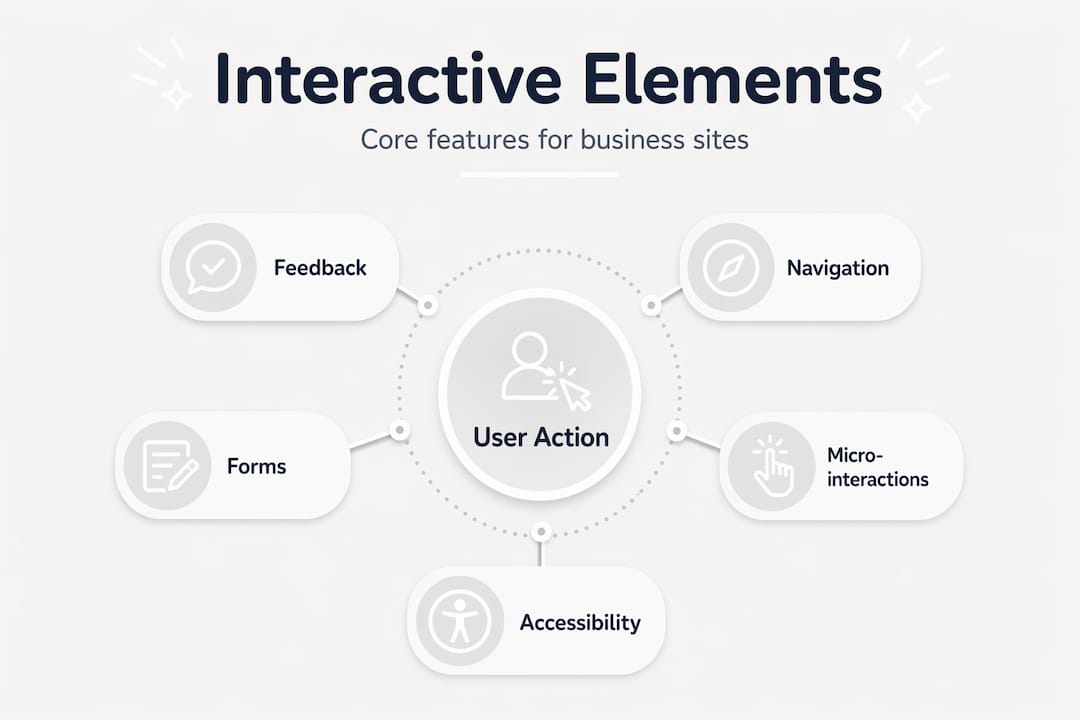
Understanding what makes a website interactive starts with knowing the building blocks. Interactive UI components such as buttons, forms, modals, accordions, and tooltips respond to user events and enable task completion. These are not decorative features. They are the mechanisms through which your visitors take action.
Here is what each core element does in practice:
- Buttons trigger actions such as submitting a form, opening a menu, or navigating to a new page. A button that changes colour when hovered tells the user it is clickable.
- Forms collect enquiries, bookings, or sign-ups. An interactive form validates fields in real time, telling users immediately if something is wrong.
- Modals display focused content like a pricing summary or confirmation message without sending the user to a new page.
- Accordions condense information into expandable sections, keeping pages clean while allowing users to reveal what they need.
- Tooltips provide brief contextual guidance when a user hovers over a term or icon.
Every one of these elements creates a feedback loop. The user acts, the site responds, and the user feels confident continuing. Without that loop, users second-guess themselves and abandon the journey. You can learn more about how these contribute to overall usability in our guide to improving website UX for SMEs.
Pro Tip: Avoid using interactivity purely as decoration. If an animation does not confirm an action, guide the user, or reduce uncertainty, it is adding noise rather than clarity. Every interactive element should serve a clear purpose.

Usability principles behind effective interactive design
Knowing what interactive elements to include is one thing. Knowing why they work is what separates a site that converts from one that frustrates. Interaction design emphasises five core principles to reduce friction and uncertainty for users:
- Feedback. The system responds visibly to every action. A button press produces a visual change. A form submission shows a confirmation message. Users always know what happened.
- Constraints. Choices are limited to prevent errors. A booking form greys out unavailable dates. A field accepts only numbers where required. This guides users towards correct actions.
- Mapping. Controls align with their effects in a way that feels obvious. A left arrow moves content left. An upward scroll reveals earlier content. Outcomes feel intuitive without instruction.
- Consistency. Similar interactions behave the same way across every page of your site. If a button on the homepage behaves one way, an identical button on the contact page should behave identically.
- Affordance. Each element communicates what it can do. A raised button looks pressable. An underlined link looks clickable. Users do not need to guess.
These principles work together to make your website feel reliable. When a site behaves predictably, trust builds quickly. And trust is the foundation of every lead, sale, or enquiry. Our article on professional web design for business growth explores how these principles apply to real business outcomes.
Pro Tip: Define distinct visual states for every interactive element: idle, hover, pressed, loading, success, and error. This manages user expectations at every step of their journey.
The power of micro-interactions: small moments that make a big impact
Micro-interactions are easy to overlook, but they are often what separates a polished, trustworthy website from one that feels unfinished. Micro-interactions are small, single-purpose moments triggered by user actions that confirm progress, validate inputs, and communicate what happens next.
They follow a simple pattern: a trigger (the user’s action), a rule (the system’s logic), and a response (the visible feedback). In practice, they look like this:
- A button changing colour the moment it is clicked
- A form field displaying a green tick after a valid email address is entered
- A loading spinner appearing while a page request processes
- A toggle switch animating smoothly between on and off states
- An error message appearing inline beside a field, not after the entire form is submitted
“Micro-interactions remove uncertainty and improve form completion rates, which directly impacts lead generation.”
This matters for your business because incomplete forms mean lost leads. When a user fills in a contact form and nothing visibly changes after they hit submit, many assume it did not work and try again, or give up entirely. A simple confirmation message or animation removes that doubt entirely.
Accessibility is equally important here. Micro-interactions must support keyboard navigation, not just mouse use, and use ARIA attributes to communicate state changes to screen readers. This ensures every potential customer can complete your key actions, regardless of how they access your site. Revisiting our guide on website features that improve lead capture will show you exactly which features drive the most enquiries.
How interactive design boosts engagement and lead generation for SMEs
The business case for interactive website design is not theoretical. The numbers are stark. Interactive forms convert at 47.3% compared to just 2.8% for static forms, a 16.9 times improvement. Lead conversion rates for interactive experiences often range between 35% and 55%.
| Content type | Average conversion rate |
|---|---|
| Static contact form | 2.8% |
| Interactive form | 47.3% |
| Interactive quiz or calculator | 35–55% |
| Product recommender tool | 40–50% |
Beyond forms, interactive content such as quizzes, pricing calculators, and product recommenders significantly boost both lead quality and user intent. A visitor who completes a needs assessment quiz has told you exactly what they want before they even make contact.
“Interactive content is the only format that consistently drives high user engagement levels beyond passive pageviews.”
Tracking the right metrics helps you optimise these features over time. Watch your start rate (how many users begin an interaction), your completion rate (how many finish it), and your conversion rate (how many go on to enquire or purchase). These three numbers tell you precisely where users are dropping off and where improvements will have the greatest impact. To see which interactive features that increase lead capture are worth prioritising, our dedicated guide breaks this down by business type.
Best practices for implementing interactive design on your business website
Knowing what to build is only half the job. How you build it determines whether your interactive features actually improve results or create new frustrations. Here is a practical approach:
- Define all interaction states upfront. Before any development begins, specify what every element looks like at idle, hover, pressed, loading, success, and error. Gaps here cause the broken journeys that lose leads.
- Use real-time form validation. Show errors as users type, not after submission. This single change reduces form abandonment significantly.
- Apply progressive enhancement. Build core functionality first, then layer richer interactions on top for browsers that support them. Progressive enhancement provides richer interactions where supported with graceful fallback elsewhere, keeping your site reliable for every user.
- Use loading indicators appropriately. Any action that takes longer than one second needs a visual indicator. Follow loading state design best practices to communicate system status without alarming users.
- Support keyboard navigation throughout. Not every user relies on a mouse. Ensure all interactive elements are reachable and operable via keyboard, and use ARIA attributes to communicate state changes to screen readers.
Pro Tip: Standardise your motion timing and feedback language across the entire site. If buttons confirm actions in 200 milliseconds on one page, they should do the same on every other page. Inconsistency undermines trust, even when users cannot articulate why.
Our website UX improvement guide walks through these principles in the context of real SME websites, with examples you can apply directly.
Rethinking interactive design: what many small businesses get wrong
Here is something worth saying plainly. Most small business websites that feel “modern” are actually just visually animated, not truly interactive. There is a meaningful difference. Animation plays back the same way regardless of what the user does. Interaction responds to what the user does. Confusing the two is one of the most common and costly mistakes we see.
A common pitfall is treating interactivity as purely visual decoration instead of designing meaningful state transitions that inform users what happened and what to do next. A menu that fades in dramatically is an animation. A menu that highlights the current page, responds to keyboard input, and closes when focus moves away is an interaction.
The second mistake is ignoring accessibility and fallback behaviour. When an interactive feature breaks on an older browser or fails for a keyboard user, that is not a minor inconvenience. It is a blocked journey for a potential customer.
The businesses that see real returns from interactive design are those that treat it as a functional investment, not a cosmetic one. They prototype interaction states before building. They test with real users. They track completion rates and refine based on data. They do not ask “does it look impressive?” They ask “does it help the user complete the task?”
Successful interactive design integrates with your overall web strategy. It is not a standalone feature set bolted onto an existing site. If you are approaching a redesign or refresh, our article on effective web design strategies explains how to build interactive thinking into the process from the start.
Enhance your website with professional interactive design services
At Fylde Digital, we build websites where every interaction is deliberate. Not just visually polished, but genuinely functional, with clear feedback states, accessible components, and conversion-focused layouts designed to turn visits into enquiries.

Our professional web design in Blackpool service applies core interaction design principles from the ground up, whether you need a full new site or improvements to your existing one. Every project is built with usability, responsiveness, and accessibility in mind. If you want a website that genuinely works harder for your business, explore our web design for business growth service, or read our guide to effective business websites to understand what a high-performing site should include. We are here to help you get it right.
Frequently asked questions
What exactly is interactive website design?
Interactive website design is about how a site responds to your actions, such as clicks or scrolls, with meaningful behaviour changes and feedback, making your experience active rather than static.
How does interactive design improve business website performance?
By enabling users to complete tasks easily through interactive elements and clear feedback, interactive design boosts engagement and significantly increases lead conversion. Interactive forms convert at 47.3% compared to just 2.8% for static forms.
Are interactive websites accessible to all users?
Yes, when designed correctly with keyboard navigation support, ARIA attributes, and options to reduce motion, interactive websites can be fully accessible. Micro-interactions must support keyboard accessibility and use ARIA attributes to communicate states to screen readers.
Can I add interactive design to an existing website?
Yes. You can progressively enhance your current site by adding interactive features that work on modern browsers while ensuring graceful fallback behaviour for older ones, improving reliability without requiring a full rebuild.