
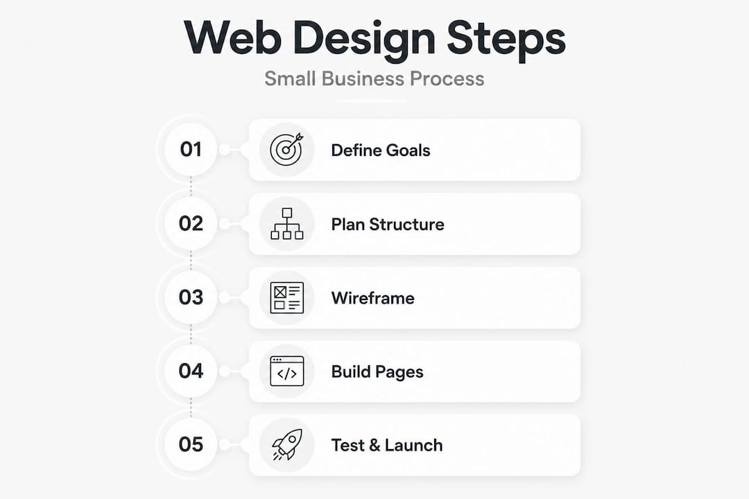
Building a website without a clear plan is one of the most common and costly mistakes small business owners make. You end up with something that looks reasonable but doesn’t generate enquiries, rank in search results, or reflect your brand properly. Following a structured web design step by step process changes that. Instead of guessing what to include or where to start, you work through each stage deliberately, from setting goals to going live, and the result is a site that actually works for your business.
Table of Contents
- Laying the groundwork: defining goals and planning your site structure
- Wireframing and establishing your design system
- Choosing your platform and building your key pages
- Configuring conversion elements and ensuring technical quality
- Launching your website and measuring success
- Why strategy and structure must lead your web design process
- Get professional help to bring your website vision to life
- Frequently asked questions
Key Takeaways
| Point | Details |
|---|---|
| Start with clear goals | Define your website’s purpose and audience before any design begins to guide all decisions effectively. |
| Plan site structure | A well-organised sitemap and user flow mapping ensure visitors find what they need and take desired actions. |
| Wireframe before design | Use wireframes to focus on functionality and user experience early, saving rework after visual design. |
| Test and optimise pre-launch | Perform thorough technical checks and improve performance to enhance usability and SEO rankings. |
| Launch with ongoing review | Monitor key metrics post-launch to continuously improve your website’s impact and growth potential. |
Laying the groundwork: defining goals and planning your site structure
Before you open a single design tool or write a line of content, you need to know what your website is supposed to achieve. This is where most small business owners skip ahead and pay for it later. Defining goals and success metrics is the recognised starting point for any professional website build, and for good reason. Vague intentions like “we need a website” produce vague results.
Start by writing down specific, measurable objectives. Do you want to generate ten new enquiries per month? Rank on the first page for a local search term? Reduce the number of calls asking basic questions by directing people to an FAQ page? Each goal shapes decisions later in the process.
Next, identify who you are actually designing for. Your primary audience might be local homeowners or regional trade buyers. Your secondary audience might be potential employees or referral partners. These groups want different things from your site, and knowing this upfront lets you tailor the user experience accordingly.
With goals and audiences defined, map out your site’s structure. A typical small business site needs the following core pages as a minimum:
- Home — your first impression and primary conversion driver
- About — builds trust and communicates your values
- Services or Products — explains what you offer in detail
- Contact — makes it easy to get in touch
- Privacy Policy — a legal requirement, not optional
Once you have your page list, build a simple sitemap showing how pages connect to each other. This is called information architecture, and it ensures visitors can find what they need without frustration. Mapping the user journey at this stage, thinking through how someone lands on your homepage and moves toward booking or buying, prevents costly rework later. Our small business website guide goes into more detail on structuring your site for growth.
With clear goals and a planned structure, you have a strong foundation for the next design stages.
Wireframing and establishing your design system
Wireframing is the stage where most beginners think they can skip straight to making things look good. That instinct is understandable but expensive. Wireframing with greyscale boxes to plan layout and hierarchy before visual design is standard practice precisely because it forces you to think about function before form.
A wireframe is simply a rough sketch or digital outline of a page showing where elements sit: the headline, the image, the call to action button, the navigation. You are not choosing colours or fonts at this stage. You are answering the question: does this layout make sense for the person using it?

Move towards mid-fidelity wireframes once you are happy with the basic layout. These add more detail around spacing, content blocks, and the placement of key calls to action (CTAs). A CTA is any button or link that prompts the visitor to take a specific action, such as “Get a free quote” or “Book a consultation.”
Alongside wireframing, establish your design system. This is a set of rules covering:
| Design element | What to define |
|---|---|
| Colours | Primary, secondary, and background palette |
| Typography | Heading font, body font, and sizing scale |
| Button styles | Shape, colour, hover state, and size |
| Spacing | Consistent padding and margin values |
| Imagery | Photo style, illustration, or icon system |
A well-defined design system means every page feels like it belongs to the same brand. It also makes working with a developer or content writer far smoother, as everyone references the same rules.
Pro Tip: Keep your colour palette to a maximum of three colours and your fonts to two. More than that and your site starts to look inconsistent, which undermines trust before the visitor has even read a word.
If you want to learn how to put these design principles to work on a site that generates leads, our guide on how to design a business website that converts gives practical, business-focused advice.
Once wireframes and design principles are set, it is time to select the right platform to build your site.
Choosing your platform and building your key pages
Platform choice is a decision that will affect your site for years. Choosing your technology platform carefully matters because it determines how flexible and scalable your site can become as your business grows. The wrong choice can leave you rebuilding everything from scratch in two years.
The two main routes for small businesses are:
- A content management system (CMS) like WordPress — highly flexible, excellent for SEO, and widely supported by developers and designers.
- An online website builder — faster to set up and easier for non-technical users, but often more limited in customisation and ownership of your data.
Your choice should come down to three factors: your technical comfort level, your budget, and how complex your site needs to be. A service-based local business often does well on either platform, but if you anticipate growth or need specific integrations, a CMS typically offers more room to expand.
When building your homepage, structure matters enormously. Follow this order for a conversion-focused layout:
- Hero section — a clear headline stating who you help and how, with a prominent CTA button
- Social proof — client logos, review scores, or brief testimonials placed directly below the hero
- Problem statement — one or two sentences that articulate the problem your business solves
- Services overview — a concise summary of your core offerings with links to individual service pages
- Trust builders — awards, accreditations, case studies, or longer testimonials
- Final CTA — a second conversion prompt before the footer
Pro Tip: The average visitor decides whether to stay or leave within a few seconds. Your headline must immediately communicate what you do and who you do it for. Clever or vague headlines cost you customers. Clarity wins.
Build out your supporting pages, About, Contact, and Privacy Policy, with the same care. These pages carry more weight than most business owners realise. The About page is often among the most visited and is frequently the page that tips a potential customer from interest to action. Our web design services team works through this exact structure for every client we take on.
With your platform selected and pages built, focus shifts to integrating key conversion elements and functionality.
Configuring conversion elements and ensuring technical quality
A well-designed site with poor conversion elements is like a shop with no till. Visitors arrive, have a look, and leave without taking action. Configuring conversion elements deliberately and completing thorough technical quality assurance before launch separates professional sites from amateur ones.
Your website conversion optimisation steps should include:
- Contact forms — keep them short. Name, email, and one specific question outperforms lengthy forms every time.
- Click-to-call buttons — essential for mobile users, who make up the majority of web traffic for most local businesses.
- Live chat or chatbot — captures leads outside business hours and reduces friction for hesitant visitors.
- Trust signals — GDPR-compliant notices, secure payment badges, and professional photography all contribute to confidence.
The importance of strong CTAs for conversion rates is well established. Every page should have at least one clear next step. Visitors should never reach the bottom of a page without knowing what to do.
Before launch, work through a technical quality assurance checklist:
- Test every form submission and confirm emails are received
- Check all pages render correctly on mobile, tablet, and desktop
- Scan for broken links and fix or redirect them
- Review page load speed and address any images or scripts slowing things down
- Verify that Core Web Vitals (Google’s performance benchmarks) are within acceptable ranges
- Check all pages meet basic accessibility requirements, including alt-text on images and keyboard navigation
Page speed deserves particular attention. Slow sites lose visitors fast, and Google factors speed into its rankings. Our guide on how to improve website UX covers the practical steps you can take to tighten up performance without needing a developer on standby.
Pro Tip: Run your site through Google’s free PageSpeed Insights tool before and after launch. It flags specific issues and explains their impact, which makes fixing them much more targeted than guessing.
After configuring and testing, the final step is to launch your website confidently and monitor its ongoing success.
Launching your website and measuring success
Launch day should be methodical, not rushed. This stage of the website redesign process is where small mistakes, a forgotten redirect or an untested form, can cause real harm to your search rankings or customer experience.
If you are redesigning an existing site rather than building from scratch, your pre-launch checklist must include:
- Migration mapping — list every current URL and where it will redirect to on the new site
- 301 redirects — set these up before going live to preserve your existing SEO authority
- Staging environment testing — run the complete new site on a private staging server and test everything before it touches your live domain
Migration mapping and staging pre-testing are widely recognised as the factors that determine whether a redesign protects or damages your existing rankings. Skipping them is a risk no business should take.
Once live, set up your monitoring routine from day one:
- Install Google Analytics and Google Search Console
- Define the key performance indicators (KPIs) you set in step one
- Review traffic, bounce rate, and conversion data weekly for the first month
- Gather user feedback through surveys or heatmapping tools
- Schedule a formal review at the 30, 60, and 90-day marks to assess performance against your goals
- Iterate based on what the data tells you, not what you assumed would work
Continuous improvement is not a nice-to-have. It is the difference between a website that delivers results this year and one that quietly stops working. Our website redesign SEO guide explains how to protect and grow your organic visibility through and beyond a redesign.
Why strategy and structure must lead your web design process
Here is the uncomfortable truth that even experienced designers sometimes sidestep: most underperforming websites are not a visual problem. They are a strategy problem. Treating web design as purely visual is one of the most common professional pitfalls, and it leads to sites that look polished but quietly fail their owners.
The businesses we see struggling most often have invested in good photography and a tidy layout. But they have not defined what success looks like, they have not mapped how a visitor moves from curiosity to enquiry, and they have not tested whether any of it actually works. The result is a site that generates compliments but not customers.
Starting with goals, audience clarity, and a solid site structure means your design choices serve a purpose. Every colour, every heading, every button placement is there because it guides a specific person toward a specific outcome. Without that foundation, even the most attractive site is working against you.
Wireframing and user testing before committing to visual polish is particularly valuable for small businesses. It costs far less to realise that your contact form is buried three clicks deep at the wireframe stage than after your developer has built the whole site. Equally, getting your content ready before design begins, rather than fitting words into a template afterwards, produces far stronger results.
Think of your website as your most consistent salesperson. It is working every hour of every day, and it should know its job better than anyone. That level of reliability only comes from strategy-led design. To see what that looks like in practice, explore our work on designing a website that attracts and converts.
Get professional help to bring your website vision to life
Following this guide puts you well ahead of most business owners, but implementing it takes time, technical skill, and a good deal of testing. That is exactly where working with specialists pays for itself.

At Fylde Digital, we help small and medium-sized businesses across the Fylde Coast and beyond build websites that are designed around real business goals. Our approach follows the same structured process outlined in this guide: goals first, architecture next, conversion-focused design throughout. We also provide ongoing SEO best practices support to keep your site performing after launch. Whether you are starting from scratch or working through a web design that powers growth project, our team handles the complexity so you can focus on running your business. Get in touch today for a free website review and see exactly where your current site stands.
Frequently asked questions
What is the first step in the web design process for small businesses?
The first step is to define your website’s purpose and goals. Defining goals and success metrics at the outset ensures every subsequent design decision is aligned to real business outcomes rather than personal preference.
Why is wireframing important before final visual design?
Wireframing gives you a blueprint of page layout and user flow before any visual decisions are made, which makes it far easier to spot structural problems early. Greyscale wireframes keep the focus on function and hierarchy rather than aesthetics.
How does website speed affect customer conversions?
Load speed has a direct impact on how long visitors stay and whether they take action. Improving LCP below 1.5 seconds can nearly double conversion rates compared to slower sites, making performance optimisation a commercial priority, not just a technical one.
What should I test before launching my redesigned website?
Test all URLs, forms, redirects, and page functionality on a staging environment before going live. Migration mapping and staging pre-testing are the key steps that protect your SEO rankings and prevent a poor user experience on launch day.
How can I make my website accessible to all users?
Provide descriptive alt-text on all images, ensure keyboard navigation works throughout the site, and use sufficient colour contrast between text and backgrounds. WebAIM offers clear guidance and tools to help you meet accessibility standards and keep your site legally compliant.

