
Most business owners think visual branding begins and ends with a logo. It does not. Visual branding, known in design practice as visual identity design, is the complete visual language your business uses to communicate who you are across every single touchpoint. Get it right, and customers recognise you instantly, trust you faster, and remember you longer. Get it wrong, or worse, leave it to chance, and every piece of communication you produce works against itself. This article covers what visual branding actually means, the elements that make it work, how to build it as a system, and what it takes to maintain it properly.
Table of Contents
- Key takeaways
- What is visual branding and its core elements
- How visual branding builds recognition and trust
- Modern visual branding systems
- How to create visual branding for your business
- Common misconceptions about visual branding
- My perspective: what actually makes visual branding work
- Build your visual brand with Fyldedigital
- FAQ
Key takeaways
| Point | Details |
|---|---|
| Visual branding is a system | It goes far beyond a logo to cover colour, type, imagery, layout, and tone across every channel. |
| Consistency builds trust | Repeatable visual cues across touchpoints shape first impressions and reinforce your brand promise. |
| Guidelines alone are not enough | You need ready-to-use assets and governance so your team can apply the brand without guesswork. |
| AI changes execution, not strategy | AI image generation needs clear brand parameters to avoid visual drift across your marketing. |
| Accessibility cannot be ignored | Colour and typography choices must work across devices and real environments to reach all audiences. |
What is visual branding and its core elements
Visual branding is the visual expression of your brand identity through deliberate design choices. It translates who your business is into what people see: the colours, typefaces, images, shapes, and layouts that appear on your website, your packaging, your social posts, and your signage.
There is an important distinction worth making here. Brand identity is who you are: your values, your personality, your promise to customers. Visual identity is how that translates into what people see. The two must align. A brand that claims to be premium but uses clashing colours and inconsistent fonts sends contradictory signals.
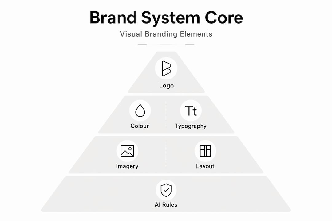
The core elements of visual branding are:
- Logo. Your primary visual mark. It needs to work at any size, in colour and in monochrome, and across every format from a business card to a billboard.
- Colour palette. Not just a favourite colour, but a structured set of primary, secondary, and neutral tones with defined usage rules. Colour psychology directly affects how customers perceive your brand, whether you feel trustworthy, energetic, or approachable.
- Typography. The typefaces you use and how you use them. Font choices carry personality. A law firm and a children’s toy brand make very different typographic choices for good reason.
- Imagery style. The type of photography, illustration, or graphic work you use. Bright and candid, or dark and editorial? Real people or abstract visuals?
- Layout and composition. How you arrange elements on a page, a screen, or a physical surface. White space, grid systems, and hierarchy all contribute to your visual personality.
“Visual brand language is the intentional use of design elements to subliminally communicate brand personality and create a consistent consumer experience.”
These elements work together as a visual brand language: a set of signals that customers read without consciously realising it. Done well, they instantly communicate what your brand stands for before a single word is read.
How visual branding builds recognition and trust
Consistency is not just a design principle. It is a commercial one. Consistent visual cues shape first impressions, reinforce your brand promise at every encounter, and build the kind of familiarity that turns a one-time buyer into a repeat customer.

Think about the touchpoints your customers move through. They might find you on a Google search, land on your website, follow you on social media, receive a delivery in branded packaging, and eventually walk into your physical premises. If each of these looks slightly different, the experience feels disjointed. It quietly erodes trust because the customer cannot form a clear picture of who you are.
Multi-touchpoint consistency across physical and digital environments is not a luxury reserved for large brands. Even a small business benefits from presenting a unified visual face across its website, printed materials, and social channels. Customers notice coherence, even if they cannot name what they are responding to.
Pro Tip: Before you spend money on new design assets, audit what you already have. Print or screenshot every customer-facing material: website, social profiles, email templates, invoices. Lay them side by side. If a stranger could not tell they came from the same business, your visual branding needs attention.
The emotional impact of visual consistency goes further than recognition. Consistent visual experiences create a repeatable signal that customers associate with reliability. When your design looks the same on Tuesday as it did six months ago, and the same online as it does in person, that reliability translates into trust. Trust leads to loyalty. Loyalty leads to growth.
Modern visual branding systems
Most businesses have brand guidelines. Few have a proper visual branding system. The difference matters more than most people realise.
Guidelines tell people what the brand should look like. A visual branding system provides everything needed to actually produce it correctly, including ready-to-use templates, design tokens (standardised values for colours, spacing, and fonts), asset libraries, and governance processes. Effective brand rollouts require both: rules and ready-to-use assets so teams can apply the brand without reinventing it each time.
Here is how the two approaches compare:
| Approach | What it includes | Common outcome |
|---|---|---|
| Brand guidelines only | PDF document, colour codes, font names | Inconsistency at point of execution |
| Full visual brand system | Guidelines plus templates, tokens, asset library, governance | Consistent application across every channel |
Poor implementation of guidelines without executable assets is one of the leading causes of brand drift. A designer joins the team, cannot find the approved files, and creates something close but not quite right. Multiply that across six months and ten team members, and the brand starts to fragment.
Modern visual branding systems now include a sixth pillar: AI image generation rules. As AI prompt patterns become part of standard marketing workflows, brands need documented parameters that tell team members and AI tools what kind of imagery fits the brand. Without these, AI-generated visuals can technically be high quality whilst still being completely off-brand.
Pro Tip: If you work with freelancers or an in-house team, create a single shared folder containing your logo files, approved templates, and a one-page brand reference sheet. This alone reduces inconsistency significantly and saves hours of back-and-forth on every project.
Dynamic online documentation that syncs updates instantly and is searchable is the current best practice for scaling visual branding across growing organisations. If your brand guidelines live as a PDF on someone’s desktop, they are already out of date.
How to create visual branding for your business
Building a strong visual identity does not require a million-pound budget. It requires clarity, discipline, and the right process. Here is how to approach it:
-
Define your brand identity first. Before you pick a colour, know who you are. What are your values? Who is your audience? What does your business promise, and how do you want people to feel after interacting with you? Your visual choices must follow from this, not precede it.
-
Choose visual elements that reflect your identity. Select a colour palette, typefaces, and an imagery style that genuinely fits your brand personality and resonates with your audience. A visual web design approach that matches your brand positioning will produce far better results than picking what looks fashionable.
-
Create and centralise your documentation. Your brand guidelines should cover every element with clear usage examples. Pair this with a library of ready-to-use templates for social posts, presentations, email headers, and print materials. Centralised brand documentation is what makes scaling possible without sacrificing consistency.
-
Test across channels and real environments. Check that your colour palette holds up on screen and in print. Verify that your typography is readable on mobile as well as on a 27-inch monitor. Accessibility testing for colour contrast and legibility should be part of every brand review, not an afterthought.
-
Review and evolve systematically. Visual branding is not a one-off project. Markets shift, audiences change, and design trends move. Build in a regular review cycle, ideally annually, to assess whether your visual identity still positions you correctly.
Pro Tip: When testing your brand visuals, ask someone outside your business to describe the impression each piece gives them. You will often discover that what you intended to communicate and what is actually coming across are not the same thing. That gap is where the work is.
Strong logos and branding are foundational, but they only carry value when applied consistently across every channel your customers encounter. That application is what separates brands that are merely recognised from those that are genuinely trusted.
Common misconceptions about visual branding
A few misunderstandings tend to hold businesses back when they try to tackle their visual identity. It is worth naming them directly.
- Visual branding is not a one-off task. Creating a logo and a colour palette is a starting point, not a finished system. The ongoing application, governance, and evolution of those elements is the actual work.
- Aesthetic appeal is not the same as brand communication. Something can look beautiful and still fail to communicate the right message. The question is never just “does this look good?” It is “does this accurately represent what we stand for to the right audience?”
- Digital and physical media do not behave the same way. A colour that looks vibrant on screen may appear dull in print, or vice versa. Typography that is elegant on a large screen can be illegible on a mobile device. Consistency across channels requires active management, not assumptions.
- AI-generated imagery can create brand drift. AI image tools are genuinely useful for marketing teams, but without clear parameters tied to your visual brand language, the output can quickly feel generic or misaligned. Building AI usage rules into your brand system protects consistency.
- Rebrand urgency is often misplaced. Many businesses reach for a full rebrand when the actual problem is inconsistent application of what they already have. Before you commit to a redesign, audit your existing assets and execution quality first.
My perspective: what actually makes visual branding work
I have worked with enough businesses to see the same pattern play out repeatedly. A company invests in a professional logo, chooses a strong colour palette, and then six months later their social media looks nothing like their website, which looks nothing like their printed leaflets. The guidelines exist. Nobody uses them consistently.
What I have come to believe is that the real challenge in visual branding is not creative. It is operational. The businesses that get this right are the ones that treat their visual system as an ongoing business process, not a design project with an end date. They keep their assets accessible. They make it easy for anyone producing content to do it correctly the first time.
I have also seen how underestimated motion and atmosphere are as brand signals. The way a website loads, the transition between pages, the tone of an event space. These are all visual branding decisions, and most businesses are not thinking about them.
On AI: I am genuinely optimistic about what AI image generation offers marketing teams. But I have seen it cause real brand damage when used without parameters. Building AI usage rules into your brand documentation is not complicated. It just requires someone to treat it as a priority before the problem appears, not after.
The brands that get long-term value from their visual identity are not always the ones with the most sophisticated design. They are the ones where everyone who touches the brand knows exactly how to apply it.
— tibor
Build your visual brand with Fyldedigital
If you are ready to move beyond a scattered collection of design files and build a visual identity that actually works across every channel, Fyldedigital can help.

At Fyldedigital, we work with businesses across the Fylde Coast and beyond to create professional branding solutions that go beyond logos. From visual brand strategy and graphic design services to building visually cohesive websites that reflect your identity at every touchpoint, our team takes a practical, results-focused approach. If your website is where customers form their first impression of your brand, it needs to look and feel exactly right. Explore our web design in Blackpool to see how we bring brand identity to life online.
FAQ
What is visual branding in simple terms?
Visual branding is the collection of design elements, including your logo, colours, fonts, and imagery, that communicate your brand’s identity consistently across every customer touchpoint.
Why does visual branding matter for small businesses?
Consistent visual branding builds recognition and trust with your audience, which directly supports customer loyalty and growth, regardless of the size of your business.
What are the main elements of visual branding?
The core elements are your logo, colour palette, typography, imagery style, and layout principles. Together, these form a visual brand language that communicates your personality without words.
How do I start creating visual branding for my business?
Start by defining your brand values and audience, then develop visual elements that reflect those clearly. Pair your guidelines with practical templates and asset libraries so your team can apply them consistently.
What is the difference between brand guidelines and a visual brand system?
Brand guidelines describe what your visual identity should look like. A visual brand system goes further by providing the templates, asset libraries, and governance processes needed to apply it correctly every time.

