
Your visual branding elements are not decoration. They are the infrastructure your business runs on. Every time a potential customer lands on your website, opens a proposal, or spots your social media post, they form an instant judgement about your credibility, professionalism, and relevance. That judgement happens before they read a single word.
A complete visual identity system allows customers to recognise a brand instantly across multiple touchpoints, reducing cognitive load and improving recall. For SMEs competing in crowded UK markets, that recognition is not a luxury. It is a commercial advantage.
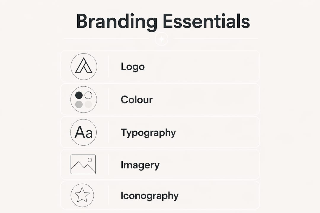
The core visual branding elements are:
- Logo system — primary mark, secondary lockups, and standalone icon
- Colour palette — primary, secondary, and accent colours with defined usage rules
- Typography — a limited set of typefaces with assigned roles (display, body, UI)
- Imagery style — photography, illustration, and graphic treatment guidelines
- Iconography — a consistent icon set that reinforces the visual language
- Layout grid — spacing, alignment, and compositional rules
- Voice and tone — the verbal layer that complements every visual decision
Together, these form a system. Individually, they are just assets.
Table of Contents
- What are the core visual branding elements SMEs should prioritise?
- How to develop and implement your visual branding strategy
- Common visual branding pitfalls SMEs should avoid
- How Fyldedigital approaches visual branding for SMEs
- How visual branding supports business growth
- How visual branding reduces market friction
- How to conduct a visual brand audit
- UK SME visual branding in practice
- Applying your visual branding across digital and physical channels
- Key takeaways
What are the core visual branding elements SMEs should prioritise?
Start with the three foundations: logo, colour, and typography. These appear on everything, so getting them right first gives you a stable base to build from.
Logo system. A single logo file is not enough. You need a primary horizontal lockup, a stacked version, and a standalone icon or monogram for small applications like favicons and social avatars. Research suggests logos are often more effective than colours alone in driving distinctiveness and brand ownership recognition.
Colour palette. A structured palette often follows a rule dividing colours into dominant, secondary, and accent proportions to maintain balance. Every colour must meet accessibility contrast standards to remain legible across print and digital media.
Typography. Limit yourself to one to three typefaces with clearly defined roles. One for headlines, one for body copy, and optionally one for UI or captions. Poor typographic decisions are behind most DIY brand failures, producing designs that look inconsistent or are simply hard to read. Always verify licence compliance before using a typeface commercially.

Imagery style. Define the photographic and illustrative treatment your brand uses. High-contrast and minimal? Warm and documentary? Illustrated and playful? Without a defined style, your content will look like it belongs to three different businesses.
Iconography and layout grid. A consistent icon set and a defined grid system keep your materials looking coherent even when different people produce them.
Pro Tip: Build your visual identity modularly. Start with logo, colour, and typography. Add imagery guidelines and iconography once the foundations are solid. This approach lets you grow the system without rebuilding it.
How to develop and implement your visual branding strategy
A clear process prevents the most common SME mistake: jumping straight into design before the strategy is settled.
- Define your brand foundation. Clarify your mission, values, positioning, and the audience you are speaking to. Your visuals must express something real about your business, not just look attractive.
- Create a mood board. Gather visual references that capture the feeling you want your brand to convey. This aligns expectations before any design work begins.
- Select your colour system. Choose your palette with accessibility in mind from the start. Define hex, RGB, and CMYK values for every colour so they reproduce consistently across screens and print.
- Choose your typefaces. Pick your display and body typefaces, confirm licensing, and document the size scales and weights for each role.
- Design your logo system. Work with a designer to produce all required lockups and formats, including SVG, PNG, and EPS files.
- Write your brand guidelines. Document every rule: logo spacing and minimum sizes, colour values, type hierarchy, imagery tone, and icon usage. Brand guidelines are what prevent inconsistency from eroding the trust you have built.
- Build locked templates. Create pre-built templates for social media posts, presentations, email headers, and printed materials. Locked templates reduce brand drift when non-designers produce content, keeping your visual identity intact without requiring a designer for every task.
- Train your team. Share the guidelines and walk colleagues through them. A document no one reads is not a brand system.
- Measure and update. Review your visual identity annually. Markets shift, products evolve, and your branding should reflect where your business is now, not where it was three years ago.
Pro Tip: Tools like Canva for Teams, Figma, and Adobe Express allow you to lock brand colours, fonts, and logo placements so that anyone on your team produces on-brand materials without needing design skills.
Common visual branding pitfalls SMEs should avoid
Most branding problems are avoidable. They tend to follow the same patterns:
- Starting with design before strategy. Choosing colours or commissioning a logo before defining your positioning produces visuals that look fine but say nothing meaningful about your business.
- No brand guidelines. Without documented rules, every team member interprets the brand differently. The result is a fragmented identity that erodes trust with customers and investors alike.
- Failing to provide templates. Guidelines alone are not enough. If your team does not have ready-made, locked templates, they will improvise, and brand drift follows quickly.
- Ignoring accessibility. Colour contrast failures, illegible type sizes, and low-resolution logos exclude users and signal a lack of care. Accessibility is not optional; it is a baseline standard.
- Inconsistent imagery. Mixing stock photography styles, illustration treatments, and graphic approaches makes your brand look uncoordinated, even when the logo and colours are correct.
- Treating branding as a one-off project. Visual identity needs maintenance. A brand that looked fresh at launch can feel dated within a few years if it is never reviewed.
Weak or improvised visuals carry a real commercial cost. Prospects who cannot quickly read your credibility from your materials will move on to a competitor who makes it easier.
How Fyldedigital approaches visual branding for SMEs
Fyldedigital works with SMEs across the UK to build visual identities that do more than look professional. The process starts with brand strategy, not design assets, because the visuals only work when they express something true about the business behind them.
The agency’s approach covers the full system: logo development, colour and typography selection, imagery guidelines, brand documentation, and template creation. Crucially, Fyldedigital integrates visual branding directly with web design, SEO, and social media management, so the identity performs consistently across every channel a customer might encounter.
That kind of outcome reflects what happens when visual branding is treated as infrastructure rather than an afterthought. Fyldedigital also provides clients with locked Canva and Figma templates, reducing the burden on internal teams while protecting brand integrity between agency touchpoints. For SMEs without in-house designers, that practical enablement is often what makes the difference between a brand that stays consistent and one that gradually fragments.
How visual branding supports business growth
Strong visual branding compounds over time. Every consistent touchpoint reinforces recognition, and recognition builds the trust that converts prospects into customers. Coherent visual branding signals professionalism and stability, making your products and services appear more trustworthy even before any functional evaluation takes place.
For SMEs at growth milestones, this matters acutely. Investors, retail buyers, and corporate procurement teams all use visual presentation as a proxy for operational quality. A polished, consistent brand identity signals that the business behind it is organised and credible. You can read more about this dynamic in Fyldedigital’s guide on branding and business growth.
How visual branding reduces market friction
Every time a customer has to work harder to understand who you are or what you offer, you lose ground. Inconsistent branding creates exactly that friction. When your logo looks different on your website versus your business cards, or your social media uses a completely different colour scheme to your printed materials, customers sense the dissonance even if they cannot name it.
A coherent visual identity system removes that friction. It makes your business easier to remember, easier to trust, and easier to recommend. In saturated UK markets, where buyers have abundant choice, reducing the cognitive effort required to choose you is a genuine competitive advantage.
How to conduct a visual brand audit
A brand audit does not need to be complicated. Gather every branded asset your business currently uses: website screenshots, social media profiles, email signatures, printed materials, packaging, and any templates your team relies on. Then assess them against four criteria:
- Consistency — do all assets use the same logo, colours, and typefaces?
- Accuracy — do the colours and fonts match your defined brand values?
- Accessibility — do your colour combinations meet WCAG contrast standards?
- Currency — does the visual identity still reflect your current positioning and audience?
Any asset that fails one of these checks is a candidate for revision. Prioritise the highest-visibility touchpoints first: your website, your social media headers, and your primary printed collateral.
UK SME visual branding in practice
Several UK SMEs have demonstrated what consistent visual branding achieves in competitive markets. Independent food and drink brands on the Fylde Coast have used structured colour palettes and distinctive typographic choices to stand out on crowded retail shelves, winning listings that previously went to larger competitors. Professional services firms in Lancashire have used cohesive brand identities to position themselves credibly against national firms, winning contracts where they were previously overlooked.
The common thread is not budget. It is consistency and intentionality. A modest brand system applied rigorously outperforms an expensive one applied carelessly.
Applying your visual branding across digital and physical channels
Your brand identity must work everywhere your customers encounter you: your website, social media, email newsletters, printed brochures, exhibition stands, packaging, and signage. Each channel has different technical requirements, but the visual language must remain recognisable across all of them.
For digital channels, this means supplying your web designer with correct hex colour codes, web-safe font files, and SVG logo files. For print, it means providing CMYK colour values and high-resolution artwork. Fyldedigital’s graphic design services and print services are built to handle both, ensuring your brand translates accurately from screen to page.
Social media deserves particular attention. Profile images, cover photos, post templates, and story formats all carry your brand, and they are often the first touchpoint a new prospect encounters. Pre-built, locked social templates are the most practical way to keep these consistent without requiring a designer for every post.
Key takeaways
A coherent visual identity system, built on logo, colour, typography, and imagery, is the single most effective tool an SME has for building credibility and reducing market friction.
| Point | Details |
|---|---|
| Start with strategy, not design | Define your brand positioning before selecting colours, typefaces, or commissioning a logo. |
| Build a modular system | Begin with logo, colour, and typography, then add imagery and iconography as the business grows. |
| Document everything | Brand guidelines and locked templates are what keep your identity consistent when multiple people produce materials. |
| Audit regularly | Review all branded assets annually against consistency, accuracy, accessibility, and currency. |
| Integrate across channels | Supply correct colour codes and file formats for both digital and print to maintain fidelity everywhere. |

