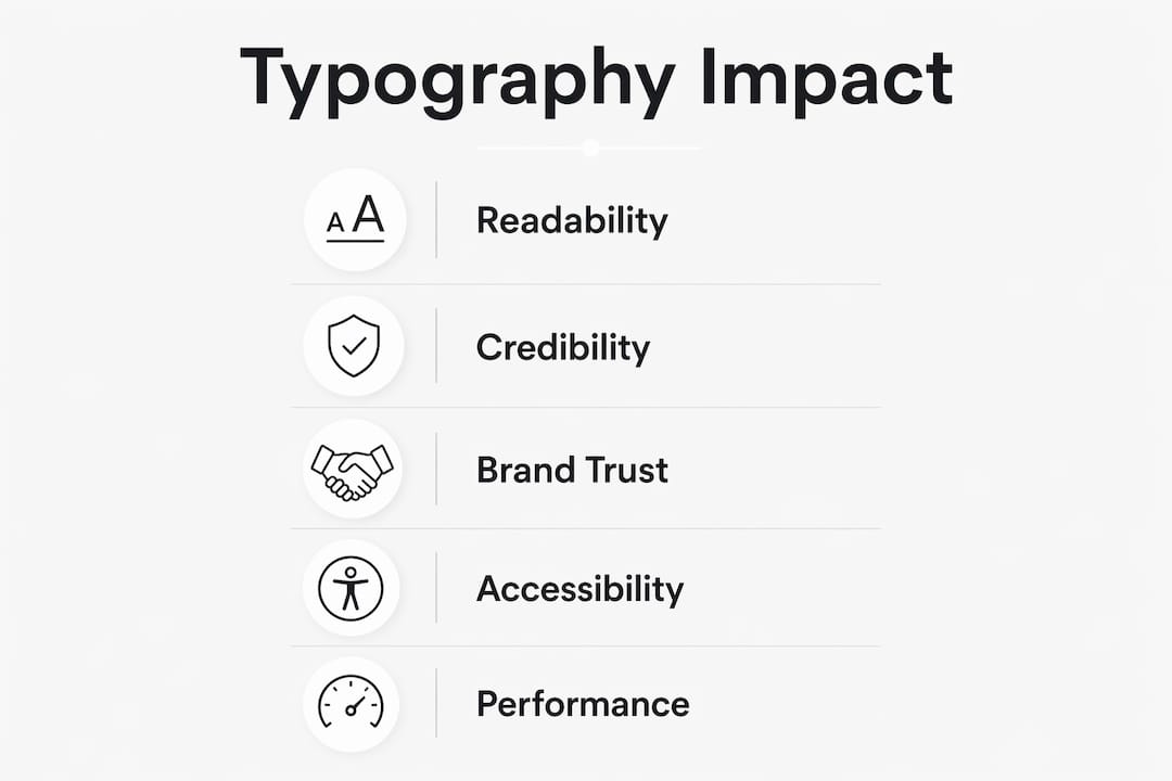
Typography shapes how visitors read your site, trust your brand, and decide whether to stay or leave. Get it right and your content feels effortless to absorb; get it wrong and even the best copy struggles to land. The Monotype and Neurons study found that typeface choice can make a word appear 13% more relevant to its message, boost memorability by 10%, and enhance perceived trustworthiness by 9% — measurable business outcomes driven entirely by font selection. WCAG accessibility guidance adds a further layer: contrast, sizing, and spacing are not optional refinements but baseline requirements for a site that works for everyone.
Three things you can do right now:
- Check contrast ratios using WebAIM’s Contrast Checker against the WCAG minimum of 4.5:1 for normal text.
- Set your base font size in
rem(start at1rem, equivalent to the browser default of 16px) so users who adjust their browser settings are not locked out. - Add
font-display: swapto every@font-facedeclaration so text is visible immediately while your web font loads, preventing a blank page experience.
Table of Contents
- What typography actually means on the web
- Why typography matters for readability, credibility, and brand identity
- How to design typographic hierarchy: headings, body text, and CTAs
- How to choose the right fonts for your site
- Concrete readability rules: sizes, line-height, and contrast
- Typography and accessibility: what WCAG requires
- Responsive typography patterns that work across every device
- Common typographic mistakes and how to fix them
- A one-page checklist to improve your typography today
- What the research actually shows about typography’s impact
- Key takeaways
- A practitioner’s view on typographic systems
- Typography and web design: how Fyldedigital can help
- Useful sources and further reading
What typography actually means on the web
Most people use “font” and “typeface” interchangeably, but the distinction matters when you are specifying a design system. A typeface is the design family — Inter, Georgia, Playfair Display. A font is a specific instance of that family: Inter Regular 400, or Playfair Display Bold Italic 700. When you choose a typeface for your site, you are selecting the personality; when you choose a font, you are selecting the exact voice for a given context.
The anatomical terms you will encounter most often in web work are x-height (the height of a lowercase ‘x’, which governs perceived size at small scales), ascenders (strokes rising above the x-height, as in ‘b’ or ‘d’), descenders (strokes below the baseline, as in ‘p’ or ‘g’), and counters (the enclosed or partially enclosed spaces inside letters like ‘o’ or ‘e’). A high x-height typeface reads clearly at small sizes on screen — which is why Inter and Roboto dominate UI design. Serifs add fine strokes at letter terminals; sans-serifs omit them, producing the cleaner, more neutral feel that most digital interfaces favour.
“Typographic features — the granular details found within letter shapes and overarching tonal themes in fonts — connote real meaning and appropriateness and have the power to directly influence emotions.” — Phil Garnham, Creative Type Director, Monotype
The most practical shift you can make is to treat typography as a design token, not a one-off decision. Define your type scale, weights, and line-height values as named variables in CSS or your design tool, then reference those tokens everywhere. That way, a single change propagates consistently across every page, component, and breakpoint — which is the foundation of a scalable brand system.
Why typography matters for readability, credibility, and brand identity
Typography is rarely the first thing a visitor consciously notices, but it is one of the first things their brain processes. Reading speed, comprehension, and the instinctive sense of whether a site feels trustworthy are all shaped by typographic choices before a single word of copy is evaluated on its merits.

The font appropriateness research from academic consumer experiments is striking: products presented in a contextually appropriate font were chosen significantly more often than those in an inappropriate font. In a field chocolate test, the appropriate font was selected the vast majority of the time. That is not a marginal effect — it is the difference between a product that feels right and one that creates unconscious friction.
For your website, the practical consequences are:
- Bounce rate rises when body text is too small, too light, or set at poor contrast — visitors leave before they have read enough to convert.
- Dwell time increases when reading feels comfortable; users who stay longer are more likely to reach a CTA or enquiry form.
- Brand recall depends on consistency: the same typeface used across your site, email, and social content builds the kind of brand familiarity that compounds over time into genuine trust.
Typographic appropriateness often outweighs superficial brand cues. A luxury service using a playful rounded sans-serif sends a contradictory signal that visitors sense even if they cannot articulate it. Matching the semantic tone of your typeface to your brand personality is not a design nicety — it is a conversion factor.
How to design typographic hierarchy: headings, body text, and CTAs
A clear hierarchy tells visitors where to look first, second, and third. Without it, every element competes for attention equally, and the page reads as visual noise.

The practical approach is a modular scale: choose a ratio (1.25 or 1.333 are common) and multiply your base size upward for each heading level. If your body text is 16px, a 1.25 ratio gives you roughly 20px for H3, 25px for H2, and 31px for H1. The exact numbers matter less than the consistent progression — visitors should be able to scan the page and immediately understand the content structure.
| Role | Size (rem) | Line-height | Weight |
|---|---|---|---|
| H1 | 2.5–3rem | — | 700 |
| H2 | 2rem | — | 700 |
| H3 | 1.25–1.5rem | 1.4 | — |
| Body | 1rem | 1.5–1.6 | 400 |
| Small / caption | 0.875rem | 1.4 | 400 |
| CTA button | 1rem | 1 | 700 |
Reserve display or decorative styles for hero headings only — never for body text or navigation. CTAs deserve their own typographic treatment: slightly heavier weight than body, enough size to register as a distinct action, and sufficient contrast against the button background to pass WCAG at 4.5:1.
Pro Tip: Use vertical rhythm — a consistent baseline grid — so spacing between headings, paragraphs, and images feels intentional rather than arbitrary. Set your line-height and margin values as multiples of your base unit (e.g. 8px or 0.5rem) and apply them through design tokens.
How to choose the right fonts for your site
Font selection is where brand tone, legibility, and technical constraints all collide. The checklist below keeps the decision structured.
- Tone appropriateness: Does the typeface personality match your brand? A serif like Playfair Display signals heritage and authority; a geometric sans like Futura signals modernity and precision.
- X-height and readability: Higher x-height typefaces (Inter, Source Sans, Lato) read more clearly at small sizes on screens.
- Available weights: Check that the family includes the weights you need (at minimum Regular 400 and Bold 700) before committing.
- Variable font support: Variable fonts encode multiple weights and widths in a single file, reducing HTTP requests and payload.
- Licensing: Google Fonts is free for commercial use with no attribution required. Adobe Fonts requires an active Creative Cloud subscription but offers a broader catalogue of premium typefaces. Paid foundry fonts (from Klim, Commercial Type, or Fontsmith) carry per-project or annual licences — budget for this before specifying them.
Pro Tip: Limit yourself to two typeface families per site. A common pairing pattern is a serif for display headings and a sans-serif for body text, or two sans-serifs with contrasting weights and personalities. Match x-heights between the two families so they sit comfortably together at similar sizes.
For performance-critical projects, a system font stack eliminates network requests entirely. The stack system-ui, -apple-system, BlinkMacSystemFont, "Segoe UI", Roboto, sans-serif delivers San Francisco on Apple devices, Segoe UI on Windows, and Roboto on Android — all rendered instantly with no layout shift. Where your web design demands a specific brand typeface, weigh the payload cost against the brand benefit.
A single web font file can run 50–200KB; loading four weights of two families adds up quickly. Prefer variable fonts or subset your fonts to the character sets you actually use.
Concrete readability rules: sizes, line-height, and contrast
Readability is not subjective. There are numeric targets that work across the vast majority of users, and WCAG gives you the accessibility floor.
Base font size: Set body text at 1rem (16px browser default). Never go below 0.875rem (14px) for paragraph text. Users who have increased their browser’s default font size will benefit automatically from rem-based sizing.
Line-height: Aim for 1.4–1.6 for body paragraphs. Tighter than 1.4 and lines feel cramped; looser than 1.6 and the eye struggles to track from the end of one line to the start of the next.
Measure (characters per line): 45–75 characters per line is the comfortable reading range for most users. Wider than 75 and the eye fatigues tracking across; narrower than 45 and the constant line-breaks interrupt reading flow. In CSS, max-width: 65ch on your body container is a reliable starting point.
Contrast: WCAG 2.1 Level AA requires a minimum contrast ratio of 4.5:1 for normal text (under 18pt / 24px) and 3:1 for large text (18pt bold or 24px regular). Level AAA raises the bar to 7:1 for normal text — worth targeting for body copy on sites where accessibility is a priority.
Pro Tip: Test contrast with the WebAIM Contrast Checker before sign-off. Dark grey on white (#333 on #fff) typically passes at around 12:1 — well above the minimum — while light grey on white (#999 on #fff) fails. Never rely on your design tool’s colour picker alone.
Typography and accessibility: what WCAG requires
Accessibility in typography is not a separate concern from good design — the two overlap almost entirely. A site that is readable for a user with low vision is almost always more readable for everyone.
The core WCAG requirements for typography are:
- Contrast ratios: 4.5:1 for normal text, 3:1 for large text (Level AA). Use the WCAG quick reference to check your specific cases.
- Responsive text sizing: Text must reflow and remain readable when users zoom to 200% without horizontal scrolling (WCAG 1.4.4 and 1.4.10).
- Semantic HTML: Use
<h1>through<h6>in logical order; use<strong>and<em>for emphasis rather than styling a<span>to look bold. - No meaning by font alone: Never convey information solely through typeface, weight, or colour — always pair a visual cue with a text label or ARIA attribute.
For dyslexia-friendly typography, prioritise:
- High x-height typefaces with clear, open letterforms (avoid decorative or condensed faces).
- Generous letter-spacing (
letter-spacing: 0.05emon body text is a reasonable starting point). - Left-aligned text — never justified. Justified text creates irregular word spacing that produces “rivers of white” through paragraphs, which disrupts reading for users with dyslexia.
- Sufficient line-height (1.5 minimum) and paragraph spacing (at least 1.5× the line-height).
Testing checklist:
- Run automated contrast checks with WebAIM or the browser DevTools accessibility panel.
- Navigate the page using a keyboard only — check that focus states are visible.
- Test with a screen reader (NVDA on Windows, VoiceOver on macOS/iOS) to verify heading order and emphasis.
- Zoom to 200% in the browser and confirm text reflows without horizontal scrolling.
- Ask a user unfamiliar with the site to read a key page aloud — hesitations reveal readability problems faster than any tool.
Responsive typography patterns that work across every device
Fixed pixel sizes are the single most common technical mistake in web typography. A 14px body font that looks acceptable on a 27-inch monitor becomes genuinely difficult to read on a 375px mobile screen — and vice versa for oversized display headings that dominate a small viewport.
The solution is fluid type using CSS clamp():
body {
  font-size: clamp(1rem, 2.5vw, 1.25rem);
}

h1 {
  font-size: clamp(2rem, 5vw, 3.5rem);
}
clamp(minimum, preferred, maximum) sets a floor and ceiling with a fluid value in between, so type scales smoothly between breakpoints without a single media query. Pair this with responsive design principles and your typography adapts to every viewport automatically.
| Technique | Use case | Trade-off |
|---|---|---|
clamp() fluid type |
Body and heading scales | Requires modern browser (all major browsers) |
rem units |
Base size, spacing | Respects user browser settings |
Viewport units (vw) |
Display / hero headings | Can become too small on narrow screens without a floor |
| Variable fonts | Multiple weights in one file | Slightly larger single file but fewer HTTP requests |
| System font stack | Performance-critical pages | No brand font; native OS appearance |
For font loading, add font-display: swap to every @font-face rule. This tells the browser to render fallback text immediately and swap to the web font once it has downloaded, preventing the Flash of Invisible Text (FOIT) that leaves users staring at a blank page. For Google Fonts, append &display=swap to the URL. For Adobe Fonts, the swap behaviour is configurable in the kit settings.
Also add a <link rel="preconnect"> to your font host (fonts.googleapis.com or use.typekit.net) in the <head> so the DNS lookup and connection happen as early as possible.
Common typographic mistakes and how to fix them
Most typographic problems on live sites fall into a small number of repeating patterns. Auditing for these takes under an hour and the fixes are usually straightforward.
- Body text too small: Anything below 15px for paragraph text is a readability problem on most screens. Fix: set
font-size: 1remonbodyand remove any overrides that reduce it below that. - Poor contrast: Light grey text on a white background is the most common failure. Fix: darken the text colour until it passes 4.5:1 —
#595959on#ffffffpasses;#767676does not. - Too many typefaces: Three or more families create visual noise and inflate page weight. Fix: reduce to two families maximum and use weight and size variation within those families to create hierarchy.
- Inconsistent heading hierarchy: H2s styled smaller than H3s, or heading tags used for visual effect rather than structure. Fix: enforce a strict modular scale and use heading tags semantically, not decoratively.
- Decorative fonts in body text: Script or display typefaces used for paragraphs are exhausting to read at length. Fix: reserve decorative faces for single-line display use only; use a legible sans or serif for all body copy.
- No
font-displaystrategy: Custom fonts that block rendering leave users with invisible text for several seconds on slow connections. Fix: addfont-display: swapto every@font-facedeclaration. - Justified body text: Creates uneven word spacing and reading rivers. Fix: set
text-align: lefton all paragraph elements.
Quick audit priority order: hero heading, navigation labels, body paragraphs, CTA buttons, and form labels. These five areas cover the majority of user reading time and the highest-impact conversion touchpoints.
A one-page checklist to improve your typography today
Work through this list in a single session or sprint. Designers, developers, and business owners each have a distinct role.
Designers:
- Audit your type scale — confirm a consistent modular ratio from H1 down to caption.
- Check all text/background combinations against WCAG 4.5:1 using WebAIM.
- Reduce typeface families to two maximum and document the pairing rationale.
- Define typography as design tokens (size, weight, line-height, letter-spacing) in your design file.
Developers:
- Replace all
pxfont-size values withremequivalents. - Implement
clamp()for heading and body scales. - Add
font-display: swapto every@font-faceor Google Fonts URL. - Add
<link rel="preconnect">for your font host in<head>. - Limit loaded font weights to those actually used — remove unused variants from the
@font-facestack.
Business owners:
- Approve a documented type system before development begins — changes after build are expensive.
- Request a Lighthouse performance score before and after font changes to confirm load time improvement.
- Set a baseline for bounce rate and average session duration; measure again four weeks after typographic changes go live.
After implementation, track: page load time (Lighthouse or PageSpeed Insights), Cumulative Layout Shift (CLS) score, bounce rate, and average session duration. A well-executed typographic overhaul typically improves all four.
What the research actually shows about typography’s impact
The evidence for typography’s business impact is stronger than most designers realise, and it comes from controlled experiments rather than opinion.
The Monotype and Neurons study used applied neuroscience methods to measure emotional responses to typefaces among UK participants aged 18 and over. The results: typeface choice made a word appear 13% more relevant to its message, produced a 10% increase in memorability, and delivered a 9% increase in perceived trustworthiness. Mike Storm, COO of Neurons, noted: “We typically expect similar studies to reach results between 0% and 5%. The fact that responses reached 13% confirms the power of type.”
The academic consumer choice experiments add a behavioural dimension. Across multiple product categories, appropriate fonts produced a 2:1 choice ratio over inappropriate fonts. In a real-world chocolate field test, the appropriate font was selected approximately 75% of the time.
| Study | Method | Key finding |
|---|---|---|
| Monotype / Neurons | Neuroscience panel, UK adults | 13% relevance lift, 10% memorability, 9% trust |
| Academic consumer choice | Controlled experiments + field test | 2:1 choice ratio; 75% field selection rate |
The practical implication is that font selection is a testable variable, not a matter of taste. A/B testing headline typefaces on a landing page, measuring scroll depth and conversion rate, and iterating based on results is a legitimate and measurable optimisation strategy. Start with the typeface most congruent with your brand personality and test against a neutral alternative.
Key takeaways
Typography is the single design variable that simultaneously affects readability, brand trust, accessibility, and page performance — making it the highest-leverage place to invest design effort on any website.
| Point | Details |
|---|---|
| Font choice drives measurable outcomes | Typeface selection makes a word appear 13% more relevant, boosts memorability by 10%, and increases perceived trustworthiness by 9%, according to the Monotype / Neurons study. |
| Appropriate fonts influence purchase behaviour | Academic experiments show a 2:1 choice ratio favouring contextually appropriate fonts, with 75% selection in real-world field tests. |
| WCAG contrast is the accessibility floor | Minimum 4.5:1 contrast ratio for normal text; use rem units and clamp() so type scales with user settings and viewport. |
| Treat typography as a design system | Define type as tokens (size, weight, line-height) so changes propagate consistently across every page and breakpoint. |
| Fyldedigital builds typographic systems into every project | From token-based type scales to accessible contrast and performance-optimised font loading, Fyldedigital applies these principles as standard in web design work. |
A practitioner’s view on typographic systems
Typography tends to get treated as a finishing touch — the last thing chosen before a site goes live, after layout, colour, and content have already been locked. That sequencing is backwards, and it shows in the results. When type is chosen last, it gets retrofitted around decisions it should have informed. Heading sizes feel arbitrary because no one set a scale. Body text is too small because the designer was working at 1440px and never checked a mobile. Contrast fails because the palette was chosen for aesthetics, not legibility.
The projects where typography works hardest are the ones where it was defined first, as a system. That means tokens in the design file before a single component is built, a documented type scale that the developer can implement directly, and a contrast audit that runs before the colour palette is finalised. It also means choosing a typeface for what it communicates, not just how it looks in a mockup. A rounded sans-serif that feels friendly in a Figma frame can read as unprofessional in a 12px navigation label on a 375px screen.
The Monotype / Neurons findings are worth keeping in a back pocket for client conversations. A 13% lift in message relevance from typeface choice alone is the kind of number that reframes typography from a stylistic preference to a business decision. Most clients have never thought about it that way — and once they do, the conversation about investing in a proper type system becomes much easier.
Typography and web design: how Fyldedigital can help
Getting typography right across a full website — from the type scale and token system to accessible contrast and performance-optimised font loading — takes time and expertise that most business owners simply do not have spare. Fyldedigital’s web design service builds typographic systems in from the start: a documented scale, WCAG-compliant contrast, clamp()-based fluid type, and font-display: swap as standard on every build.
Whether you need a full site redesign or a focused UX audit that identifies where your current typography is costing you leads, the team at Fyldedigital can scope the work and give you a clear picture of what needs to change. The graphic design service covers brand typography and identity work for businesses that need a consistent type system across digital and print. Get in touch for a free website review and find out exactly where your typography stands.
Useful sources and further reading
- Monotype / Neurons study — The primary neuroscience research quantifying typeface effects on relevance, memorability, and trust. Read this for the methodology and the 13% / 10% / 9% findings in context.
- Font appropriateness and brand choice (academic paper) — Peer-reviewed consumer experiments showing the 2:1 choice ratio and 75% field selection rate. Useful for understanding how font congruence affects real purchasing behaviour.
- WCAG 2.1 quick reference (W3C) — The authoritative checklist for accessibility requirements including contrast, text resize, and semantic structure. Bookmark this for QA.
- WCAG standards overview (W3C) — The broader standards page explaining Level A, AA, and AAA requirements and how they apply to typography.
- WebAIM Contrast Checker — The fastest way to verify text/background contrast ratios against WCAG thresholds during design and QA.
- font-display guidance (web.dev) — Google’s developer documentation on font loading strategies, including
font-display: swapimplementation for Google Fonts and self-hosted fonts. - Typography for the web: DesignKit guide — Practical guidance on measure, line-height, base sizes, and performance considerations for web font use.
- Why typography is vital to branding (Creative Bloq) — A well-argued case for treating type as a brand asset rather than a finishing detail, with examples from established brands.
- Typography First™ (An Artful Science) — The argument for making typography the structural foundation of content design, not an afterthought.