Updating your brand visuals preserves market relevance, strengthens conversion, and signals strategic intent to customers, partners, and recruits. If your logo was designed before mobile-first design became standard, or your colour palette hasn’t been reviewed since your last website build, a visual refresh is likely overdue. The single most useful next step is a 30–60 minute brand health audit: pull together your key touchpoints, compare them side by side, and ask honestly whether they still reflect where your business is today.
TL;DR — three reasons to act:
- Relevance: Dated visuals quietly erode trust, particularly on digital channels where first impressions form in seconds.
- Differentiation: Refreshed visuals help you stand apart from competitors who haven’t invested in their identity.
- Digital readiness: Logos and assets designed for print often fail at small sizes, on app icons, or in social media formats.
Table of Contents
- What is a brand refresh and how does it differ from a rebrand?
- Which visual assets should you update, and by how much?
- What are the real business benefits of refreshing your brand identity?
- How do you know when it’s time to update your brand visuals?
- How do you plan and run a visual update from start to finish?
- What does a visual update typically cost and how long does it take?
- How do you measure whether a visual update has worked?
- What mistakes do businesses most often make when updating their visuals?
- What does the latest research say about visual complexity and brand status?
- What should you do in the next 90 days?
- Key takeaways
- A perspective on visual refreshes that most guides miss
- How Fyldedigital can support your visual refresh
- Useful sources and further reading
What is a brand refresh and how does it differ from a rebrand?
A brand refresh is a targeted update to your visual and creative assets: the logo, colour palette, typography, imagery style, and templates. The strategy, name, and core positioning stay intact. A rebrand, by contrast, involves rethinking the strategy itself, often including the name, audience, or market position. Understanding which you need before you commission any design work saves significant time and budget.
Visual branding comprises every touchpoint a customer sees, from your website hero image to your email footer. According to Shopify’s visual branding guide, brands should revisit these assets as markets and products evolve, keeping the system cohesive across all channels. A refresh is appropriate when the visual system is misaligned with where the business is today but the underlying strategy remains sound.
Choose a refresh when:
- Your visuals look dated but your positioning and audience haven’t changed.
- You’re expanding into new digital channels (apps, social, video) and existing assets don’t scale.
- Inconsistency has crept in across touchpoints through years of ad hoc updates.
- A product line extension or new service needs to sit coherently within the existing brand.
Consider a full rebrand when:
- A merger, acquisition, or leadership change has fundamentally altered the business direction.
- You’re repositioning for a new audience or entering a new market.
- Negative associations with the current name or identity are affecting commercial performance.
Common catalysts for a full rebrand include mergers and acquisitions, strategic repositioning, and international expansion, as VIM Group’s rebranding research notes. These situations typically require more than updated assets. If you’re unsure which path applies, a brand health audit will clarify it quickly.
Which visual assets should you update, and by how much?
Not every element needs the same degree of change. The goal is to evolve the system without losing the recognition you’ve already built.
- Logo (mark and wordmark): The most equity-laden asset. Minor refinements, such as cleaning up proportions, improving scalability, or creating a responsive variant for small screens, are low risk. A full redesign carries the highest risk of recognition loss. Logos designed for print often fail on mobile and app icon formats; responsive, flat, and scalable marks are now standard.
- Colour palette: Expanding or shifting the palette is moderate risk. Adding a secondary accent colour or adjusting primary tones for digital accessibility (WCAG contrast compliance) is usually straightforward. Wholesale colour changes can confuse existing customers.
- Typography: Switching to a modern, web-safe typeface family is one of the lowest-risk updates and often delivers an immediate lift in perceived quality. Pair a display face with a legible body face and define clear hierarchy rules.
- Imagery and photography style: Updating the style of photography, illustration, or graphic elements refreshes the brand’s feel without touching the logo. A streetwear brand might shift from studio shots to dynamic street photography; a professional services firm might move from stock imagery to bespoke portraits.
- Iconography: Custom icon sets replace generic stock icons and reinforce the brand’s visual language across digital products and presentations.
- Motion and animation: Increasingly expected on websites, social channels, and digital ads. Define a motion style (speed, easing, personality) that matches the brand’s character.
- Templates: Presentation decks, email signatures, social post templates, and document headers are often the most inconsistent assets in a business. Rebuilding these from a single master template set pays dividends immediately.
- Packaging and signage: Higher production cost and longer lead times mean these need careful phasing. Prioritise high-visibility items first.
Pro Tip: When simplifying a logo, preserve the recognisable motifs — the colour block, the mark geometry, the distinctive curve — that customers already associate with you. Stripping these away in pursuit of minimalism is the most common cause of recognition loss after a refresh.
For a detailed breakdown of each element, Fyldedigital’s guide to visual branding elements covers the practical decisions for SMEs.
What are the real business benefits of refreshing your brand identity?
The importance of brand visuals goes well beyond aesthetics. Investopedia’s brand identity analysis describes brand identity as the visible layer that directly influences customer perception and, by extension, pricing power and loyalty. Updated visuals affect the business in four concrete ways.
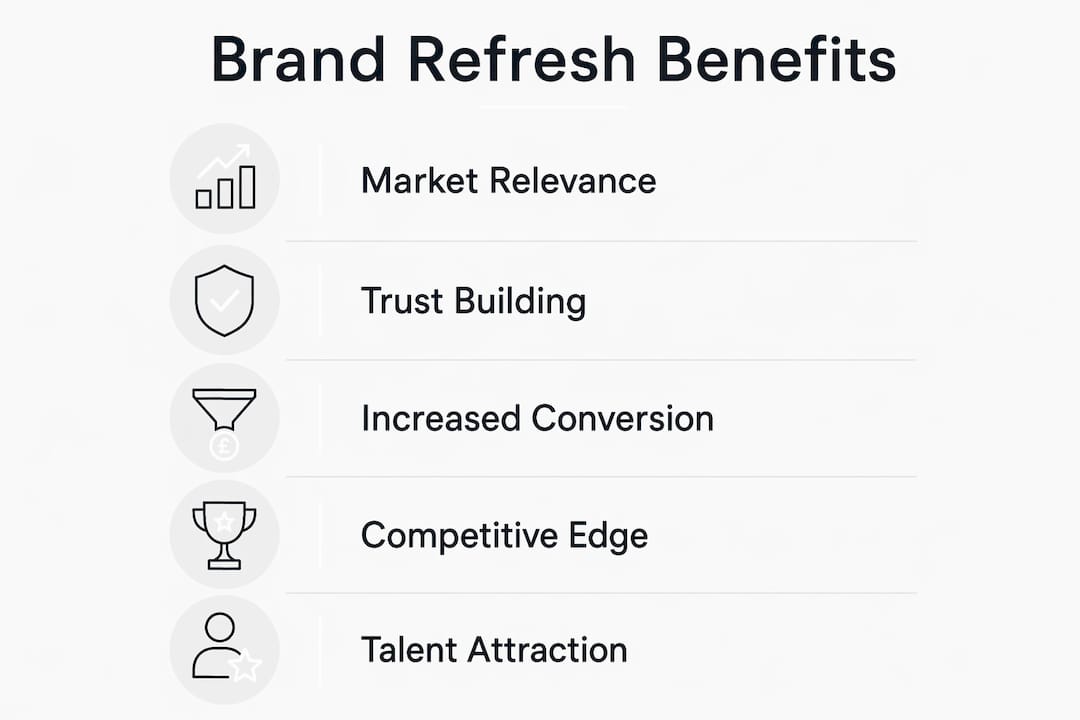
Market relevance and trust. Customers make rapid judgements about credibility based on visual signals. A dated logo or inconsistent website signals that a business may not be keeping pace with its market. Conversely, a clean, current visual identity communicates that you’re active, invested, and worth trusting with a purchase or contract.
Conversion and commercial performance. Consistent use of colours, typography, and imagery strengthens recall and conversion across the funnel. When your paid ads, landing pages, and website all speak the same visual language, the cognitive load on a prospective customer drops. That friction reduction translates directly into enquiries and leads. A website redesign case study from Fyldedigital illustrates how visual alignment between brand and site can drive measurable uplift in lead generation.

Differentiation. If your competitors have refreshed their identities and you haven’t, the gap becomes visible to your shared audience. Visual positioning, whether premium or accessible, is communicated through design choices before a single word is read.
Recruitment and partnerships. Your brand is the first impression for potential hires and B2B partners, not just customers. A professional, modern identity signals organisational health and ambition, which matters when you’re competing for talent or pitching for contracts.
How do you know when it’s time to update your brand visuals?
Run through this diagnostic honestly. If you answer “yes” to three or more, a refresh is worth scoping now.
- Does your logo look noticeably different from the version on your website, your printed materials, and your social profiles?
- Was your current visual identity designed primarily for print, with no responsive or digital variants?
- Have your products, services, or target audience shifted significantly since the last update?
- Are your conversion rates or social engagement metrics declining without a clear tactical explanation?
- Have competitors in your sector refreshed their identities in the past two years?
- Do new team members or partners struggle to apply the brand consistently without guidance?
- Are you entering a new channel (app, video, out-of-home advertising) where existing assets don’t work?
- Has your business gone through a significant milestone: new leadership, a funding round, a major new client sector, or a geographic expansion?
Brand identity should be reviewed on a regular cadence: major brand identity overhauls now average every 7–10 years, and minor visual refreshes commonly occur every 3–5 years. Tech and consumer brands tend to refresh more often than this, using incremental updates to signal ongoing momentum.
When a refresh is not enough: if your answers point to a fundamental change in strategy, audience, or positioning, a visual update alone won’t solve the problem. That’s when a full rebrand, as described in Fyldedigital’s rebranding campaign guide, becomes the right path.
How do you plan and run a visual update from start to finish?
A phased approach reduces risk and keeps the project on track. The recommended sequence is: audit → brief → design → guidelines → test → phased rollout.

Phase 1: Brand audit
Gather every customer-facing asset: website, social profiles, email templates, presentations, printed materials, signage, and packaging. Assess each for consistency, quality, and fit with the current business strategy. Identify the gaps and prioritise by customer impact.
Phase 2: Creative brief
Translate the audit findings into a written brief. Define what must stay (equity-bearing elements), what must change, the target audience, the positioning intent, and the success metrics. Stakeholder alignment at this stage prevents costly revisions later.
Phase 3: Design and concept development
Work through visual concepts that address the brief. For a refresh, this typically means two or three directions that each preserve core equity while solving the identified problems. Present concepts in context: on a website mockup, a social post, a business card, not just on a white background.
Phase 4: Brand guidelines
Document every decision. A usable brand guidelines document covers logo usage rules, colour codes (HEX, RGB, CMYK, Pantone), typeface specifications, imagery direction, and template files. Without this, inconsistency returns within months.
Phase 5: Testing
Before full rollout, test the new visuals on high-traffic touchpoints. Run A/B tests on landing pages and paid ad creative. Gather internal stakeholder feedback. For consumer-facing brands, a small focus group or online survey can surface recognition issues before they become public problems.
Phase 6: Phased rollout and governance
Prioritise high-impact touchpoints first: website hero, paid ads, app icon, and store signage. Schedule secondary assets (internal templates, printed collateral, packaging) in subsequent phases. Assign a named owner for brand governance, and set a review date to check consistency six months after launch.
When planning the launch communications, a brand reveal video can be an effective way to introduce the updated identity to customers and stakeholders, particularly for businesses with an active social media presence.
What does a visual update typically cost and how long does it take?
Timelines and budgets vary considerably depending on scope, asset count, and whether you’re working with an agency, a freelancer, or an in-house team. The table below gives realistic bands for UK SMEs.
| Scope | Typical timeline | Indicative budget range (excl. VAT) | What’s included |
|---|---|---|---|
| Quick refresh | 4–8 weeks | — | Logo refinement, colour/type update, core digital templates |
| Medium refresh | 3–6 months | — | Full visual system, photography direction, web redesign, guidelines |
| Full rebrand | 6–12+ months | — | Strategy, naming, identity, all assets, signage, packaging, rollout |
A full rebrand commonly involves updating around 215 assets, which explains why production costs escalate quickly beyond the design fee itself. For UK businesses, VAT applies to design and print production services, so factor that into budget approvals. Procurement cycles in larger organisations can add four to eight weeks to the timeline before a brief is even signed off.
The biggest budget driver is usually asset count, not design complexity. A business with a single website and a handful of templates costs far less to roll out than one with vehicle livery, retail signage, uniforms, and a product packaging range. Be specific about your asset inventory before requesting quotes.
How do you measure whether a visual update has worked?
Measurement starts before the refresh launches. Capture baseline figures across your key metrics so you have a genuine before/after comparison.
Recommended KPIs to track:
- Brand awareness and recognition: Aided and unaided recognition scores via a simple survey panel, run before and three to six months after launch.
- Website conversion rate: Track goal completions (enquiry form submissions, calls, purchases) on your key landing pages.
- Bounce rate: A refreshed, more coherent visual experience typically reduces bounce on the homepage and key service pages.
- Social engagement: Follower growth, post engagement rate, and share of voice in your sector.
- Recruitment metrics: Application volume and quality for open roles, particularly if employer brand was a stated objective.
- Net Promoter Score (NPS) or customer satisfaction (CSAT): Useful for tracking whether existing customers perceive the brand more positively post-refresh.
For testing, use A/B and holdout tests on high-traffic touchpoints such as landing pages and paid ad creative. Measure short-term performance metrics alongside a longer-term brand tracking metric to avoid optimising for a quick win that doesn’t reflect genuine brand health improvement.
A practical reporting cadence for most SMEs is: a four-week post-launch check on digital metrics, a three-month review of conversion and engagement trends, and a six-month brand recognition survey. Avoid drawing conclusions from the first two weeks alone; visual changes take time to register with audiences.
What mistakes do businesses most often make when updating their visuals?
Most refresh projects that go wrong do so for predictable, avoidable reasons.
- Changing too much too fast. Overhauling every asset simultaneously creates confusion for existing customers and overwhelms internal teams. A phased rollout is almost always safer.
- Skipping user testing. Internal teams become blind to their own brand. What feels fresh to the design team may read as unrecognisable to a long-standing customer. Test before you commit.
- Ignoring brand equity. Distinctive assets, a specific shade of blue, a particular mark shape, a typographic style, have real commercial value. Discarding them without evidence that they’re a problem is a costly mistake.
- Underestimating implementation costs. The design fee is rarely the largest line item. Print production, signage, web development, and template builds often exceed it. Build a full asset inventory before approving a budget.
- Poor stakeholder communication. A refresh that surprises your sales team, your customer service staff, or your longest-standing clients creates unnecessary friction. Brief internal teams before the public launch.
- No governance after launch. Without a named brand guardian and a clear approval process, inconsistency creeps back within six months. Assign ownership and document the rules.
Pro Tip: Run a pilot test on one high-traffic digital touchpoint, such as your homepage hero or a paid search landing page, before rolling out the new visuals across every channel. The data from that test is far more useful than any internal opinion.
What does the latest research say about visual complexity and brand status?
A 2026 study of over 400,000 visuals, published in the Journal of the Academy of Marketing Science, used computer-vision analysis to examine how edge complexity and colour complexity affect perceived brand status. The findings have direct implications for positioning decisions.
| Visual dimension | Low complexity | High complexity |
|---|---|---|
| Edge complexity (shapes, lines, detail) | Can signal prestige (luxury minimalism) | Can also signal prestige (richly crafted, artisanal) |
| Colour complexity (palette breadth, saturation) | Tends to raise perceived status | Tends to lower perceived status |
The practical implication: colour restraint is almost universally associated with higher perceived status, regardless of whether the brand is minimalist or richly detailed in its shapes and imagery. A broad, saturated, multi-colour palette tends to read as mass-market. This doesn’t mean monochrome is always right, but it does mean that palette discipline is one of the highest-leverage decisions in a refresh.
Research insight: The study found that both low and very high edge complexity can signal prestige, while greater colour complexity consistently lowered perceived status across the dataset of 400,000+ visuals.
For positioning choices, the guidance is straightforward. If you want to signal premium or professional status, tighten the colour palette before you simplify the logo. Test these choices on a representative sample of your audience before full rollout, using the A/B testing approach described in the measurement section above.
What should you do in the next 90 days?
The verdict: refresh when your visuals are misaligned with where the business is today but the underlying strategy is sound. Rebrand when the strategy itself has changed. Most UK SMEs sitting on a five-year-old identity need a refresh, not a rebrand.
Your 90-day checklist:
- Weeks 1–2: Run a brand health audit. Gather all customer-facing assets and assess them for consistency, digital readiness, and strategic fit.
- Weeks 3–4: Stakeholder alignment session. Agree on what must stay, what must change, and what success looks like. Document the brief.
- Weeks 5–8: Shortlist design partners or confirm internal resource. Request proposals based on the written brief, not a general scope.
- Weeks 9–12: Review initial concepts in context (on real touchpoints, not white backgrounds). Run a pilot test on one high-traffic asset. Approve direction.
- Ongoing: Compile an asset inventory. Identify quick wins (email signature, social profile images, presentation template) that can be updated immediately while the full rollout is planned.
Annual or quarterly brand health checks are the most effective way to catch misalignment early, before it requires a costly overhaul. Build this into your marketing calendar now.
Key takeaways
Updating your brand visuals is a strategic business decision, not a cosmetic one: the most effective approach combines a structured audit, phased rollout, and clear measurement to protect equity while improving relevance and conversion.
| Point | Details |
|---|---|
| Refresh vs rebrand | Choose a refresh when strategy is sound but visuals are misaligned; rebrand when strategy has changed. |
| Colour restraint signals status | Research on 400,000+ visuals shows greater colour complexity consistently lowers perceived brand status. |
| Asset count drives cost | A full rebrand typically involves updating around 215 assets; build an inventory before approving any budget. |
| Measure before and after | Capture baseline conversion rates, recognition scores, and engagement metrics before the refresh launches. |
| Fyldedigital can help | Fyldedigital offers graphic design and brand identity services alongside web design and digital rollout support for UK SMEs. |
A perspective on visual refreshes that most guides miss
Most advice on brand refreshes focuses on the design process. What gets less attention is the governance problem that follows it.
The brands that get the most value from a visual update are not necessarily the ones with the best new logo. They’re the ones that treat the refresh as a system change, not a design project. That means updating the templates, briefing the sales team, rebuilding the email signatures, and assigning someone to say “no” when a well-meaning colleague produces an off-brand social post six months later.
The research on visual complexity reinforces this. Colour restraint signals status, but only if it’s applied consistently. One off-palette graphic on a busy week undoes the positioning signal you paid to create. The design work is the easy part. The discipline of maintaining it is where most businesses fall short.
There’s also a tendency to over-refresh. Frequent minor updates are a legitimate strategy for tech and consumer brands signalling ongoing momentum, but for professional services and B2B businesses, constant visual change can read as instability rather than innovation. The right cadence depends on your sector and your audience’s expectations, not on how bored your marketing team is with the current logo.
The most underrated move in a refresh is the pilot test. Running the new visuals on a single high-traffic landing page before committing to a full rollout gives you real data, not internal opinion. It’s the difference between a refresh that works and one that looked great in the presentation.
How Fyldedigital can support your visual refresh
If your brand audit has flagged that your visuals need updating, the practical question is where to start. Fyldedigital works with UK SMEs on the full range of visual identity and digital asset work: logo and brand identity design, website redesign, social media templates, print materials, and rollout support across digital channels.

The concrete advantage of working with a full-service agency is that your website, your print materials, and your social assets are updated in a coordinated way, not in separate projects that drift apart over time. Fyldedigital’s graphic design service covers identity work through to production-ready files, and the web design team in Blackpool handles the digital implementation so the new identity lands correctly across every screen size.
The starting point is a free website and brand review. It takes under an hour and gives you a clear picture of where your current identity is working and where it isn’t. Get in touch with Fyldedigital to book yours.
Useful sources and further reading
The following sources informed this guide and are worth consulting directly for deeper reading.
- How visual complexity signals brand status — Journal of the Academy of Marketing Science (2026). The primary research on edge and colour complexity and perceived brand status, based on analysis of over 400,000 visuals.
- The Brand Identity Lifespan: A Practical Guide for Designers — Covers refresh cadence (3–5 years minor, 7–10 years major), digital asset requirements, asset count estimates, and governance best practice.
- What Is Visual Branding? Definition and Beginner’s Guide — Shopify’s overview of visual branding cohesion, touchpoint consistency, and A/B testing approaches for creative.
- What is brand identity? 5 key elements — Canva’s practical guide to brand identity components, including imagery, typography, and the case for periodic refresh.
- Brand Identity: What It Is and How to Build One — Investopedia’s analysis of brand identity’s commercial impact, including pricing power and customer loyalty.
- 10 Reasons for Rebranding: Why Companies Rebrand — VIM Group’s research on the most common catalysts for a full rebrand versus a visual refresh.
- Visual branding inspirations for SMBs — Fyldedigital’s guide to before/after examples and campaign inspiration for small and medium-sized businesses.
- 7 essential tips for impactful brand reveal videos — Practical guidance on producing reveal videos for the rollout phase of a visual update.