A brand style guide is the rulebook that makes every use of your logo, colour and voice feel like the same brand, whether it appears on a website, an invoice or a shop-front banner. It sets out the visual and verbal rules a business follows so a freelance designer, a new marketing hire, or an external agency all produce work that looks and sounds consistent, without asking you the same question twice.
Three groups tend to reach for one: internal teams juggling multiple products or campaigns, freelancers who need clear boundaries before touching your logo, and agencies briefed to extend a brand across new channels. The outcome is the same in every case: consistent brand execution, whether the asset is a social post or a shopfront sign. A workable guide answers three practical questions before anyone opens a design tool:
- What does the brand look like across every channel?
- What does it sound like in writing?
- What is explicitly off-limits, and why?
TL;DR:
- A comprehensive brand style guide should include specific technical details like hex, RGB, CMYK, and Pantone for colors, with a 60/30/10 usage ratio.
- The guide must pair all rules with clear visual do/don’t examples, especially for logo misuse and tone of voice, to prevent inconsistent application.
- An effective style guide varies in format based on team size, from one-pagers for solo founders to hosted portals for larger teams and external collaborators.
- Technical specifications for print, web, and motion graphics—such as file formats, color values, and contrast ratios—are essential to avoid rework and ensure brand consistency.
- For SMEs, custom services often include editable source files, organized asset libraries, and guidance on applying rules in real formats, often delivered alongside web or print projects.
Table of Contents
- What a brand style guide contains and why it matters
- Core elements every brand style guide needs
- How to create a brand style guide, step by step
- What technical specifications belong in a style guide?
- Where to find brand guideline examples and templates
- Fyldedigital: helping SMEs build brand guides that get used
- Editorial take: what actually makes a guide useful
- Get your brand style guide built properly, without the agency overheads
- Key Takeaways
- Sources
What a brand style guide contains and why it matters
A brand style guide is not the same document as a brand strategy. Strategy answers why your brand exists, who it serves, and what it stands for against competitors. The guide answers how that strategy gets expressed visually and verbally, day to day, asset by asset.
You need a formal guide the moment more than one person touches your brand assets. That might be a rebrand, a new hire joining the marketing function, or the first time you brief an external agency on a campaign. Before that point, informal habits usually cover it. After that point, informal habits are exactly how brands drift: slightly different blues on the website versus the van livery, three variations of the tagline, a logo stretched out of proportion on a flyer because nobody wrote down the rule against it.
Adobe’s guidance on building a brand style guide frames it as the document defining logo usage, colour palette, typography, imagery, iconography and voice, so that anyone executing the brand has a single reference rather than guesswork.
Format matters as much as content, and the right choice depends on team size and how often the brand evolves:
- One-pager: fast to produce, easy to share, but too thin for a growing team with several collaborators.
- PDF: portable and familiar, though static. Every update means reissuing the file and hoping everyone deletes the old version.
- Figma or Sketch file: editable at source, ideal when designers need to duplicate components directly, but less useful for non-designers who just need to check a colour code.
- Hosted portal: searchable, permission-controlled, and always current, which is why it’s increasingly the default for teams beyond a handful of people.
A one-pager works fine for a solo founder briefing their first freelancer. A growing SME juggling a web agency, a print supplier and an in-house social manager needs something closer to a full guideline document, ideally one that lives somewhere everyone can reach without emailing “the latest version” back and forth. Fyldedigital’s guide to essential branding elements walks through how these core building blocks fit together for exactly this stage of growth.
Core elements every brand style guide needs
This is the section most DIY guides get half right. They cover the logo and colours, then leave voice and application rules as an afterthought, which is precisely where inconsistency creeps back in. A complete guide covers seven areas, and each one needs more specificity than most founders expect.
Logo system. Document every approved lockup (horizontal, stacked, icon-only), the exact clear space required around the mark, and a minimum size below which it becomes illegible. Then show misuse examples explicitly: stretched, recoloured, placed on a clashing background, rotated. A rule stated once in prose gets forgotten. A rule shown as a crossed-out image sticks.
Colour palette. List primary, secondary and accent colours with hex, RGB, CMYK and Pantone values for each, since digital and print production need different formats and guessing at conversions introduces drift. Guidance from Norfolk County Council’s colour palette documentation recommends pairing full technical specifications with a 60/30/10 usage rule, meaning roughly 60% of a layout uses the dominant colour, 30% a secondary, and 10% an accent for contrast. It’s a simple ratio that stops every page looking like a colour test chart. Fyldedigital’s visual branding elements guide covers how to apply this ratio across web and print layouts. The psychology of colour in marketing also explains why the proportions themselves, not just the shades chosen, affect how a brand reads.
Typography. Specify a display typeface for headlines and a separate body typeface for long-form text, along with the weights permitted (regular, medium, bold) and a type scale for headings down to body copy. Always include a web-safe fallback stack for browsers or email clients that can’t render the primary font.
Imagery and illustration. Describe the mood you’re after: natural light versus studio lighting, candid versus posed, warm versus cool colour grading. A short moodboard communicates this far faster than adjectives alone, and pairing it with a “don’t” example (a stock photo that feels off-brand) prevents the vague brief that produces generic imagery. Fyldedigital’s visual branding inspirations guide is a useful reference point when building this out.

Iconography and graphic elements. Set the stroke weight, corner radius and underlying grid so icons from different designers still look like a matched set, not a mismatched pile borrowed from five different icon libraries.
Voice and tone. List three to five voice adjectives (direct, warm, no-nonsense) and show how tone flexes by context: a support email reads differently to a product launch post, even from the same brand. The most useful technique here is the side-by-side rewrite: show a sentence written the wrong way, then the same sentence written on-brand. Adobe’s guidance specifically flags that tone examples work far better than adjectives alone, because “friendly” means something different to every writer on your team. Fyldedigital’s piece on brand voice online has worked examples of this rewrite technique.
Application rules. Show the logo and colour system applied to real formats: a web header, a social profile image, a business card, packaging, a presentation template. Seeing the rules in context answers questions a spec sheet alone can’t.
Pro Tip: Borrow the “don’t” example habit from historic design manuals like the NASA graphics manual, which paired every rule with an explicit misuse illustration. A single crossed-out logo image prevents more mistakes than a paragraph of instructions.
How to create a brand style guide, step by step
Building a usable guide doesn’t require a design department. It requires working through six steps in order, without skipping the boring ones.
- Decide scope and audience first. A one-pager suits a founder briefing one freelancer. A full guideline document suits an SME with a website agency, a print supplier and an in-house social manager all touching the brand. Digital Polo’s brand guidelines guide puts a useful number on this: a one-pager for solo operators, roughly 12 to 40 pages for a typical SME, and 60-plus pages once you’re dealing with enterprise-scale collaborators and regional variations. Decide where you sit on that scale before opening a design tool.
- Gather assets and build a moodboard. Pull together every existing logo file, past marketing material, and any imagery that already feels right. A moodboard here does more work than a brief written in prose, because it shows rather than describes the direction.
- Write specific rules, not vague ones. “Keep it professional” tells a designer nothing actionable. “Body text is always Arial or the web fallback, sentence case, never all-caps” tells them exactly what to do. Pair every important rule with a do/don’t visual example.
- Design the guide using its own rules. This is the step people forget, and it undermines credibility instantly: if your brand guide itself uses the wrong font or an off-palette colour, nobody trusts the document. Apply your own typography and colour rules to the guide as you build it.
- Publish assets somewhere accessible. Logo files, colour swatches and font files need to live in a folder structure anyone can find without asking you for a link. Downloadable, organised, and clearly labelled beats a single cluttered folder every time.
- Assign ownership and a review cadence. Every guide needs a named owner, a version number, and a scheduled review, ideally annually or whenever the brand shifts meaningfully. Without an owner, guides go stale within a year and nobody notices until the inconsistency has already spread.
Pro Tip: Keep a one-page summary as the front page of even a full guideline document. Most people only need the logo, the three main colours and the primary font on any given day. The detail further in exists for the edge cases, not the daily grind.
What technical specifications belong in a style guide?
A guide without exact technical specifications creates more rework than it saves, because designers end up guessing at colour values or exporting the wrong file format and finding out only after print. Every colour swatch needs its full set of values: hex and RGB for screens, CMYK for litho or digital print, and Pantone for spot colour jobs like signage or branded merchandise, where an exact ink match matters more than a screen approximation.
Norfolk County Council’s published colour guidance recommends documenting every palette entry across all four formats and applying a 60/30/10 usage rule so a layout has a clear dominant colour rather than competing tones fighting for attention.
Accessibility deserves its own line item, not an afterthought. State the minimum contrast ratio your brand commits to, typically WCAG AA level, which requires 4.5:1 for normal body text and 3:1 for large headline text against its background. A guide that specifies this saves a web designer from testing every colour combination by trial and error later.
File formats need equal clarity:
- Print: vector EPS or high-resolution PDF, CMYK colour mode, with bleed specified where relevant.
- Web: SVG for the logo wherever possible, optimised PNG or JPG for photography, sized for the actual display context rather than exported at maximum resolution.
- Motion or animation: frame rate and easing notes if the brand uses any animated elements, so a video editor doesn’t invent movement style from scratch.
If your brand appears on physical materials with different finishes, textured card, foil, matte versus gloss, note how colour and contrast shift on each substrate. What reads clearly on a screen can wash out on uncoated stock.
Where to find brand guideline examples and templates
Format choice comes down to a trade-off between portability, editability and control, and most teams land on the wrong one because they pick based on habit rather than actual need.
| Format | Best for | Main limitation |
|---|---|---|
| Sharing externally with agencies or print suppliers | Static; every update means a new file version circulating | |
| Figma or Sketch file | In-house design teams duplicating components directly | Less accessible to non-designers who just need a colour code |
| Hosted brand portal | Growing teams with multiple external collaborators | Requires setup time and often a paid platform |
Hosted portals win on one measure that static files can’t match: they stay current. Frontify’s collection of brand guidelines examples shows how a digital-first hub centralises assets, version history and access permissions in one searchable place, which matters once more than two or three people are pulling logo files on a given week.
Whichever format you choose, a workable minimal template contains the same core folder structure:
- A one-page summary (logo, three main colours, primary typeface).
- A logo pack (all lockups, in SVG, PNG and EPS).
- Colour swatches with all four value formats.
- Font files or web font licence links.
- A clearly labelled download folder, not a single dump of loose files.
When you’re browsing example hubs for inspiration, look at how each one handles the boring parts: folder naming, version labelling, and whether the “don’t” examples are as prominent as the “do” ones. That’s usually the real difference between a guide people actually use and one that gets ignored after the launch week.
Fyldedigital: helping SMEs build brand guides that get used
Most SMEs don’t need a 60-page enterprise manual. They need a working set of rules and the actual files to back them up, which is exactly where Fyldedigital’s brand guidelines service focuses its effort: logo systems, colour and typography specifications, print-ready handoffs for signage and packaging, and a hosted asset library your team and suppliers can actually reach.
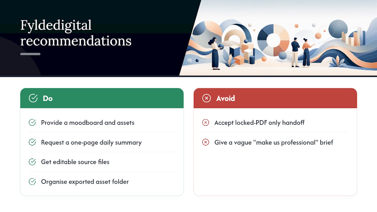
The deliverable set we recommend for most small businesses covers three things: a one-page summary for daily use, editable source files (not just flattened PDFs) so future designers aren’t starting from scratch, and an organised asset folder with every logo variant and colour format already exported.
Briefing an agency for this work goes smoother when you arrive with the moodboard and any existing brand assets already gathered, even loosely. That single step turns a vague “make us look professional” brief into a focused project with a clear outcome, usually a guide your team is using within days rather than a document that sits unopened.
Pro Tip: Ask any agency quoting for guideline work exactly which file formats you’ll receive at handoff. A guide delivered only as a locked PDF, with no editable source files, will need redoing from scratch the next time your brand evolves.
Editorial take: what actually makes a guide useful
Most advice on this topic obsesses over comprehensiveness, more pages, more edge cases, more sections nobody will read. That’s backwards for the vast majority of small teams. A guide’s value comes from how often it actually gets opened, not how thoroughly it anticipates every scenario a brand might face five years from now.
The conventional wisdom undersells two things: the one-page summary, and the technical specificity designers actually need. A beautiful 40-page document with vague colour swatches and no WCAG contrast figures is less useful than a rough one-pager with exact hex codes and a genuine do/don’t logo example. Precision beats polish here.
If you’re starting from nothing, prioritise the one-page version first, with hex, RGB and CMYK values already filled in, then build outward. Skip the temptation to write a beautiful strategy document before you’ve nailed down the boring technical specifics that stop a designer guessing. The strategy matters, but it won’t stop your logo turning up stretched on a banner next week. The specs will.
— tibor
Get your brand style guide built properly, without the agency overheads
Building a guide in-house takes real hours you probably don’t have spare, and hiring a freelancer for just this one task often means paying again later when nobody’s kept the source files. Fyldedigital builds brand guidelines as part of a wider web design and identity service, so the logo system, colour specs and typography rules we set actually match the website, social templates and print materials we produce for you, rather than sitting as a separate document nobody references.
That means one supplier, one set of editable files, and a hosted asset folder your team, your printer and your next freelancer can all pull from without emailing you for the “latest version” again. If your business is planning a rebrand or simply needs its first proper guideline document, get in touch about a web design project and ask us to scope the brand guidelines alongside it, or start with our graphic design services if the guide is your immediate priority. Request a free brand and website review to see exactly what’s missing from your current setup.
Key Takeaways
A usable brand style guide pairs a one-page daily reference with full technical specifications (hex, RGB, CMYK, Pantone, WCAG contrast) so both quick checks and detailed production work are covered.
| Point | Details |
|---|---|
| Start with scope | Choose a one-pager, full guideline document, or hosted portal based on team size and collaborator count. |
| Document every colour format | List hex, RGB, CMYK and Pantone for each swatch, plus a 60/30/10 usage ratio. |
| Show, don’t just tell | Pair every rule with a do/don’t visual example, especially for logo misuse and voice tone. |
| Assign an owner | Give the guide a named owner, a version number and a scheduled annual review. |
| Get agency support if needed | Fyldedigital delivers brand guidelines with editable source files and a hosted asset library for SMEs shipping assets quickly. |
Sources
- Create a brand style guide for your business — Adobe
- Brand guidelines examples — Frontify
- Colour palette — Norfolk County Council
- Brand Guidelines: What They Are, What to Include, and Real Examples — Digital Polo