Pick images that earn their place on the page: decorative shots need empty alt text, informative ones need a plain-English description, and every photo should ship as AVIF or WebP with a JPEG fallback. Confirm the licence before it goes live. Everything else in this guide fills in the how.
TL;DR:
- Using AVIF or WebP for photographs significantly reduces page load times without sacrificing quality, provided fallbacks are correctly implemented.
- Consistent lighting, color palette, framing, and authentic imagery reflecting your customer base are key to building a trustworthy and professional website.
- Proper licensing records, model releases, and careful sourcing from stock, commissioned, or user-generated content are essential to avoid legal risks.
- Responsive images with
srcset,<picture>, and lazy-loading improve user experience and SEO by serving appropriately sized files to different devices.- Clear, brief alt text enhances accessibility, while structured workflows and editing tools ensure visual consistency and technical optimization across your site.
Table of Contents
- How do you choose website images that actually work?
- What makes a website image trustworthy and on brand?
- Where should you source images, and what does the licence actually mean?
- Which image format should you actually use?
- How do you serve the right image size to every device?
- How do you write alt text people can actually use?
- What are the practical rules for hero, team and product images?
- How should you manage image files and versions over time?
- Fylde Digital’s checklist for choosing site images
- What legal risks go beyond the licence itself?
- Does image choice actually affect SEO and site speed?
- What tools help you edit images to match your brand?
- When is original photography worth the investment?
- How Fylde Digital helps you get image strategy right
- Sources
How do you choose website images that actually work?
Every image on your site should pass one test: does it inform the visitor or just decorate the page? That distinction shapes almost every decision that follows, from file format to alt text.
Decorative images add mood or texture without conveying information. A blurred background photo behind a headline, a subtle pattern beside a testimonial, a stock shot of a laptop on a desk that isn’t the actual product. These get an empty alt="" attribute, because a screen reader announcing “stock photo of laptop, 47” helps nobody.
Informative images carry meaning the text doesn’t repeat. A team photo showing who a customer will actually speak to on the phone, a product shot showing the item’s real size and colour, a hero image on a landing page that sets context for the offer.
Complex images need more than a sentence. Charts, infographics, diagrams, and screenshots of a dashboard fall here. They need a short alt description plus a longer explanation nearby or linked, because “bar chart showing sales growth” tells a screen reader user almost nothing.
Run this decision flow before you upload anything:
- Does removing the image lose information? If yes, it’s informative or complex.
- Does removing it only change the mood or visual balance? If yes, it’s decorative.
- Does it need more explanation than a short sentence can give? If yes, treat it as complex and plan a longer description.
Getting this categorisation right at the selection stage saves a rewrite of your alt text later.
What makes a website image trustworthy and on brand?
Visitors size up a site within seconds of landing on it, and inconsistent imagery is one of the fastest ways to undermine that first impression. A hero photo shot in warm natural light next to a product shot lit with a harsh flash reads as amateur even if both images are individually decent.
Build a short checklist before you select anything:
- Lighting consistency. Match colour temperature across images, whether that’s daylight-balanced photography or a consistent studio setup. Mixing warm and cool light across a single page is the quickest way to look unplanned.
- Palette discipline. Pull two or three dominant colours from your brand palette and favour images that contain them, or that you can grade towards them in editing.
- Framing and crop style. Decide whether your site uses tight close crops or wider environmental shots, then apply that choice everywhere. Alternating styles page to page looks like the site was built by three different people.
- Authenticity over generic stock. A real photo of your premises, your team, or your product in use will usually outperform a polished stock image of strangers in a boardroom, particularly on service pages where visitors want to know who they’re dealing with.
Inclusivity deserves the same rigour as lighting and colour. Choose imagery that reflects the range of people who actually use your product or service, and avoid the trap of adding a single token image of diversity to a gallery that’s otherwise homogeneous. If your customer base is genuinely varied, your imagery should be too, consistently, not as an occasional gesture. Marketing data on visual content consistently shows that engagement rises when imagery feels relevant and specific rather than generic.
Pro Tip: Screenshot your homepage, product page, and about page side by side and check whether the lighting and colour grade feel like one photographer took them all. If they don’t, that’s your first fix.
Where should you source images, and what does the licence actually mean?
Three sourcing routes cover almost every website: stock libraries, commissioned photography, and user-generated content. Each comes with different cost, quality, and legal profiles.
Stock libraries are fast and cheap, but the same image can appear on a competitor’s site within weeks. Commercial-use licences vary between platforms, so read the terms rather than assuming “stock” means “safe to use anywhere.” Some licences restrict use to editorial contexts only, meaning you cannot use them to promote a product or service commercially.
Commissioned photography costs more upfront but produces images nobody else has, matched precisely to your brand palette and framing rules. It’s the stronger long-term asset, particularly for team and product pages where authenticity matters most.
User-generated content, customer photos of your product in use, carries huge trust value but needs explicit written permission before you republish it commercially, even if the customer tagged your brand publicly.
Whichever route you choose, keep records. A licence-record spreadsheet noting the source, licence type, purchase date, and permitted use for every image protects you if a dispute arises later. Downloading an image from a search engine or social media feed with no clear licence trail is one of the most common ways small businesses end up with an infringement claim.
If you commission a photographer, brief them clearly:
- Specify web-ready file formats and minimum resolution alongside the RAW originals.
- State explicitly that you need full commercial usage rights, not just a licence to display the images in a portfolio.
- Confirm model releases are signed for anyone identifiable in the shots.
Which image format should you actually use?
Format choice affects load speed, visual quality, and how much you’ll need to manage fallbacks. The short version: AVIF or WebP for photographs, SVG for logos and icons, PNG for lossless screenshots or anything needing transparency.
Browser support data from Cloudinary indicates that WebP and AVIF have broad global browser support, with most modern browsers able to display these formats, though some older devices require a fallback to JPEG or PNG. That’s not a reason to avoid the modern formats; it’s a reason to serve them properly with a fallback in place.
Here’s the practical breakdown by use case:
- Photographs (hero images, team photos, product shots): AVIF first, WebP second, JPEG as the fallback. AVIF typically compresses smaller than WebP at comparable quality, though encoding takes longer.
- Logos and icons: SVG, always. It’s vector-based, scales to any size without pixelation, and file sizes stay tiny regardless of display size.
- UI elements and screenshots: PNG, because lossless compression matters when text or fine lines are visible in the image.
- Images needing transparency: PNG or WebP, both support alpha channels; SVG works too for flat graphics.
MDN’s image format guidance reinforces this same hierarchy, and Web adds one habit worth adopting: never embed important text inside an image. A web font renders sharper, translates more easily, and remains selectable and accessible, where text baked into a JPEG does none of those things.
To handle the fallback question without maintaining three versions of every image by hand, use the <picture> element, which lets the browser pick the best format it supports from a list you provide, or configure server-side content negotiation so your CDN serves AVIF to browsers that accept it and JPEG to those that don’t.
For animation, skip GIF entirely. Animated WebP or AVIF, or a short WebM/MP4 video clip, delivers far better quality at a fraction of the file size. GIF’s colour palette is limited to 256 colours, which is why animated GIFs often look banded or grainy compared with a modern alternative covering the same motion.
How do you serve the right image size to every device?
Serving a 4,000-pixel-wide hero image to a visitor on a 375-pixel phone screen wastes bandwidth and slows the page for no visual benefit. Responsive image markup solves this by letting the browser choose the right file for its own screen, rather than forcing every visitor to download the largest version.
- Use
srcsetandsizesfor resolution switching. Provide the same image at several widths (say 400w, 800w, 1200w, 1600w) and let the browser pick based on viewport size and pixel density. The WHATWG HTML specification sets out this pattern as the standard approach, and it works with a single crop of the image. - Use the
<picture>element for art direction. When you need a genuinely different crop on mobile than desktop, not just a smaller version of the same crop,<picture>with<source>elements lets you swap the whole image based on breakpoint. - Plan multiple crops only where art direction demands it. A square crop for a card grid and a wide crop for a hero banner are different assets, not the same photo scaled down. Budget for both at the photography or editing stage.
- Lazy-load anything below the fold. The native
loading="lazy"attribute defers loading until the image nears the viewport, cutting initial page weight substantially on image-heavy pages. - Preserve intrinsic width and height attributes. Always specify dimensions in the HTML even when the image scales responsively via CSS. This lets the browser reserve space before the image loads, preventing the layout jump that happens when content shifts around a late-loading image.
- Consider a CDN with automatic transcoding. Many image CDNs generate AVIF, WebP, and multiple widths automatically from a single upload, removing the manual export step entirely.
How do you write alt text people can actually use?
Alt text is the single most-skipped accessibility step, largely because writers assume it needs to be more complicated than it is. It doesn’t. It needs to be accurate and brief.
Use these templates as a starting point:
- Decorative:
alt="". Nothing else. An empty attribute tells screen readers to skip it silently rather than announce “image” for no reason. - Informative: describe what matters, not everything visible. “Customer service team at the Blackpool office” beats “three people standing in front of a blue wall smiling.”
- Complex (charts, infographics): write a short alt summary, then link to a longer text description nearby, either in a caption, an expandable section, or a linked page. “Bar chart: monthly website traffic, description follows” with the actual figures spelt out below covers both sighted and screen reader visitors.
Test what you’ve written by closing your eyes and having someone read only the alt text aloud. If you can’t picture what’s on the page from that description alone, rewrite it.
Pro Tip: Run your homepage through a free screen reader trial like NVDA and listen to how your images get announced. Most teams are shocked by how many say “image” with nothing else.
What are the practical rules for hero, team and product images?
Different image types on your site need different composition rules, and applying the wrong rule to the wrong type is a common source of amateurish-looking pages.
Hero images need a clear focal point that doesn’t compete with your headline text. If text overlays the image, add a gradient or solid overlay behind it, dark-to-transparent works for light text, to guarantee contrast regardless of what’s happening in the photo underneath. Test legibility on mobile specifically, since hero crops often shift awkwardly at narrow widths.
Team and profile photos need a consistent background and crop, whether that’s a plain studio backdrop or a consistent office setting, shot from the same distance and angle for every person. A gallery where one photo is a tight headshot and the next is a full-length shot from an office party looks unplanned rather than characterful.
Product images need a primary shot on a clean white or neutral background for clarity, plus supporting shots showing the product in genuine use. Vary the angle across the set, front, three-quarter, detail shot, so visitors get a full sense of scale and finish before they commit to buying.
How should you manage image files and versions over time?
A workflow that works for ten images breaks down at two hundred unless you build structure in from the start.
Keep a master file, RAW, PNG, or TIFF, for every asset you commission or shoot, stored separately from your web-ready exports. That master lets you regenerate variants later without re-shooting when formats or size requirements change.
- Adopt a consistent filename convention (
product-name_view_date.ext) rather thanIMG_4821.jpg. - Log licence type, source, and expiry date (where relevant) in a spreadsheet or a custom field in your CMS.
- Use CMS plugins or an image CDN to automate AVIF/WebP generation from a single upload, rather than manually exporting three formats every time.
- Where possible, run format generation through a build pipeline so nobody has to remember the step manually.
Fylde Digital’s checklist for choosing site images
Every image project Fylde Digital runs gets checked against the same short list before it goes live: purpose confirmed (decorative, informative, or complex), format chosen with a fallback in place, responsive variants generated, alt text written, and licence recorded against the file.
That last step matters more than most site owners expect. A missing licence record is the single most common gap found during a website audit, and it’s the cheapest one to fix upfront.
In practice, most sites Fylde Digital builds mix commissioned photography for the pages that carry the most trust, home, team, key product pages, with carefully edited, colour-matched stock for supporting content where a full shoot isn’t justified. That blend keeps quality consistent without pricing smaller clients out of a professional-looking site.
What legal risks go beyond the licence itself?
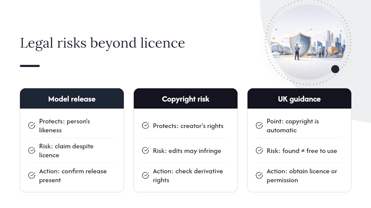
A valid image licence doesn’t automatically clear every legal risk. Two separate issues catch site owners out even after they’ve paid for a proper stock subscription or commissioned a shoot.
Model releases cover the people in your photos, not the photo itself. A photographer might own full copyright to an image and grant you commercial usage rights, but if the person in that photo never signed a release permitting commercial use of their likeness, you can still face a claim from that individual. This applies whether the photo is commissioned specifically for you or pulled from a stock library, licences on stock platforms should already include model releases, but it’s worth confirming rather than assuming.
Copyright infringement risk extends beyond simply lifting an image without permission. Editing a copyrighted photo, cropping it, adding a filter, combining it with other elements, doesn’t remove the original creator’s rights unless your licence specifically permits derivative works. Screenshots of other companies’ websites or products carry similar risk if used without permission, even in a comparison or review context.
Official UK government guidance sets out the basic copyright position for digital images clearly: copyright exists automatically from the moment an image is created, and reusing it without permission or a valid licence is an infringement regardless of whether the image carries a visible watermark or copyright notice. Assuming an image is free to use because you found it without a paywall is the single most common mistake behind infringement claims against small business websites.
Does image choice actually affect SEO and site speed?
Image weight is one of the biggest levers on page load speed, and page speed is a confirmed ranking factor. A page carrying five uncompressed 3MB photos will load noticeably slower than one using properly sized, modern-format images, and that gap shows up directly in Core Web Vitals metrics like Largest Contentful Paint.
Beyond raw file size, a handful of habits move the needle on both speed and search visibility together:
- Compress before upload, don’t rely on the CMS to do it for you. AVIF and WebP already cut file size substantially versus JPEG at equivalent quality, but starting with an oversized source image still produces a bloated output.
- Use descriptive filenames.
blackpool-shopfront-signage.jpggives search engines and screen readers more to work with thanDSC00234.jpg. - Write genuine alt text, not keyword-stuffed phrases. Search engines can detect unnatural repetition, and it does nothing for the screen reader users alt text exists to serve.
- Set explicit width and height on every image tag to prevent layout shift, which factors directly into Cumulative Layout Shift, another Core Web Vitals metric search engines weigh.
- Avoid images as headline text. Search engines can’t index text baked into a JPEG, so any keyword-relevant heading needs to exist as real, crawlable text.
Treat image selection and technical delivery as one decision, not two separate jobs handled by different people at different stages. A beautifully chosen image that ships as an unoptimised 4MB PNG undoes most of the benefit of choosing it carefully in the first place.
What tools help you edit images to match your brand?
Most sites don’t need a full studio setup to keep imagery consistent, they need a repeatable editing process applied every time.
For colour and lighting consistency, batch-editing tools that let you save and reapply a preset, common in most professional photo editors, mean every new image gets the same white balance and colour grade as the last, rather than each upload being edited from scratch by feel.
For format conversion, dedicated online converters or command-line tools can batch-produce AVIF and WebP variants from a single source file, which matters once you’re managing dozens or hundreds of images rather than a handful.
For quick brand-consistent graphics, template-based design tools let non-designers produce social banners, quote graphics, or simple infographics that stay within a locked colour palette and font set, useful for blog content or social posts where commissioning original photography for every piece isn’t realistic.
For background removal and product shot cleanup, AI-assisted background removal tools have become accurate enough for straightforward product photography, cutting what used to be a manual editing task down to seconds. That’s particularly useful for the white-background primary product shot most e-commerce pages rely on.
Whatever tools you use, the goal is the same one that runs through this entire guide: reduce the guesswork so every image, regardless of who selected it or when, ends up looking like it belongs on the same site.
When is original photography worth the investment?
Original photography earns its cost when the page it supports carries real commercial weight, your homepage, your team page, your core product range, and when generic stock would visibly undercut trust. A visitor who spots the same stock photo on three of your competitors’ sites notices, even if only subconsciously.
Stock, edited consistently for colour and tone, remains a legitimate interim solution for supporting content: blog headers, secondary service pages, seasonal campaign graphics. The mistake isn’t using stock. It’s mixing unedited stock with original photography and expecting the page to look coherent regardless.
— tibor
How Fylde Digital helps you get image strategy right
Fylde Digital handles the whole image workflow as one job rather than three separate headaches, choosing the right shots for each page, briefing and managing photography where it’s worth the investment, and building the technical delivery (responsive formats, fallbacks, alt text) directly into your site’s build.
That matters because most small business owners don’t have time to learn srcset syntax or chase down a model release form, and shouldn’t have to. Fylde Digital’s web design service folds image strategy into the build from day one, so you’re not left retrofitting alt text and compressed formats onto a finished site months later. If you want a second opinion on how your current images are performing, or a plan for what a new site’s imagery should look like, request a free website review and Fylde Digital will walk you through exactly what’s working and what’s costing you speed, trust, or search visibility.
Sources
- WebP format: technology, pros, cons and alternatives (Cloudinary)
- Images — HTML Living Standard (WHATWG)
- Web
- Use of images for online business website (LegalVision)
- Gov