The quickest win is one strong quote above the fold, three to four relevant quotes on each service page, and a dedicated testimonials page for the long-form proof. Favour text paired with a photo, and add a short video wherever a client agrees to film one. Always get explicit written permission before publishing anything, and keep a record of that consent for GDPR purposes.
TL;DR:
- Placing a strong, relevant quote above the fold significantly increases initial trust and engagement.
- Video testimonials recorded on a phone outperform text quotes in boosting visitor interaction and conversions.
- Testimonials should be strategically positioned near decision points, like pricing buttons or service pages, to maximize influence.
- Credibility is enhanced with client photos, full names, roles, and quantifiable results in every testimonial.
- Continuously testing testimonial placement and content through analytics and A/B tests improves overall website conversion rates.
Table of Contents
- Types and formats of testimonials to use
- How do you ask customers for a testimonial?
- Where should testimonials go on a website?
- Design and credibility: what makes a testimonial believable?
- Testimonial design examples you can copy
- How do you measure whether testimonials are working?
- An agency’s honest workflow for testimonial collection
- Why most businesses get testimonials wrong
- Let Fylde Digital turn your testimonials into conversions
- Sources
- FAQ
Types and formats of testimonials to use
Different pages call for different proof. A text quote with a name and role is the fastest thing to produce and the most versatile: you can drop it into a hero banner, a footer, or a sidebar without much design work. Video carries more weight because visitors see a real person say the words, and video testimonials tend to outperform text-only quotes on engagement and conversion. You don’t need a production crew. A thirty-second clip recorded on a phone, with basic lighting and captions, does the job.
Case-study excerpts work best where the buying decision is complex, such as B2B services or anything with a longer sales cycle. Pull one strong “before, after” line from a full case study and link back to the detail. Star ratings and aggregate badges suit transactional pages, product listings, and pricing tables, where a shopper wants a quick trust signal rather than a story.
For everyday authenticity, don’t overlook user-generated content:
- Text quotes with name and role, for speed and flexibility
- Short video clips with captions, for trust and engagement
- Case-study excerpts and before-and-after results, for considered purchases
- Star ratings and review badges, for transactional or e-commerce pages
- Social media screenshots and tagged posts, for informal, relatable proof
Mixing formats across a page, rather than relying on one type throughout, makes the whole display feel more active and less staged.
How do you ask customers for a testimonial?
Timing decides whether you get a great quote or a polite one-liner. Ask right after delivery, at the point a client sees a result, or once a documented milestone lands. That’s when someone is most likely to describe specifics rather than generic praise, and gathering feedback at peak-satisfaction moments consistently produces stronger material than a random follow-up email six months later.
Keep the ask short. A script that works well:
- Thank the client and reference the specific project or result.
- Ask one focused question: “What changed for your business after this?”
- Ask a follow-up: “Would you be comfortable with us sharing that in a short quote or video, with your name and role?”
- Offer a simple way to reply: a form, a two-minute recorded call, or a voice note.
- Confirm permission in writing, even if it’s just a reply to an email, and store that record.
Make the collection method as low-friction as possible. A short form with three questions beats a blank text box every time, because it nudges people toward useful specifics like numbers, timeframes, and outcomes. A five-minute recorded chat often produces better quotes than a written form, since people talk more naturally than they type.
Consent wording doesn’t need to be complicated: state clearly that you intend to publish their name, role, company, and words on your website and marketing materials, and get an explicit yes. Keep a dated copy of that agreement. That’s your GDPR paper trail if anyone ever asks how the testimonial was obtained.
When you edit a long response down to a punchy quote, keep the client’s own words and only trim filler. Never invent a phrase they didn’t say.
Pro Tip: Build the testimonial request into your delivery checklist, not your marketing calendar. If it only happens when someone remembers, it won’t happen often enough.
Where should testimonials go on a website?
Testimonials belong wherever a visitor is deciding whether to trust you, not just on one page tucked in the footer menu.
- Hero or above the fold: one strong quote, or an aggregate rating badge, right where visitors land first.
- Service pages: three to four quotes relevant to that specific service, with a mix of roles, plus a link to the full case study.
- Pricing and signup pages: one short reassurance quote positioned near the call-to-action button, not buried below it.
- A dedicated testimonials or case-studies page: the place for longer, detailed proof that doesn’t fit a sidebar.
- Checkout or booking steps: a single line of social proof at the exact decision point, if your site has a booking flow.
Placement near a CTA does more for conversions than volume alone. Reported examples show a testimonial positioned beside a pricing call-to-action lifting conversions by around 34%, which tells you something important: a handful of well-placed quotes at decision points beats a wall of forty quotes nobody reads.
On mobile, keep things simple. Static quotes that stack vertically usually perform more reliably than carousels, because a swipeable slider can hide your best testimonial behind three taps a phone user never makes.
Design and credibility: what makes a testimonial believable?
A testimonial without a name, role, or photo reads like it was written by the business itself, however genuine it actually is. Aim for at least two credibility signals on every quote: full name plus company, or a photo plus job title.
- Pair the quote with a photo, logo, or short video still whenever the client provides one.
- Use quantified results where you have them: “cut our page load time by half” beats “great service”.
- Highlight the strongest phrase in bold or a larger font so a scanning eye catches it in two seconds.
- Add alt text to photos and captions to video, and check colour contrast meets basic accessibility standards.
- Keep at least one static quote visible without any clicking, scrolling within a widget, or hovering.
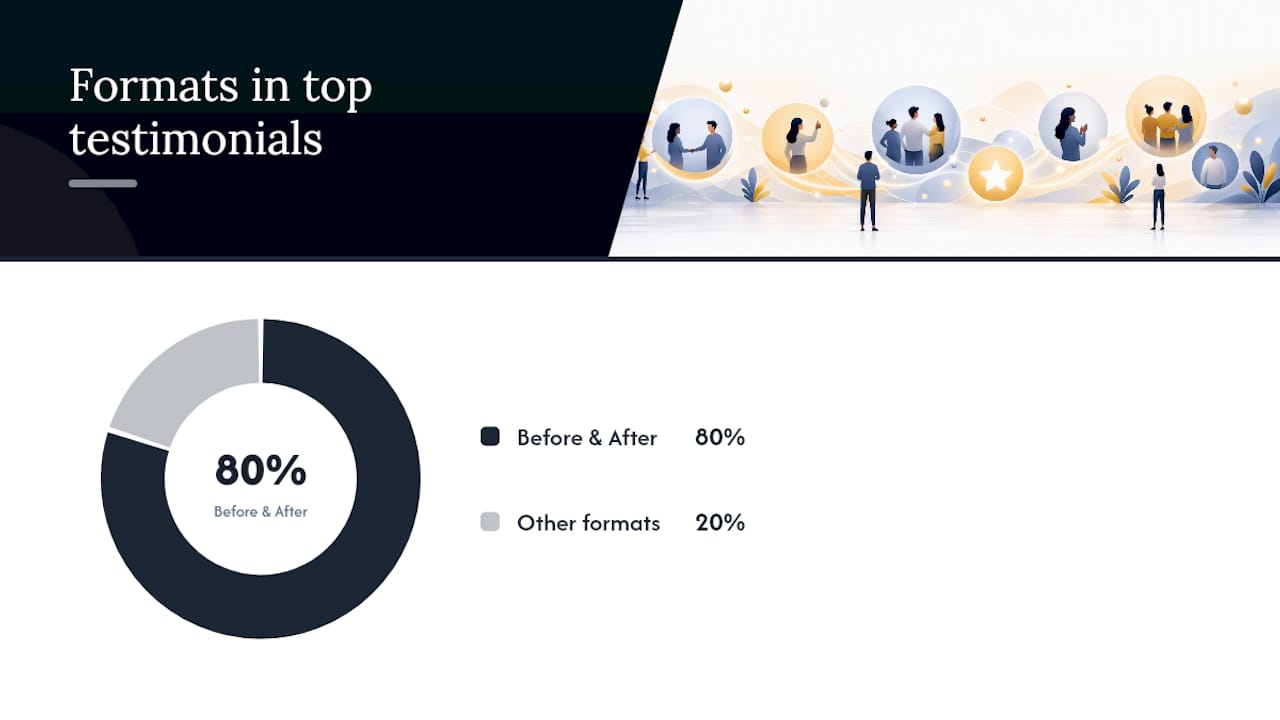
Best-in-class testimonial sections lean heavily on outcome-focused language: roughly 80% of the strongest examples use a before-and-after story, often with a case-study link attached. A short quote next to a real face does more work than a long paragraph on its own, because pairing text with an image helps visitors process the social proof as genuine rather than staged.
Pro Tip: If a testimonial only says “great service, highly recommend”, ask the client one more question before publishing it: “What specifically changed?” That single follow-up usually turns a flat quote into a usable one.
Testimonial design examples you can copy
You don’t need a designer to get this right. A handful of layout recipes cover most small business sites.
- Hero single-quote: one testimonial, the client’s name, and a one-line metric (“increased bookings by 40% in three months”) sitting directly under your main headline.
- Service page grid: three to six short quotes in a card layout, mixing roles and industries, each linking through to a fuller case study.
- Inline quote: a single testimonial dropped mid-page to back up a specific feature or benefit claim, right where a reader might start doubting you.
- Marquee or ticker strip: a scrolling row of client logos or short quotes for ambient trust, paired with a compact star-rating badge near the top of the page.
- Accessible carousel: only if you must use a slider, add visible dots or arrows, pause on hover, and never rely on autoplay as the sole way to reveal your best quote.
Avoid a carousel as the only way to display testimonials. If someone lands on your homepage and the slider hasn’t rotated to your strongest line yet, you’ve lost the moment.
How do you measure whether testimonials are working?
Guessing where testimonials help is a waste of good content. Test it properly.
- Track click-through on the CTA nearest each testimonial, plus form completions and overall conversion rate for that page.
- Run A/B tests: testimonial present versus absent, photo versus logo, and a quantified quote versus generic praise.
- Check heatmaps and scroll maps to confirm visitors actually reach and see the testimonial, especially on mobile.
- Let each test run until you have a reliable sample size before drawing conclusions, then iterate quarterly.
- Refresh testimonials every six to twelve months, and re-test placement after any major page redesign.
Behaviour tools and structured A/B testing turn testimonial placement from a guess into a repeatable decision, and given that a single well-placed quote near a CTA has been linked to a 34% conversion lift in reported cases, the return on running these tests properly is hard to ignore.
An agency’s honest workflow for testimonial collection
Testimonial collection isn’t an afterthought bolted on at the end of a project. It’s a fixed step: request a quote once a result is confirmed, run a short interview if the client is willing, edit down to a tight quote, get written approval, then publish.
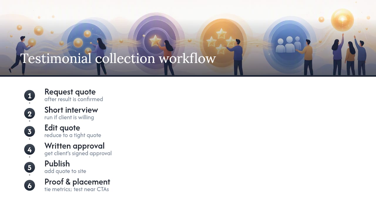
Every testimonial gets tied to a proof point wherever possible: a metric, a before-and-after comparison, or a link through to the fuller case study behind it. Placement isn’t fixed either. Quotes get tested near different CTAs and reviewed against conversion data, not left in the same spot because that’s where they were first added.
If you’re weighing up whether your own testimonials are pulling their weight, a free website review will tell you fairly quickly.
Why most businesses get testimonials wrong
The biggest mistake isn’t a lack of testimonials. It’s treating them as decoration rather than data. Most small business sites either bury three vague quotes on an “About Us” page nobody visits, or they publish forty near-identical five-star lines that blur together after the third one. Neither approach does anything for conversion.
The uncomfortable truth is that a testimonials page, on its own, is close to worthless. Visitors rarely navigate to it deliberately. The value comes from scattering the right quote at the right decision point: one strong line beside your pricing table, a role-specific quote on the service page someone is actually reading, a quantified result sitting under your headline. That’s where social proof actually changes behaviour, not in a quote archive three clicks deep in your navigation.
There’s also a bias toward collecting testimonials only from happy clients who volunteer them, which skews your proof toward generic enthusiasm rather than specific outcomes. The businesses that get real conversion value are the ones that chase the boring, unglamorous follow-up question, “what specifically changed for you”, every single time, rather than accepting whatever compliment lands in the inbox first.
— tibor
Let Fylde Digital turn your testimonials into conversions
Collecting strong quotes is only half the job. Getting them in front of the right visitor, at the right moment, on a page that’s actually built to convert, is where most small business sites fall short. Some agencies design and build websites with testimonial placement, layout, and testing built in from the start, rather than added as an afterthought once the site’s already live.

Our web design work sits alongside conversion-focused layouts, and where a client wants ongoing traffic to send to those pages, our SEO, PPC, and content services work in tandem with the design side. If your homepage, service pages, or pricing page could be doing more with the proof you already have, a free website and SEO review can show you where testimonials, or their absence, may be costing you conversions.
Sources
- Testimonials on website examples
- How to display testimonials on your website: placement, formats & examples (2026) | Shoutjar
- Where to place customer testimonials on a website (+examples) | Crazy Egg
- Best testimonial section design
FAQ
Where do testimonials go on a website?
The strongest spots are above the fold on the homepage, on relevant service pages near role-specific quotes, and beside pricing or signup CTAs where a decision is actually being made. A dedicated testimonials page works as a secondary destination for longer, detailed proof rather than the primary display point.
What is another way to say “testimonials” on a website?
Common alternatives include “customer reviews”, “client feedback”, “success stories”, “what our clients say”, and “case studies” for longer-form versions. Choose the phrasing that matches the format: “reviews” suits star ratings, while “success stories” suits before-and-after content.
Can you give examples of testimonials to use on a website?
A strong example pairs a specific result with attribution: “Our enquiries doubled within two months of the new site going live, Sarah, Owner, [Business Name].” Weaker examples read as generic praise with no name, role, or outcome attached, which is exactly what to avoid when drafting your own.
How do I add reviews to my website?
Collect written or verbal permission first, then add the quote as text with a photo, or embed a short video clip, placed near the page’s main call-to-action. For ongoing display and testing, a web design partner can build testimonial sections directly into your page templates rather than bolting them on with a third-party widget.
How many testimonials should a website have?
There’s no fixed number, but quality and placement matter more than volume. One strong quote above the fold, three to four relevant ones per service page, and a handful of detailed case studies on a dedicated page cover most small business sites well.