Visual branding inspirations are the creative sources that shape how your business looks, feels, and is remembered across every platform. A strong visual identity is not decoration. Consistent branding drives revenue increases of up to 33%, according to a Lucidpress survey. That figure means your colour palette, logo, and typography are doing commercial work every day. This guide covers the most effective branding design ideas, emerging trends, and practical creative branding concepts to help you build a visual identity that earns recognition and trust.
1. What makes visual branding inspirations worth following?
Not every trend deserves your attention. The best visual branding inspirations share three qualities: they are rooted in a real brand story, they work across multiple formats, and they age well. Chasing a trend that looks dated in 18 months costs you money and erodes the recognition you have built.
The industry standard for evaluating any logo or visual concept uses four tests: simplicity, memorability, versatility, and meaningfulness. A strong logo remains clear even in one colour and at thumbnail size. If your mark fails either of those conditions, it will cause problems on social media profiles, favicons, and printed materials.
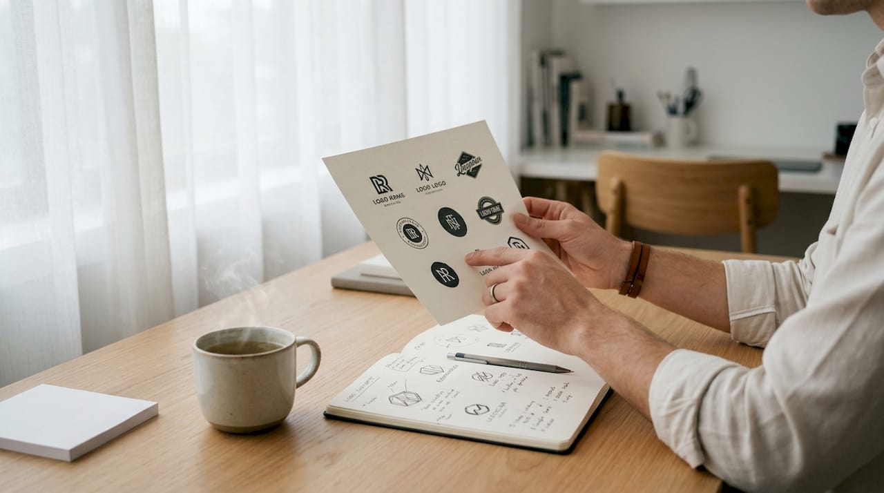
Pro Tip: Before committing to any new visual direction, print your logo at 16px and view it in greyscale. If it still reads clearly, you have a versatile mark.
2. Kinetic logos and motion graphics
Kinetic logos are animated versions of a static mark, designed to move on digital screens. Leading 2026 branding trends place kinetic logos at the forefront of visual identity work, particularly for brands with a strong digital presence. The movement adds personality without requiring a full rebrand.
Motion graphics extend this idea across social media, website headers, and email campaigns. A subtle loop on your logo in a website header creates a more polished impression than a static image. For small businesses, even a simple fade or reveal animation made in a tool like Adobe After Effects can achieve this effect affordably.
The practical constraint is consistency. Your animated logo must share the same proportions, colours, and spacing as your static version. Treat the animation as a behaviour, not a separate asset.
3. Childlike anarchy: authenticity through imperfection
“Childlike anarchy” is a 2026 design movement that uses naive handwriting, irregular shapes, and deliberately imperfect illustration to signal authenticity. This style breaks away from the rigid corporate polish that dominated the previous decade. Consumers, particularly younger buyers, respond to it because it feels human rather than manufactured.
For a small business, this approach is genuinely accessible. A hand-lettered wordmark or a rough illustrated mascot communicates craft and personality. A local bakery, independent retailer, or creative studio can use this style to stand apart from the generic sans-serif logos that fill their sector.
The risk is execution. Imperfection must look intentional. A poorly drawn logo reads as unprofessional rather than charming. Work with a designer who understands the difference between controlled naivety and careless work.
4. Slick retro: blending vintage with contemporary design
Slick retro combines the visual language of the 1960s–1980s with modern production values. Think bold geometric shapes, limited colour palettes, and serif typefaces rendered with precision digital tools. The result feels familiar and fresh at the same time.
“The most enduring branding strategies use restraint in primary assets, evolving transient brand materials to maintain recognition and freshness. Brands that have held consistent packaging for 35 or more years compound distinctiveness that frequent reinvention cannot replicate.”
— WeLoveDaily, 2026 Brand Guidelines Examples
This insight applies directly to slick retro work. The style works because it borrows proven visual equity from an era audiences already trust. A craft beer brand, an independent tailor, or a heritage food producer can use retro aesthetics to signal quality and longevity without appearing old-fashioned.
5. Sensory and sonic branding
Sensory branding extends your visual identity into sound, texture, and experience. Sonic branding, specifically, assigns an audio signature to your brand. Think of the three-note chime associated with major broadcasters or the sound a device makes when it powers on. These audio cues reinforce visual recognition.
For SMBs, sonic branding is more accessible than it sounds. A consistent audio logo used in video content, podcast intros, or social media reels creates a multi-sensory memory trigger. Pair it with your visual identity and you occupy more cognitive space in your audience’s mind.
The 2026 branding trends report from Fyldedigital notes that multi-sensory engagement is becoming a standard expectation, not a premium differentiator. Starting now puts you ahead of most SMB competitors.
6. Building a full brand identity system
A logo alone is not a brand identity. A complete brand identity system includes logo variants, a defined colour palette with both hex and Pantone/CMYK values, primary and secondary typefaces, imagery style rules, and documented brand voice guidelines.
The colour precision point matters more than most business owners realise. Defining exact colour values for digital and print prevents the situation where your website shows a warm navy blue and your printed leaflets arrive in a cold purple. That inconsistency erodes trust without anyone being able to name why.
Pro Tip: Ask your designer to deliver a one-page brand reference card alongside the full guidelines. It gives your team a quick reference for everyday decisions without opening a 40-page document.
7. Documented brand rules for scalability
A brand system that only the original designer understands is a liability. A mature brand system must be extendable by outside designers using clear, documented rules. This means your guidelines should specify minimum logo sizes, exclusion zones, prohibited colour combinations, and approved typeface pairings.
The practical benefit for SMBs is cost control. When a new social media manager, web developer, or print supplier joins your team, documented rules prevent expensive mistakes. You spend less time correcting off-brand work and more time growing the business.
Fyldedigital’s branding guide for startups covers exactly this kind of scalable system building, with practical advice on what to document and how to structure your guidelines for a small team.
8. Colour psychology and restraint
Colour is the fastest communicator in your visual toolkit. Research in colour psychology shows that audiences form a colour-based impression of a brand within seconds of first exposure. The choice between warm and cool tones, saturated and muted palettes, signals personality before a single word is read.
Restraint is the discipline that separates effective brand colour from visual noise. Leading brands prioritise a coherent visual language using colour and geometry over complex multi-colour systems. A two-colour palette, applied consistently, builds stronger recognition than a six-colour system used inconsistently.
For your business, this means choosing one dominant colour and one accent, then applying them with discipline across every touchpoint. Your website, social profiles, printed materials, and packaging should feel like they belong to the same family.
9. Negative space and dual-meaning logos
Negative space logos use the empty area around or within a shape to create a second image or meaning. The FedEx arrow, hidden between the E and the x, is the most cited example in design education. The technique rewards attention and creates a sense of discovery that makes a logo genuinely memorable.
For SMBs, a dual-meaning logo communicates creativity and depth without requiring a complex illustration. A photography studio might embed a lens aperture within a letter. A landscaping company might hide a leaf inside a geometric shape. The key is that the secondary meaning must relate directly to the brand story.
Branding inspiration rooted in brand story consistently outperforms inspiration drawn from trend catalogues. The dual-meaning technique works precisely because it forces a designer to think about what the business actually does and means.
10. Testing brand elements in the real world
Design that looks perfect on screen can fail in print, on signage, or at small sizes on a mobile screen. Testing brand elements across real-world media ensures designs remain effective and legible at any scale or device. This step is skipped more often than any other in SMB branding projects.
The testing process does not need to be expensive. Print your logo on a sheet of A4 at multiple sizes. View your colour palette on both a calibrated monitor and a cheap laptop screen. Check your typography on a mobile phone. Each test reveals a problem before it becomes a printed run of 5,000 leaflets.
Real-world application sensitivity is what separates a brand identity that works from one that merely looks good in a presentation.
11. Using product UI as a primary brand surface
Some of the world’s most recognised brands treat their product interface as the primary brand surface, with the logo acting as a secondary identifier. The implication for SMBs is significant. Your website is your most-used brand surface. Its layout, typography, spacing, and colour application communicate your brand values more consistently than your logo does.
This means your web design decisions are branding decisions. The font size on your homepage, the padding around your call-to-action buttons, and the photography style in your hero image all contribute to your visual identity. Treating them as separate from branding is a costly mistake.
Fyldedigital’s approach to web design for SMBs integrates brand identity directly into the build process, so your site and your brand speak the same visual language from day one.
Key takeaways
Consistent, documented visual branding is the single most reliable driver of brand recognition and revenue growth for small and medium-sized businesses.
| Point | Details |
|---|---|
| Consistency drives revenue | Brands with consistent visual identities can see revenue increases of up to 33%, making brand discipline a commercial priority. |
| Four-test logo standard | Every logo should pass the simplicity, memorability, versatility, and meaningfulness tests before launch. |
| Document your brand system | Clear, written brand rules allow outside designers to maintain consistency, reducing costly errors as your business grows. |
| Colour precision matters | Define hex and Pantone/CMYK values for every brand colour to prevent inconsistencies across print and digital media. |
| Test before you commit | Check all brand elements at multiple sizes and on multiple devices before finalising any design for production. |
Why most SMBs get visual branding wrong
Most small businesses treat branding as a one-time purchase rather than an ongoing system. They commission a logo, receive a PNG file, and consider the job done. Two years later, their website uses a slightly different shade of blue, their social media profile picture is a cropped version of the original, and their printed materials use a different font because nobody could remember which one was specified.
The brands I respect most, regardless of size, treat their visual identity as infrastructure. They document it, test it, and protect it with the same rigour they apply to their accounts or their stock management. That discipline is not about being precious. It is about compounding recognition over time.
The trend content in this article is genuinely useful, but I want to be direct: kinetic logos and childlike anarchy are tools, not strategies. The business owners who get the most from these ideas are the ones who first understand what their brand actually stands for. A beautifully animated logo built on a vague brand story will not hold attention for long.
The most practical thing you can do this week is audit what you already have. Collect every version of your logo, every colour you have used, and every font that has appeared on your materials. If they do not match, you have a brand governance problem, not a design problem. Fix the system before you invest in new creative work.
— tibor
Fyldedigital’s approach to visual branding for SMBs
Building a visual identity that works across your website, social media, and print materials takes more than a good logo. Fyldedigital works with small and medium-sized businesses to create cohesive brand identities that hold up at every touchpoint.

From graphic design services that cover logo creation and brand guidelines, to professional web design in Blackpool that treats your site as a primary brand surface, Fyldedigital brings your visual identity to life with practical, scalable results. If your current branding feels inconsistent or outdated, a free website review is the clearest first step. Get in touch with Fyldedigital to see what a properly built brand system can do for your business.
FAQ
What are visual branding inspirations?
Visual branding inspirations are creative sources, including design trends, competitor analysis, and brand story exploration, that inform the look and feel of a business’s visual identity.
How many colours should a small business brand use?
A two-colour palette, one dominant and one accent, applied consistently across all materials, builds stronger recognition than a larger palette used inconsistently.
What is the most important element of a brand identity system?
Documented brand guidelines are the most critical element, as they allow any designer or supplier to apply your identity correctly without direct supervision.
How do I know if my logo is strong enough?
Test it in greyscale and at 16px. A strong logo remains clear and recognisable under both conditions, meeting the industry standard of simplicity and versatility.
Why does colour consistency matter in branding?
Colour inconsistencies between print and digital materials, caused by undefined colour values, erode audience trust and make a brand appear unprofessional across touchpoints.