Your website is often the first salesperson your business has. Yet with so many examples of web design trends appearing every year, choosing the right ones can feel overwhelming. Should you chase every new visual style, or focus on what actually drives enquiries? This article cuts through the noise. We will walk you through clear criteria for evaluating trends, then show you concrete, practical examples including scroll-driven animations, variable fonts, and curated design galleries, so you can make confident decisions that improve your online presence and attract more customers.
Table of Contents
- Criteria for choosing web design trends that benefit your business
- Scroll-driven animations: modern movement without extra code
- Variable fonts: performance and flexibility in typography
- Curated website design galleries: inspiration meets practical examples
- Comparing popular web design trends for small businesses
- Our perspective: the trend you ignore is often the one that matters most
- Ready to put these trends to work on your site?
- Frequently asked questions
Key Takeaways
| Point | Details |
|---|---|
| Evaluate trends by business fit | Choose design trends that align with your goals, performance needs, and user accessibility requirements. |
| Leverage scroll-driven CSS | Use CSS scroll-driven animations for engaging motion that does not slow down your site or need extra JavaScript. |
| Use variable fonts wisely | Variable fonts boost performance when many font weights are needed but consider static fonts for few styles. |
| Draw inspiration from real examples | Look at curated galleries of successful business websites to inform your design choices effectively. |
Criteria for choosing web design trends that benefit your business
Not every trend deserves a place on your website. Some look impressive in agency portfolios but slow down your pages, confuse visitors, or create headaches for users with disabilities. Before you adopt any current web design trends, run them through these practical filters.
Ask yourself five questions before adopting any trend:
- Does it support your business goal? A fade-in animation on a product image might delight a visitor, but if it delays the page load by two seconds, it is costing you conversions.
- Does it perform well on mobile? More than half of UK web traffic comes from mobile devices. A trend that only shines on a widescreen desktop is a trend worth skipping.
- Is it accessible? Trends that exclude users with visual impairments, motor difficulties, or older devices do not just feel wrong. They cost you customers.
- Does it degrade gracefully? Progressive enhancement means that if a browser cannot support a feature, your site still works properly. This is non-negotiable.
- Does it add genuine value to the user journey? If removing the feature would make the page cleaner and easier to use, it probably should not be there.
Common mistakes to avoid:
- Adopting heavy JavaScript effects that inflate page load times
- Using motion effects without checking the user’s motion preferences
- Choosing fonts purely for aesthetics without considering readability on small screens
- Copying trending website designs from large brands without considering how they translate to a smaller site
Pro Tip: Before briefing a designer on a new feature, visit your web design trends overview and cross-reference any trend you are considering against your Google Analytics bounce rate. If your current pages already lose visitors quickly, adding visual complexity will make things worse, not better.
The small business website guide is worth bookmarking here. It provides a grounded framework for building or updating your site around what actually drives growth, rather than what simply looks fashionable.
Good design is also about how people experience your site in practice. If you want to go deeper on that, the user experience guide for SMEs covers the practical steps clearly.
Scroll-driven animations: modern movement without extra code
One of the most talked-about examples of web design trends in 2026 is scroll-driven animations. The principle is simple. As a visitor scrolls down your page, elements animate into view, images slide in, headings fade up, or a progress bar fills. Until recently, doing this well required significant JavaScript. Now it does not.
CSS scroll-driven animations allow you to build scroll-linked effects without JavaScript, and they are supported by major browsers as of mid-2026. That means cleaner code, faster pages, and fewer things that can break.
Practical use cases for small business websites:
- Fade-in sections as visitors scroll through your services page
- Image carousels that respond to scroll position rather than timed auto-play
- Subtle parallax effects on hero images that add depth without distraction
- Progress indicators on long-form pages such as guides or case studies
What makes this trend genuinely useful, rather than just visually appealing, is how it handles browsers that do not support it yet. The progressive enhancement principle means unsupported browsers simply render the content normally, without breaking the layout. There is no blank screen, no broken section. Visitors just see a clean, static page.
Accessibility is handled thoughtfully too. The safest approach includes user preference guards, meaning that if a visitor has enabled the “reduce motion” setting on their device, the animations are skipped entirely. That is the kind of considered design that builds trust with all users, not just those on the latest devices.
Pro Tip: When briefing a designer on scroll animations, specify that you want "prefers-reduced-motion` respected and progressive enhancement built in from the start. This saves time later and ensures your Blackpool web design works for every visitor, not just the majority.
Used well, scroll-driven animations make your site feel polished and modern without compromising speed. That is a meaningful advantage for any small business competing for attention online.
Variable fonts: performance and flexibility in typography
Typography is one of the most underestimated elements of modern web design styles. The fonts you choose affect how professional your site looks, how quickly it loads, and how readable your content is on a phone screen at arm’s length.
Variable fonts are a practical innovation worth understanding. A traditional font file is static. If your brand uses four weights, that is four separate files the browser must download. A variable font consolidates multiple weights into a single file, reducing the number of requests and keeping your critical-path load lean.
When variable fonts make sense for your business:
- Your site uses three or more font weights (light, regular, bold, for example)
- Your branding requires smooth typographic transitions, such as animated headings
- You want flexibility for future design updates without adding new font files
- You are working under a performance budget where every kilobyte matters
When to stick with static fonts:
- You only use one or two weights consistently across the site
- Your current font is already well-optimised and loading fast
- The variable version of your chosen font is significantly larger than the static alternative
To get the full benefit, pair variable fonts with proper font-display settings and metric overrides. These technical configurations prevent layout shift, the jarring jump that occurs when a fallback font is replaced by the loaded web font. Subsetting your font file (removing characters your language does not use) and self-hosting rather than relying on a third-party CDN also make a measurable difference to speed.
Effective typography is explored further in what makes a good business website, which covers how font choices connect to brand trust and conversion.
Pro Tip: Ask your web designer to run a WebPageTest report before and after switching to a variable font. The data will tell you clearly whether the switch improved or worsened your loading performance. Numbers matter more than assumptions here.
Curated website design galleries: inspiration meets practical examples
Sometimes the fastest way to understand what works is to look at real sites that are doing it well. Curated design galleries collect the latest web design examples across industries, categories, and business types, making it easier to spot patterns and identify what suits your own brand.
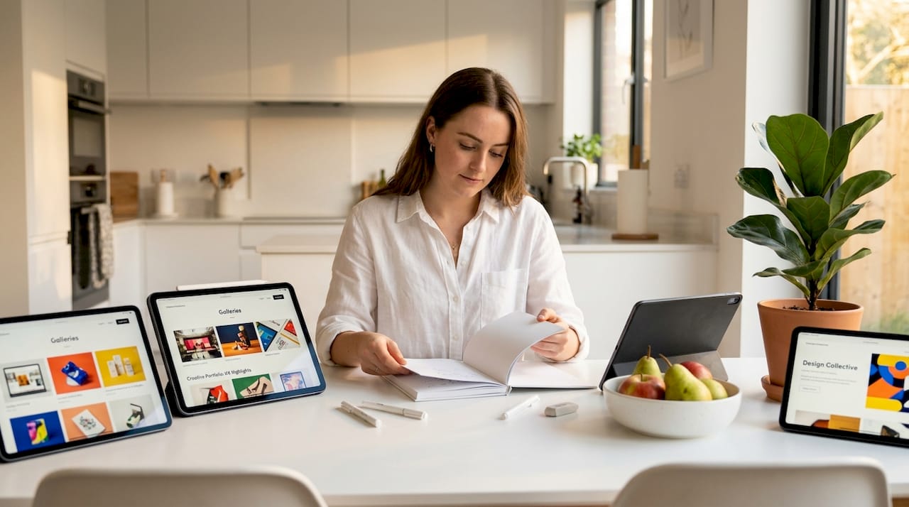
Curated inspiration galleries group real brand sites by category, explaining the design logic behind each choice and its likely impact on user behaviour. Rather than guessing why a layout feels trustworthy or a call-to-action button converts well, you get context alongside the example.
Categories typically covered in quality design galleries:
- E-commerce sites with conversion-focused layouts
- Service businesses and consultancies with trust-building structures
- SaaS products with feature-heavy, scannable layouts
- Creative portfolios showcasing personality and visual originality
- Local businesses demonstrating clear, direct messaging
The value for small business owners is in selectivity. You do not need to replicate an enterprise SaaS site to benefit from browsing one. You might notice how they handle social proof, how their navigation is structured, or how they surface their primary call to action without clutter. Those individual observations translate directly to your own site.
| Design category | Key strength | Relevant for your business if… |
|---|---|---|
| E-commerce | Clear product hierarchy and checkout flow | You sell products online |
| Service business | Trust signals, testimonials, clear pricing | You offer a professional service |
| Portfolio | Visual storytelling and brand personality | You need to showcase work or creative output |
| SaaS / tech | Feature comparison, scannable benefit blocks | You have a complex offer needing explanation |
| Local business | Location clarity, direct CTA, local SEO signals | You serve a specific geographic area |
Browsing galleries with a specific goal in mind, such as improving how you present your services or making your contact page more persuasive, is far more productive than open-ended scrolling. Look at professional web design examples to see how businesses similar to yours have used good design to generate more leads.
Comparing popular web design trends for small businesses
To decide which trends are worth your time and budget, it helps to see them side by side. Here is a straightforward comparison of the three trends covered in this article.
| Trend | Performance impact | Accessibility | Implementation complexity | Visual impact |
|---|---|---|---|---|
| Scroll-driven animations | Positive: removes JavaScript dependency | High: supports reduced-motion preferences | Low to medium: CSS-based, widely supported | High: adds depth and engagement |
| Variable fonts | Positive when multiple weights used | High: improves readability with fine weight control | Low: single file swap with configuration | Medium: subtle but professional |
| Curated design principles | Neutral: depends on choices made | Varies: depends on implementation | Low: informational, shapes decisions | High: improves overall credibility |
Variable fonts outperform static fonts specifically when multiple weights are needed, but for minimal weight usage, the advantage narrows. Similarly, scroll animations remain accessible and performant only when implemented with user preferences in mind.
Choosing the right fit for your business:
- If your site relies on visual storytelling, prioritise scroll-driven animations
- If your branding uses rich typography, explore variable fonts first
- If you are starting from scratch or planning a redesign, use curated galleries to shape your brief
- If budget is tight, start with the trend that requires the least developer time for the highest user impact
For a practical look at how accessibility and design quality intersect, the web design comparison guide is a useful reference. And if you are thinking about how design choices affect the number of enquiries your site generates, the breakdown of website features for lead generation is worth reading alongside this article.
Pro Tip: Do not try to adopt all three trends at once. Pick one, implement it well, measure the impact on your bounce rate and time-on-page over four weeks, then decide whether to add another.
Our perspective: the trend you ignore is often the one that matters most
Here is something we see regularly. A business owner spends considerable time and budget chasing the most visually dramatic web design trend of the moment, perhaps a full-screen video header or an elaborate parallax sequence, only to find that their bounce rate increases and enquiries drop.
The reason is almost always the same. Dramatic trends draw attention to themselves rather than to what the visitor came to find. Your potential customer arrived with a question or a need. If the first thing they encounter is a five-second animation they cannot skip, you have prioritised your design over their time.
The most effective modern web design styles we have seen in practice are the ones visitors barely notice. A page that loads fast, reads clearly, and makes it obvious what to do next. A scroll animation that gently reveals content as the user moves through the page, rather than demanding their attention. A font that makes a long service description easy to read on a phone, without the user consciously registering that the typography is doing its job.
The trends worth adopting in 2026 are not the loudest ones. They are the ones that make your site easier to trust, quicker to navigate, and more likely to convert a visitor into a customer. That is a quieter ambition than “trending website design,” but it is the one that actually grows your business.
Ready to put these trends to work on your site?
Knowing which trends to apply is only half the challenge. Implementing them well, with the right technical configuration and an understanding of your specific audience, is where the real results come from.
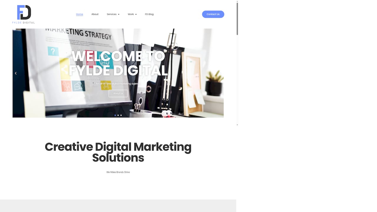
At Fylde Digital, we work with small and medium-sized businesses to build websites that use modern features purposefully, not just decoratively. Whether you are considering a full redesign or a targeted update to improve conversions, we offer a free website review to show you exactly where your current site is leaving opportunities on the table. Our team understands what drives enquiries for local businesses, and we build with performance, accessibility, and your goals at the centre of every decision. Request your free website review today and find out what your site could be doing better.
Frequently asked questions
What are some easy-to-implement web design trends for small businesses?
CSS scroll-driven animations and variable fonts are both practical choices that improve visual quality and site performance with relatively little coding effort. Scroll-driven animations in particular require no JavaScript and are now supported across major browsers.
How do variable fonts improve website performance?
Variable fonts bundle multiple weights into a single file, cutting the number of font requests the browser needs to make and reducing overall page load time when your site uses several typographic styles.
Are scroll-driven animations accessible to all users?
Yes, provided they are built with progressive enhancement and respect the user’s motion preferences. Using prefers-reduced-motion ensures animations are skipped for visitors who have enabled that setting on their device, keeping the experience inclusive.
Where can I find real-world examples of effective web design?
Curated design galleries are a reliable starting point. They present real brand sites by category, with explanations of the design logic and its likely effect on user behaviour, making it easier to draw relevant inspiration for your own business.