Website usability is defined as the extent to which specified users can achieve their goals on a website effectively, efficiently, and with satisfaction. This standard comes directly from ISO 9241-11:2018, the internationally recognised framework for measuring usability in interactive systems. Usability is a measurable component of user experience, distinct from the emotional and aesthetic dimensions that broader UX design covers. For business owners and webmasters, this distinction matters. A site can look beautiful and still lose customers because visitors cannot find what they need or complete a purchase without frustration.
What measurable factors define website usability?
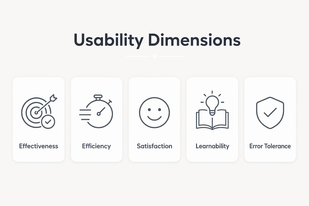
ISO 9241-11:2018 defines usability through three core dimensions: effectiveness, efficiency, and satisfaction. Each one is measurable, which means you can test them, track them, and improve them over time.
Effectiveness measures whether users can complete tasks accurately and completely. A visitor who tries to find your contact form and gives up has experienced a failure in effectiveness. You measure it through task completion rates during user testing sessions.

Efficiency measures the resources a user expends to complete a task. Time on task, number of clicks, and error rates all feed into this metric. A checkout process that requires eight steps when three would suffice scores poorly on efficiency.
Satisfaction captures how comfortable and positive users feel during their interaction. Satisfaction surveys, Net Promoter Scores, and post-task questionnaires all provide data here.
Jakob Nielsen, one of the founding figures of web usability research, added two further dimensions worth tracking:
- Learnability: How quickly can a new visitor accomplish basic tasks on their first visit?
- Memorability: When a returning visitor comes back after a break, how easily do they re-establish proficiency?
These five dimensions give you a practical framework for auditing your own site. Run a task-based test with five real users and measure completion rate, time on task, and satisfaction score. The results will tell you more than any analytics dashboard alone.
Usability is also context-dependent by definition. A site that works well for a 35-year-old professional on a desktop may perform poorly for a 65-year-old on a mobile phone. ISO 9241-11:2018 specifies that usability must always be assessed against a defined context: the users, the tasks they are performing, the equipment they use, and the environment they are in. This means there is no single universal usability score. You must define who your users are before you can measure how well your site serves them.
Pro Tip: Run a five-second test with real users. Show them your homepage for five seconds, then ask what the site does and where they would click first. If they cannot answer clearly, your effectiveness score is already in trouble.
| Dimension | What it measures | Example metric |
|---|---|---|
| Effectiveness | Task completion accuracy | Completion rate (%) |
| Efficiency | Resources used to complete a task | Time on task (seconds) |
| Satisfaction | User comfort and attitude | Post-task satisfaction score |
| Learnability | Speed of first-time task completion | Time to first success |
| Memorability | Ease of re-use after a break | Error rate on return visit |
Why is website usability crucial for business success?
Poor usability costs businesses money in direct, measurable ways. 70% of e-commerce shopping carts are abandoned, and 22% of those abandonments are caused by complicated or non-intuitive checkout processes. That is not a design preference issue. That is lost revenue caused by a usability failure.
The financial case for investing in usability is equally clear on the positive side. Forrester research estimates the return on investment from UX investment at 9,900%, or £100 returned for every £1 spent. That figure reflects the compounding effect of fewer support calls, higher conversion rates, and stronger customer retention.
“Users spend most of their time on other websites. This means that users prefer your site to work the same way as all the other sites they already know.” Jakob Nielsen’s Law of Internet User Experience explains why familiar navigation patterns consistently outperform creative custom designs in usability testing.
Jakob Nielsen’s Law has a direct implication for your site. When you deviate from standard navigation conventions, such as placing the main menu in an unusual location or using non-standard icons, you force users to relearn basic interactions. Most will not bother. They will leave.
Usability also affects your search rankings. Core Web Vitals metrics correlate strongly with usability and feed directly into Google’s ranking algorithm. Slow load times, layout shifts, and poor interactivity scores all drag down both usability and SEO performance simultaneously. Improving usability and improving your search ranking performance are, in practice, the same work.
The business impact of poor usability extends beyond lost sales:
- Increased customer support costs as confused users contact your team
- Higher bounce rates that signal poor quality to search engines
- Damaged brand trust when visitors associate frustration with your business
- Reduced repeat visits as users choose competitors with easier sites
What are Jakob Nielsen’s usability heuristics?
Jakob Nielsen’s ten usability heuristics are a set of guiding principles that help designers and developers identify interface problems before they reach real users. They act as a shared language across design, development, and business teams, which makes them particularly useful for cross-functional website projects.
The ten heuristics are:
- Visibility of system status: The site should always keep users informed about what is happening, through appropriate feedback within a reasonable time.
- Match between system and the real world: Use language and concepts familiar to your users, not internal jargon.
- User control and freedom: Provide clear “undo” and “exit” options so users can recover from mistakes without penalty.
- Consistency and standards: Follow platform conventions so users do not have to wonder whether different words or actions mean the same thing.
- Error prevention: Design to prevent problems from occurring in the first place, rather than relying on error messages.
- Recognition rather than recall: Minimise the user’s memory load by making options and actions visible.
- Flexibility and efficiency of use: Allow experienced users to use shortcuts that speed up interactions.
- Aesthetic and minimalist design: Remove irrelevant information that competes with and reduces the visibility of relevant content.
- Help users recognise, diagnose, and recover from errors: Write error messages in plain language and suggest a solution.
- Help and documentation: Provide support that is easy to search and focused on the user’s task.
Heuristics create a shared language that bridges designers, developers, and business stakeholders. When a developer and a business owner can both point to “error prevention” as the problem with a form, the conversation becomes productive rather than subjective.
Applying heuristics to your site is straightforward. Walk through your key user journeys, such as finding a product, completing a purchase, or submitting an enquiry, and score each step against the ten principles. Issues like missing confirmation messages, unclear error text, or inconsistent button labels will surface quickly.
Pro Tip: Heuristic evaluation works best with two or three reviewers independently assessing the same journeys. Comparing notes afterwards surfaces more issues than a single reviewer can catch alone.
Heuristics are a diagnostic tool, not a replacement for real user testing. User testing remains mandatory to validate how actual visitors interact with your site. Heuristics tell you what might be wrong. User testing tells you what is wrong for your specific audience.
How to improve website usability for better performance
Improving usability does not require a full redesign. Most gains come from targeted changes based on evidence, applied consistently over time. The most effective approach combines early evaluation, defined user personas, and iterative testing.
Start with usability evaluation before you build. Conducting usability evaluations early saves substantial costs compared to fixing problems after launch. Cost-saving ratios for early versus late-stage fixes are cited as high as 100:1. Reviewing wireframes and prototypes against Nielsen’s heuristics costs almost nothing. Rebuilding a live checkout flow costs significantly more.
Define your users before you design for them. Usability is contextual. A site built for a broad, undefined audience serves no one particularly well. Create two or three specific user personas based on real customer data, then test every design decision against those personas. Ask: can this person complete this task in this environment?
The practical steps that deliver the most consistent results are:
- Conduct task-based user testing with five or more real users per round
- Prioritise navigation clarity: every page should answer “where am I, where can I go, and what should I do next?”
- Design for mobile first, since a growing proportion of your visitors arrive on small screens
- Reduce form fields to the minimum required, as each additional field increases abandonment
- Use clear, descriptive link text and button labels rather than vague calls to action like “click here”
- Test with users who represent your actual audience, not colleagues familiar with your site
For a deeper look at practical improvements, Fyldedigital’s guide on improving website UX covers step-by-step methods specifically for small and medium-sized businesses.
Pro Tip: Record user testing sessions with screen capture and audio. Watching a real customer struggle silently with your navigation for 90 seconds is more persuasive than any analytics report when making the case for change.
Usability improvements also feed directly into conversion rate performance. A visitor who can find what they need quickly and complete their task without friction is far more likely to convert into a customer, enquiry, or lead.
Key takeaways
Website usability is a measurable standard defined by ISO 9241-11:2018, covering effectiveness, efficiency, and satisfaction, and improving it directly increases conversions, reduces abandonment, and strengthens SEO performance.
| Point | Details |
|---|---|
| Usability has a formal definition | ISO 9241-11:2018 defines it through effectiveness, efficiency, and satisfaction. |
| It differs from broader UX | Usability covers task performance; UX also includes emotion, aesthetics, and brand perception. |
| Poor usability loses revenue | 22% of cart abandonments are caused by complicated checkout processes. |
| Heuristics guide evaluation | Nielsen’s ten heuristics identify interface problems before real users encounter them. |
| Early testing saves money | Fixing usability issues before launch costs up to 100 times less than post-launch fixes. |
Usability is the foundation, not the finishing touch
Most business owners I work with treat usability as something to address after the site is built. They focus on design, content, and SEO first, then wonder why visitors are not converting. The sequence is wrong. Usability should be the starting point, not the final polish.
The confusion between usability and UX makes this worse. UX has become a catch-all term that covers everything from brand tone to animation choices. Usability is more specific. It asks a single question: can your users complete their tasks? If the answer is no, nothing else on the site matters much.
I have seen businesses invest heavily in paid advertising, driving significant traffic to sites where the enquiry form is buried three clicks deep or the mobile layout breaks on common screen sizes. Every pound spent on traffic acquisition is partially wasted when the site itself fails the usability test.
The other lesson I keep returning to is that usability problems are almost never obvious to the people who built the site. You know where everything is. Your customers do not. The only way to find the real problems is to watch real people use your site, without guiding them. Five users in a task-based test will surface more genuine issues than weeks of internal review.
Usability is not a one-time project. It is an ongoing discipline. Visitor behaviour changes, devices change, and your content changes. A site that tested well at launch will develop usability debt over time if it is never re-evaluated. The businesses that treat usability as a continuous practice, rather than a launch checklist, consistently outperform those that do not.
— tibor
How Fyldedigital approaches website usability
Fyldedigital builds websites with usability at the centre of every project, not as an afterthought. Every site we design starts with defined user goals and is tested against real-world tasks before it goes live.

Our web design service in Blackpool combines conversion-focused layouts with usability principles drawn from ISO standards and Nielsen’s heuristics. We work with business owners across the Fylde Coast and beyond to create sites that are straightforward to use, fast to load, and built to turn visitors into customers. If your current site is losing enquiries because visitors cannot find what they need, we can help you identify exactly where the problems are and fix them.
FAQ
What is website usability in simple terms?
Website usability is how easily visitors can use your site to complete their goals, such as finding information or making a purchase. ISO 9241-11:2018 defines it through three measures: effectiveness, efficiency, and satisfaction.
How does usability differ from user experience?
Usability is a subset of UX focused strictly on task performance. User experience also includes emotional responses, aesthetic preferences, and brand perception, which go beyond whether a task can be completed.
What are the most common causes of poor website usability?
Complicated navigation, unclear calls to action, slow page load times, and non-intuitive checkout processes are the most common causes. Baymard Institute data shows 22% of cart abandonments result directly from checkout usability failures.
How many users do I need for usability testing?
Jakob Nielsen’s research shows that five users in a task-based test will uncover the majority of significant usability problems on a site. Additional rounds with five users each are more effective than a single large-scale test.
Does website usability affect SEO?
Yes. Core Web Vitals are Google’s usability-related ranking signals, measuring load speed, interactivity, and visual stability. Poor usability scores on these metrics directly reduce your search visibility.