
To create a landing page that converts, focus the entire page on one conversion goal and follow a template-first workflow: plan the offer, adapt a proven template, publish with tracking in place, then A/B test. That single-goal rule sits at the heart of every high-performing page, and pages that try to sell two things or capture two different leads tend to convert worse than focused ones.
Here’s the shortest version of the process:
- Pick a template built for your offer type rather than designing from a blank canvas.
- Write a headline, subhead, and one primary call to action.
- Add a single form or button, publish it with analytics and conversion tracking switched on.
- Test one element at a time and let data settle the argument.
Fyldedigital has built enough of these pages for small and medium-sized businesses to know where they usually fall down: too many goals, too many form fields, or no tracking on launch day. The workflow below fixes all three.
Key takeaways
A landing page converts best when it commits to a single goal, uses a tested template structure, and ships with tracking already switched on.
| Point | Details |
|---|---|
| One page, one goal | Never mix two offers or two CTAs on the same page; split them into separate pages instead. |
| Pass the five-second test | Your headline, subhead, and CTA must be understandable at a glance, above the fold. |
| Reduce form friction | Cut fields to the minimum, use smart defaults, and confirm the submission flow works. |
| Check indexability before launch | Verify content appears in raw HTML or use server-side rendering for JavaScript-heavy builds. |
| Test one variable at a time | Change the headline, CTA, or form length individually and give each test a proper sample size. |
| Get it built professionally | Fyldedigital designs and launches conversion-ready landing pages with tracking and testing built in. |
Table of Contents
- Essential elements every landing page must have
- How do you build a landing page step by step?
- What’s on the publish and SEO checklist?
- How should you test and improve a landing page after launch?
- Which tool category actually fits your landing page needs?
- Why this template-first method holds up in practice
- Get a landing page built without the trial and error
- A note on rushed launches
- Sources
Essential elements every landing page must have
Before you touch a page builder, run through this checklist. Miss any of these and you’re leaking conversions before the page even goes live.
- A hero that does its job in five seconds. A clear headline, a one-line value proposition, and a visible primary CTA above the fold. Visitors need to grasp the offer and the action immediately, or they leave.
- One offer, described in benefits, not features. Three short bullet points beat a paragraph of specifications. Tell people what they get, not what the product technically does.
- Social proof positioned near the CTA, not buried at the bottom. A testimonial, a client logo, or a review score placed beside the button does more work than the same element sitting in the footer.
- A form with the fewest fields you can get away with. Name and email often outperform a five-field qualification form. Smart defaults, and shorter forms in general, tend to lift completion rates.
- No exit routes. Strip the main navigation menu. Every link that isn’t the CTA is a way for a visitor to leave without converting.
Pro Tip: Print your page out (or view it at actual size on your phone) and cover everything except the top third. If a stranger couldn’t tell you what you’re offering and what to do next, your hero section needs work before anything else does.
Confirm your submission flow too. A form that submits into silence, no thank-you message, no next step, quietly kills trust in whatever comes after it, even when the lead technically got through.

How do you build a landing page step by step?
Start with a brief, not a design tool. Before opening any builder, write down three things: who the page is for, what single action you want them to take, and where the traffic is coming from (paid search, an email campaign, a social post). Copy and layout decisions change depending on the answer.
From there, the build follows a fairly fixed sequence:
- Select a template close to your goal. A lead-gen form template behaves differently to a webinar sign-up or an e-commerce product page. Adapting an existing structure is faster and safer than designing from a blank canvas, and it forces you to work within layouts that have already been tested.
- Write the headline first, then the subhead. The headline states the outcome; the subhead adds the how or the catch (free trial, limited spaces, no card required).
- Draft three benefit lines, each one sentence, each answering “what’s in it for me?” rather than describing a feature.
- Choose one CTA phrase and repeat it everywhere the button appears. Mixing “Get Started” in one spot and “Book Now” in another creates friction, however small.
- Pick imagery that shows the product or service in use, not generic stock photography of people shaking hands. A screenshot, a before-and-after, or a short product clip usually earns more trust than a smiling stranger.
Assemble the blocks in this order: hero, then the problem you solve, then benefits, then proof, then a final CTA. That sequence mirrors how a sceptical visitor actually reads down a page, moving from “what is this?” to “why should I believe you?” to “fine, I’ll try it.”
Pro Tip: Write your CTA button copy last. Once the whole page is drafted, you’ll know exactly what you’re asking someone to do, and vague buttons like “Submit” or “Learn More” tend to get replaced with something sharper, like “Get My Free Quote”.
If you’re building specifically for paid traffic, the message on the ad and the message on the page need to match word for word, not just in spirit. A dedicated PPC landing page guide is worth a read if that’s your main channel.
What’s on the publish and SEO checklist?
A landing page that looks finished isn’t necessarily ready to publish. Run through these checks before it goes live, not after.
- Check the raw HTML. View source (or use Google’s URL Inspection tool) and confirm your headline, offer, and body copy actually appear in the markup. Many JavaScript-heavy builders render content client-side, which search engines can miss unless the page uses server-side rendering or pre-rendering.
- Wire up analytics before launch, not after the first campaign runs. Google Search Console, GA4, and a defined conversion event for your form or CTA button all need to be live on day one, because you can’t A/B test what you never measured.
- Test the form endpoint end to end. Submit it yourself. Confirm spam protection is active and that your GDPR consent checkbox actually gates data collection rather than sitting there decoratively.
- Write a proper meta title and description, and add FAQ schema if the page includes a Q&A section.
- Run an accessibility pass. Check colour contrast, confirm touch targets are large enough for a thumb on mobile, and make sure the form can be completed using a keyboard alone.
A structured launch checklist covering SEO, indexing, and analytics catches most of the technical failures that quietly sink pages in their first few weeks, long before anyone thinks to blame the copy or the design.
A quick reality check: it’s common for a freshly built page to look perfect in the browser and still return blank or incomplete content to a crawler. If your CMS or builder renders content dynamically, that gap between what you see and what Google sees is exactly the kind of thing an indexability check exists to catch.
How should you test and improve a landing page after launch?
Conversion rate is your primary metric. Everything else, CTA click-through rate, form abandonment, bounce rate, exists to explain why that number moves.
- Test one variable at a time: headline, CTA wording, hero image, or the number of form fields.
- Let a test run long enough to gather a meaningful sample before drawing conclusions; stopping after a handful of visits invites false confidence.
- Use session recordings and heatmaps to spot where visitors hesitate, scroll past, or abandon a form partway through.
- Rotate your test focus over a rough 30-day cycle after launch: week one for tracking sanity checks, weeks two and three for your first A/B test, week four for a form or CTA refinement based on what you saw.
Iterative testing of headlines, CTAs, and form length is what separates a page that was launched once from a page that actually improves over time.
The single biggest mistake isn’t a bad headline. It’s publishing a page, checking it once a month later, and never testing anything in between.
Small, sequential changes compound.
Which tool category actually fits your landing page needs?
The right tool depends less on budget and more on how often you’ll launch new pages and how tightly the page needs to match your main site’s branding and SEO structure.
- Hosted template builders suit non-technical marketers who need a page live within a day and don’t mind a slightly generic look.
- CMS-integrated landing pages (built inside WordPress, for instance) suit businesses that want cohesive branding and SEO benefits shared with the rest of the site, following the plan-first approach WordPress’s own guidance recommends.
- Developer frameworks and static builds suit teams that need full control over performance and structured data, usually because they’re launching pages frequently or at scale.
- Standalone form and analytics microservices are worth bolting onto any of the above when your main platform’s native form tools feel limited.
If you’re launching one page a year, speed wins. If you’re launching one a month, cohesion and control start to matter more.
Why this template-first method holds up in practice
Fyldedigital has applied this exact workflow across landing page and PPC projects for small and medium-sized businesses, and the pattern holds regardless of industry.
- Client portfolios show the same fix repeatedly solving conversion problems: cutting a page back to one goal.
- Testimonials from past projects consistently mention clarity and speed to launch as the biggest wins.
- The best landing page examples worth studying almost all follow the hero, proof, single CTA structure covered above.
Get a landing page built without the trial and error
Following the checklist above will get most small businesses a workable page. But if you’d rather skip the weeks of testing and get it right from the first version, that’s exactly what a web design partner is for.

Fyldedigital builds landing pages with tracking, indexability, and mobile responsiveness handled from day one, so you’re not discovering a broken form endpoint three weeks into a campaign. That matters most for businesses running paid traffic, where every day a page underperforms costs actual ad spend, not just missed opportunity. Rather than piecing together a template, a form tool, and an analytics setup yourself, you get a page built once, correctly, with the technical checklist above already ticked off. Take a look at Fyldedigital’s web design service and request a free review of your current page or website to see exactly where it’s losing conversions.
A note on rushed launches
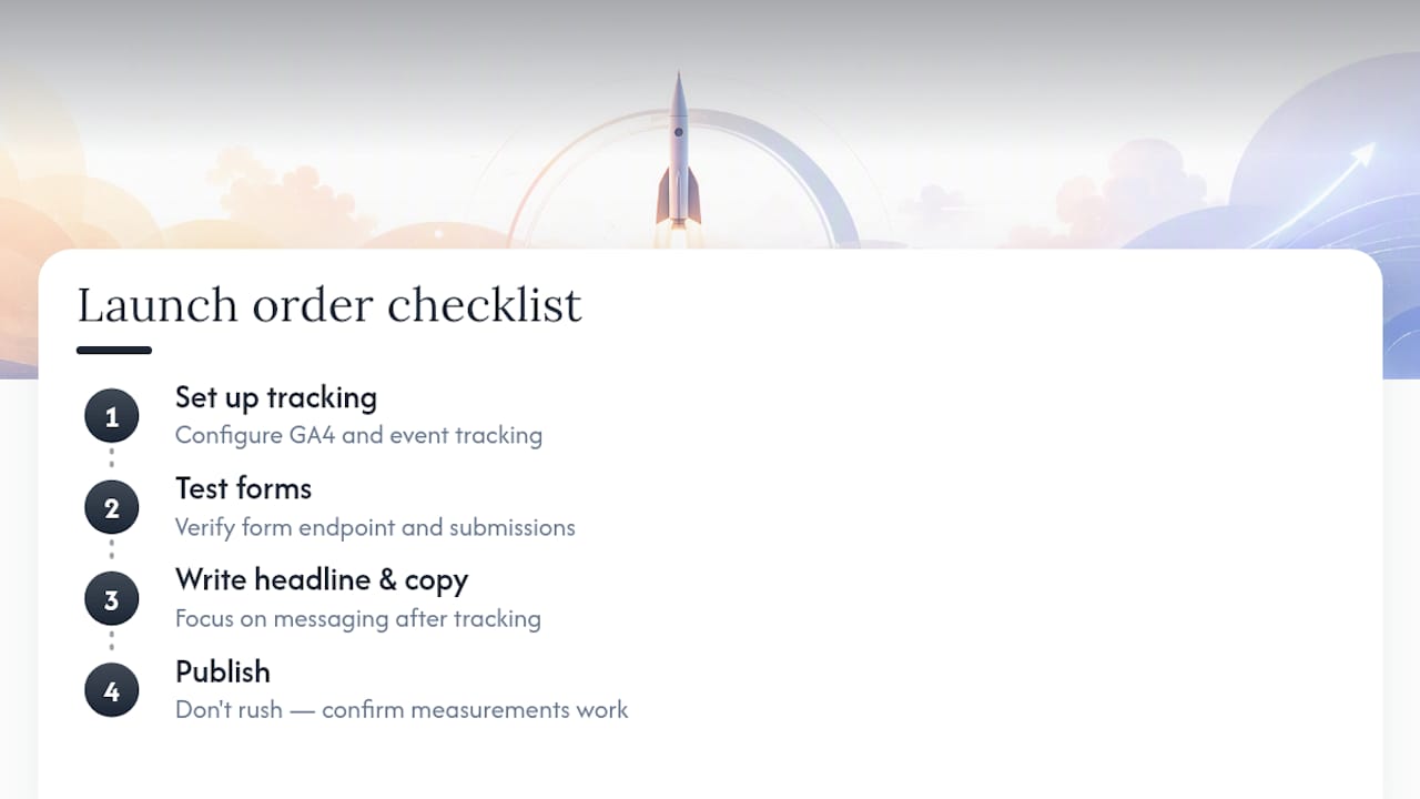
The tip I’d give first: build your tracking before your headline. Marketers obsess over copy and skip GA4 setup, then launch a page they can’t actually measure. The most common mistake isn’t bad design. It’s publishing fast and forgetting the form endpoint was never tested.
Sources
- Landing page design: 10 best practices to increase conversions | HubSpot
- The Landing Page Playbook: From template to indexed, mobile-ready page that converts | Land & Convert
- What is a landing page? Landing pages explained | Unbounce
- Framer blog — landing page best practices
Recommended
- How to Create Landing Pages That Convert – Fylde Digital – Web Design SEO Social Media
- 12 Best Landing Page Examples That Convert – Fylde Digital – Web Design SEO Social Media
- Guide to PPC Landing Pages That Generate Leads – Fylde Digital – Web Design SEO Social Media
- Lead Generation Website Design That Converts – Fylde Digital – Web Design SEO Social Media

