Your website is often the first salesperson your business has. It works around the clock, and if it is slow, cluttered, or confusing, potential customers will leave before they have even read a single word about what you offer. Good web design tips are not about making things look pretty. They are about making your site work harder, convert better, and give visitors a reason to stay. This article covers the practical, research-backed advice that Fyldedigital uses to help small and medium-sized businesses across the Fylde Coast build websites that genuinely perform.
Table of Contents
- Key takeaways
- 1. Start with the criteria that define good web design
- 2. Optimise your homepage for clarity and purpose
- 3. Apply visual hierarchy to guide your visitors
- 4. Make mobile performance non-negotiable
- 5. Improve site speed with practical changes
- 6. Simplify your navigation menu
- 7. Design forms that people actually complete
- 8. Write headings and calls to action in your customers’ language
- 9. Avoid the most costly web design mistakes
- 10. Compare the top web design tips and their business impact
- 11. Prioritise your web design improvements by impact and budget
- My take: why web design is your most under-used growth asset
- How Fyldedigital can help you build a website that works
- FAQ
Key takeaways
| Point | Details |
|---|---|
| Speed directly affects revenue | A one-second delay in load time can reduce conversions by 7%, making speed a business priority. |
| Mobile-first is non-negotiable | Over 65% of global web traffic comes from mobile, so your site must work perfectly on small screens. |
| Simplicity converts better | Clean layouts with clear visual hierarchy keep visitors focused and reduce bounce rates. |
| Forms should be short | Limiting form fields to four to six maximises completion rates and generates more leads. |
| Navigation shapes user trust | Menus with five to seven items prevent decision fatigue and help users find what they need. |
1. Start with the criteria that define good web design
Before you apply any specific web design tips, it helps to understand what separates an effective site from a frustrating one. Good web design is not about trends or personal taste. It is about meeting your visitors where they are and giving them what they need without friction.
The core criteria worth holding every design decision against are:
- Simplicity. A clean, uncluttered layout improves readability and keeps users focused on your message rather than distracted by noise.
- Visual hierarchy. Size, colour, and spacing should guide the eye naturally from headline to call to action.
- Mobile-first design. Mobile-first prioritises essential content and functionality, improving the experience on every device, not just phones.
- Fast load speed. Speed is a business metric. Every second of delay costs you money.
- Clear navigation. Users should never have to guess where to go next.
- User-focused design. Your site should be built for your customers, not for internal preferences or what the team thinks looks impressive.
Pro Tip: When reviewing your own site, try to use it as a stranger would. Time how long it takes you to find your contact page or main service. If it takes more than two clicks, something needs to change.
2. Optimise your homepage for clarity and purpose
Your homepage has one job: tell visitors who you are, what you do, and what they should do next. Users decide to stay or leave within three seconds of landing on a page, which means your opening headline carries enormous weight.
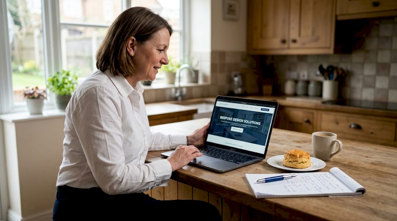
Keep your above-the-fold content focused. One clear headline, a short supporting sentence, and a visible call-to-action button is all you need. Resist the urge to cram in your full service list, a slideshow, and a welcome message all at once. That approach does not impress visitors. It overwhelms them.
Use white space deliberately. Generous spacing around text and images signals professionalism and makes content far easier to absorb. Think of white space not as empty room but as breathing room that lets your message land.
3. Apply visual hierarchy to guide your visitors
Visual hierarchy is the art of arranging elements so the eye moves in the direction you want it to go. Done well, it is invisible. Done poorly, it creates confusion and missed opportunities.
Start with your primary heading, which should be your largest and boldest text on the page. Secondary information follows in a smaller size. Supporting detail, such as body copy, sits below that. Colour contrast plays a major role here too. Your call-to-action button should stand out from the background in a way that makes it impossible to miss.
Consistent use of fonts, heading sizes, and spacing across every page builds a sense of order and trust. A site that looks different on every page feels unreliable, and that feeling transfers to your brand.
4. Make mobile performance non-negotiable
Over 65% of global traffic comes from mobile devices. If your site was designed for desktop and adapted for mobile as an afterthought, you are already losing visitors before they have seen your offer.
Responsive web design techniques go beyond making content fit a smaller screen. Touch targets, meaning buttons and links that users tap with a finger, need to be large enough to use without frustration. Text must be readable without zooming. Forms need to be easy to complete on a keyboard that takes up half the screen.
A genuinely mobile-first approach to design starts by designing for the smallest screen and working upwards. This forces you to prioritise what actually matters, cutting out the elements that clutter desktop versions but serve no real purpose.
5. Improve site speed with practical changes
A one-second delay in load time reduces conversions by up to 7%. For a small business generating modest monthly revenue online, that adds up quickly. Speed is not a technical luxury. It is a commercial necessity.
The most common culprits for slow sites are oversized images, too many third-party scripts, and unoptimised hosting. Compressing images before uploading them, using a content delivery network, and limiting plugins or tracking scripts can each make a meaningful difference.
Google’s Core Web Vitals metrics, which include Largest Contentful Paint, Cumulative Layout Shift, and Interaction to Next Paint, are now part of how search engines assess your site’s quality. A slow site does not just lose customers. It also loses ground in search rankings.
Pro Tip: Run your site through Google PageSpeed Insights for free. It will give you a prioritised list of fixes with clear explanations. Start with the highest-impact items first and work through them methodically.
6. Simplify your navigation menu
Navigation is one of the most overlooked elements of effective web design. When menus are too long, visitors experience decision fatigue and often choose none of the options. Research shows that five to seven menu items is the optimal range for top-level navigation.
Label your menu items with plain language your customers would use, not the internal names your team uses. “Services” is fine. “Solutions” is vague. “What We Do” can work if your brand voice calls for it, but avoid anything that makes visitors pause and think before clicking.
Dropdown menus can help you organise a large site, but keep them shallow. Two levels deep is usually the maximum before users start getting lost. If you have a complex service offering, a well-designed service page with clear categories will do more work than a sprawling navigation structure.
7. Design forms that people actually complete
Contact and enquiry forms are often where conversions live or die. Each extra field added to a form reduces completion rates by 11%. That figure alone should make you audit every form on your site.
Ask for what you genuinely need to make the first contact. Name, email address, and a brief description of the enquiry is usually enough. You can gather more detail once a conversation has started. Phone number, company size, and marketing questions can all wait until later in the process.
Adding inline validation, where the form tells users immediately if they have made an error, reduces frustration and abandonment significantly. A well-optimised form is one of the simplest, highest-return improvements you can make to a business website.
8. Write headings and calls to action in your customers’ language
The words on your website matter as much as the design around them. Descriptive, client-focused headings improve both search visibility and user engagement because they match the language real customers use when they search.
If your business offers accountancy services, a heading like “We provide financial consultancy solutions” tells visitors very little. “Accountancy support for small businesses in Lancashire” tells them exactly what you do, where you do it, and for whom. That specificity builds trust immediately.
The same principle applies to calls to action. “Get in touch” is weak. “Request a free website review” is specific, clear, and tells the visitor exactly what will happen when they click. Every call to action on your site should answer the question: what do I get if I do this?
9. Avoid the most costly web design mistakes
Understanding what to build is half the task. Knowing what to avoid is equally important. These are the mistakes that Fyldedigital sees most often when reviewing business websites:
- Excessive animations and auto-playing video. These slow load times, distract from your message, and frustrate users on mobile connections.
- Vague or jargon-heavy copy. Writing for internal comfort rather than customer clarity is one of the most common and costly errors. Websites built for clients convert better than those designed around internal preferences.
- Cluttered pages with too many choices. Every element you add to a page competes for attention. Ruthless editing is a design skill.
- Ignoring accessibility. Colour contrast, alt text for images, and keyboard navigation are not optional extras. They widen your audience and, in some cases, carry legal implications.
- Inconsistent branding across pages. Different fonts, colour palettes, and layouts on different pages make your business look disorganised and unprofessional.
“A website that tries to say everything says nothing. Focus on what your visitor needs to know next, not everything you want them to know.”
10. Compare the top web design tips and their business impact
| Web design tip | Business benefit | Priority for small businesses |
|---|---|---|
| Improve page load speed | Reduces bounce rate, protects conversions, boosts SEO | High |
| Mobile-first design | Captures over 65% of web traffic, improves rankings | High |
| Simplify navigation | Reduces confusion, keeps users on site longer | High |
| Shorten contact forms | Increases enquiry completions by removing friction | High |
| Apply visual hierarchy | Guides users to conversion points naturally | Medium |
| Use client-focused headings | Improves SEO relevance and user trust simultaneously | Medium |
| Maintain consistent branding | Builds credibility and professional perception | Medium |
| Improve accessibility | Widens audience reach and reduces legal risk | Medium |
11. Prioritise your web design improvements by impact and budget
Not every business can overhaul its website in one go. The good news is that you do not need to. A structured approach to improvement gives you better results than trying to fix everything at once.
- Audit your current site first. Check your mobile experience on an actual phone, run a speed test, and count your navigation items. These three checks alone will surface your biggest problems.
- Fix quick wins on speed and navigation. Compress images, reduce unnecessary plugins, and trim your menu to the most important pages. These changes can often be made without a full redesign.
- Invest in mobile optimisation. If your site is not genuinely easy to use on a mobile device, this should be your next priority. This is where the majority of your visitors are coming from.
- Refine your forms and calls to action. Review every form on your site and cut any field that is not strictly necessary. Rewrite your calls to action to be specific and benefit-led.
- Plan longer term improvements. Once the foundations are solid, you can invest in more advanced features, stronger branding, or conversion-focused redesign work.
Pro Tip: You do not need a perfect website. You need a website that is better than it was last month. Small, consistent improvements compound into significant results over time.
My take: why web design is your most under-used growth asset
I have reviewed hundreds of business websites, and the pattern is almost always the same. A business owner has invested real money in a site, is proud of how it looks, and cannot understand why it is not generating enquiries. When you look closely, the issues are rarely about aesthetics. They are structural.
The homepage buries the service offer under a welcome message. The contact form asks for eight pieces of information before the visitor has decided they trust the business. The mobile version has buttons too small to tap and text that requires zooming.
What I have learned is that the most effective web design is not the most visually impressive. It is the most honest. It answers the visitor’s question quickly, removes obstacles between interest and action, and treats the website as a measurable business asset rather than a digital brochure. The businesses that treat their website as something to be continuously tested and improved consistently outperform those who treat it as a one-time task.
Speed, clarity, and user focus are not features you add at the end of a project. They are the principles that should shape every decision from the beginning. Get those right, and the rest follows.
— tibor
How Fyldedigital can help you build a website that works
If reading this has made you question whether your current website is doing enough for your business, you are not alone. Many of the issues covered in this article are exactly what Fyldedigital addresses when working with small and medium-sized businesses across Blackpool and the Fylde Coast.
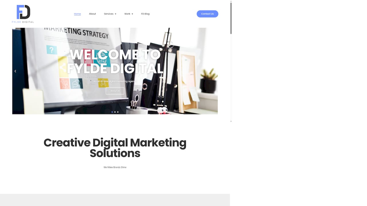
Fyldedigital builds conversion-focused web design with mobile-first layouts, fast load times, and clear calls to action built in from the start, not bolted on afterwards. Every project starts with understanding your customers and your goals, so the finished site works as hard as you do. Whether you need a full redesign or want to know where your current site is falling short, you can request a free website review today and get honest, practical feedback with no obligation.
FAQ
How many items should a website navigation menu have?
Research suggests that five to seven top-level menu items is the optimal range. More than this leads to decision fatigue and can cause visitors to leave without clicking anything.
Why does page load speed matter for my business website?
A one-second delay in load time reduces conversions by up to 7%. Slow sites also rank lower in search results, so speed affects both your traffic and the revenue that traffic generates.
What are the most important web design tips for beginners?
Focus on simplicity, clear navigation, and mobile performance first. These three areas have the greatest impact on whether visitors stay on your site and take action.
How many fields should a contact form have?
Aim for four to six fields at most. Every extra field reduces form completion rates by around 11%, so ask only for what you genuinely need to begin the conversation.
What does mobile-first design actually mean?
Mobile-first design means designing for the smallest screen first and scaling up to desktop, rather than the reverse. It forces you to prioritise essential content and produces a better experience on every device.