
Most business owners assume visual web design is simply about making a site look attractive. It is a reasonable assumption, but it misses the point entirely. Good visual design improves usability, comprehension, and accessibility, which means it directly influences whether visitors stay, trust you, and ultimately get in touch. This guide walks you through what visual web design actually means, how it shapes user behaviour, why accessibility cannot be an afterthought, and how to measure whether your design is genuinely working for your business.
Table of Contents
- What is visual web design?
- How visual design shapes user behaviour and website performance
- Accessibility and inclusivity in visual web design
- Designing for real users: the importance of edge cases
- Making visual quality measurable: tying design to business outcomes
- A fresh perspective on visual web design for SMEs
- Professional web design support for your business
- Frequently asked questions
Key Takeaways
| Point | Details |
|---|---|
| Visual design is functional | Web visuals should guide users, not just decorate your site. |
| Accessibility is essential | Design with all users in mind to increase your reach and compliance. |
| Edge cases matter | Plan for real-world scenarios to ensure everyone can access your services and content. |
| Measure for growth | Monitor business metrics to understand the impact of each visual design improvement. |
What is visual web design?
Visual web design is the practice of crafting the visual layer of a website to improve usability, comprehension, and accessibility. It goes far beyond choosing colours and fonts. Done properly, it shapes how visitors perceive your credibility, find information quickly, and decide whether to contact you or leave.
To understand what web design covers in full, it helps to break visual web design into its core elements:
- Layout: How content is arranged on the page. A well-planned layout guides the eye naturally from one section to the next, reducing confusion and cognitive effort.
- Typography: Font choice, size, weight, and line spacing. Clear typography makes your content readable on any screen and establishes the tone of your brand.
- Colour: Not just brand colours, but contrast ratios and colour combinations that ensure text is legible and important actions stand out clearly.
- Imagery: Photography, illustrations, and icons that reinforce your message. Poor-quality or irrelevant imagery undermines trust immediately.
- Graphical elements: Dividers, buttons, cards, and borders that create structure and draw attention to priority content.
Together, these elements determine whether a visitor grasps your offer within seconds or clicks away in frustration. The table below summarises each element and its primary business purpose:
| Visual element | Primary purpose | Business benefit |
|---|---|---|
| Layout | Organise content clearly | Faster navigation, lower bounce rate |
| Typography | Aid readability | Builds trust, improves comprehension |
| Colour | Signal importance and brand | Drives action, reinforces recognition |
| Imagery | Support and enhance messaging | Increases engagement and emotional connection |
| Graphical elements | Create visual structure | Guides users to key actions |
“A website that looks polished but fails to communicate clearly is just an expensive brochure.” The real purpose of visual design is to make information effortless to process and action effortless to take.
Visual design, then, is not decoration. It is the architecture of how your business communicates online.

How visual design shapes user behaviour and website performance
Now that you know what visual web design includes, let’s see why every design choice matters for user behaviour and your results.
Visual design is tightly connected to user behaviour, affecting how users perceive your site and whether they find it usable. People do not read websites the way they read books. They scan. They look for patterns, headings, and visual cues that tell them where to go next. If your design does not support that behaviour, you lose them quickly.
Visual hierarchy is the most important principle here. It means arranging elements so that the most important content attracts attention first. Large headings, bold call-to-action buttons, and whitespace all contribute to a clear hierarchy. When design impacts conversion rates, it is often because hierarchy has been used to make enquiry forms or contact buttons impossible to miss.
Here are five ways visual design directly shapes user behaviour on your site:
- Attention management: Strong headings and contrasting call-to-action buttons tell users exactly where to look. Without this, visitors have to work to find what matters, and most will not bother.
- Trust signals: A clean, consistent visual style signals professionalism. Inconsistent fonts and clashing colours subconsciously suggest a business that does not pay attention to detail.
- Navigation clarity: Spacing, grid systems, and clear menu structures reduce the time it takes a user to find information, which reduces frustration and encourages further exploration.
- Emotional response: Colour psychology and imagery choices can make visitors feel confident, reassured, or excited about your offer. These responses are fast and largely subconscious.
- Action encouragement: Attracting with design means placing the right visual prompts at the right moments in the user journey so the next step always feels obvious.
Pro Tip: Run a simple five-second test on your homepage. Show it to someone unfamiliar with your business and ask them what you do and what they should do next. If they cannot answer both questions confidently within five seconds, your visual hierarchy needs work.
A comparison of poorly structured versus well-structured design illustrates these differences clearly:
| Design factor | Poor structure | Strong structure |
|---|---|---|
| Heading hierarchy | Inconsistent sizes and weights | Clear H1, H2, H3 progression |
| Whitespace | Crowded, content-heavy pages | Breathing room around key sections |
| Call-to-action buttons | Blends with background | High contrast, prominent placement |
| Mobile layout | Text too small, buttons too close | Touch-friendly, scannable on smaller screens |
Every one of these factors influences whether a visitor becomes a lead or a lost opportunity.
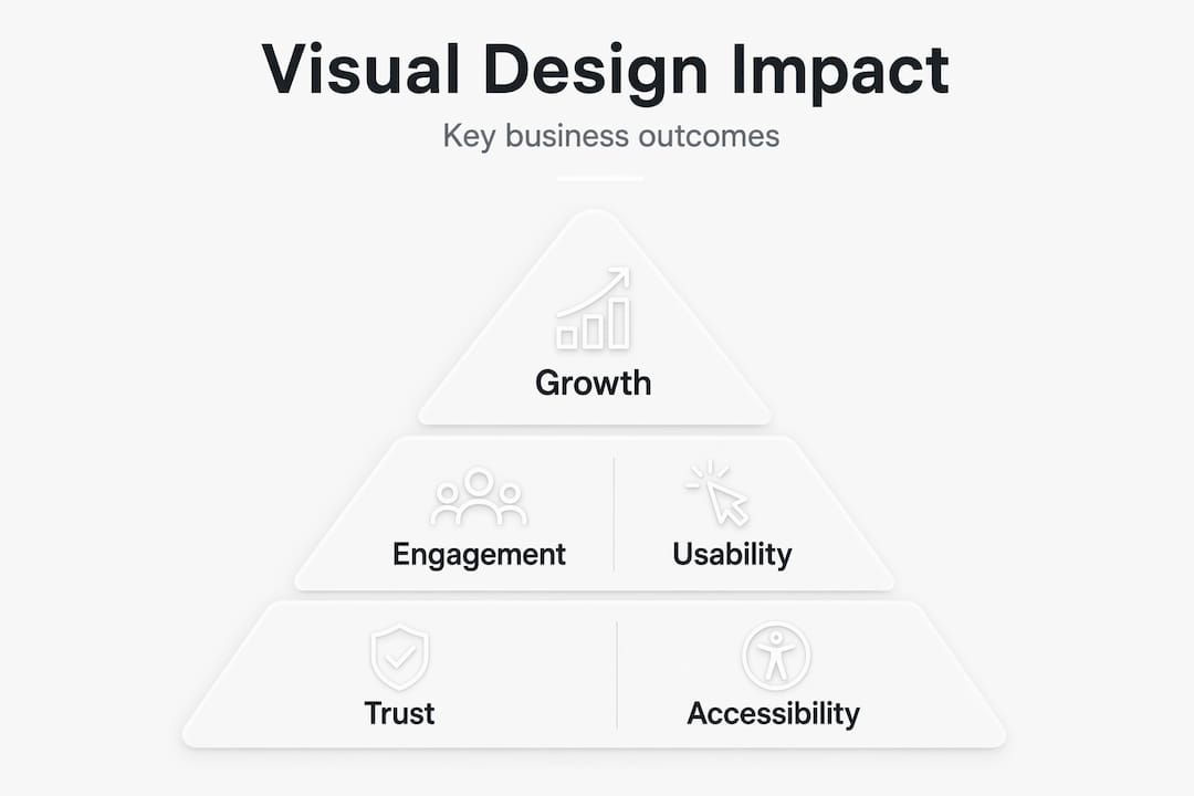
Accessibility and inclusivity in visual web design
While user experience is crucial, your design must also work for every visitor. Accessibility and inclusivity are not optional extras.
Accessibility must be built into every visual design decision, not added at the end as a patch. For small and medium-sized businesses, this matters for two clear reasons. First, a meaningful proportion of your potential customers live with some form of visual, cognitive, or motor impairment. Second, accessible design almost always improves the experience for everyone, including users on older devices or in difficult lighting conditions.
Here are the most impactful visual accessibility considerations for SME websites:
- Colour contrast: Text must have sufficient contrast against its background. The Web Content Accessibility Guidelines recommend a contrast ratio of at least 4.5:1 for normal text. Many business websites fail this basic check.
- Font size: Body text below 16px becomes difficult to read on mobile devices. Legibility is especially important for older audiences, who represent a significant share of many local businesses’ customer base.
- Clickable target sizes: Buttons and links need enough size and spacing to be tapped accurately on touchscreens. Tiny, closely spaced links frustrate users and drive them away.
- Clear visual focus states: Users navigating by keyboard need visible outlines on interactive elements. Removing these for aesthetic reasons is a common and costly mistake.
- Alt text for images: While this is technically an SEO and HTML concern, it is part of the broader visual accessibility picture because screen reader users rely on it entirely.
“Designing inclusively is not about limiting your creative choices. It is about ensuring your investment in design actually reaches every potential customer.”
For tips on improving web accessibility, a structured approach to user experience makes a significant difference. Even small gains, such as increasing button contrast or enlarging body text, can reduce bounce rates and increase the time visitors spend engaging with your content.
Pro Tip: Use a free tool such as the WebAIM Contrast Checker to audit your current site’s colour combinations. It takes minutes and often reveals quick wins that improve both accessibility and visual clarity.
Designing for real users: the importance of edge cases
Beyond the basics, many businesses stumble when faced with unusual or ‘edge’ users. Here is why these matter and what you can do about it.
Good visuals can fail if edge cases are not handled; inclusivity for all scenarios is essential to consistent performance. An edge case is simply a situation that falls outside the typical user experience. For UK businesses, edge cases are more common than many owners realise.
Consider these real-world scenarios:
- A potential customer in a rural Lancashire village is browsing your site on a slow 3G connection. Your large, unoptimised hero image never fully loads, and they leave before seeing your services.
- An older visitor is using the default large-text setting on their browser. Your fixed-width layout breaks at their zoom level, and text overlaps images, making the page unreadable.
- A user with a visual impairment is navigating your site with a screen reader. Your decorative images lack alt text, and your contact form has no visible labels, making it impossible to complete.
- A visitor on an older Android handset is trying to complete an enquiry form. Your form fields are too small to tap accurately, and the submit button sits outside the visible screen area.
Each of these situations represents a real person who wanted to engage with your business and could not. The cumulative impact on your leads and conversions is significant.
| Edge case scenario | Common failure point | Design fix |
|---|---|---|
| Slow mobile connection | Unoptimised images | Compress images, use lazy loading |
| Large text browser settings | Fixed-width layouts | Use flexible, responsive units |
| Screen reader user | Missing alt text and form labels | Add descriptive alt text and label all form fields |
| Older mobile devices | Small tap targets | Set minimum button size to 44px |
For broader website growth tips, addressing edge cases is one of the most cost-effective improvements you can make. These fixes rarely require a full redesign and often deliver an immediate improvement in engagement and enquiry rates.
- Audit your site on multiple devices, including older and budget smartphones
- Test on real slow connections using browser developer tools
- Check that all forms are fully operable without a mouse
- Review image file sizes and confirm alt text is present and descriptive
Making visual quality measurable: tying design to business outcomes
To get lasting value, tie visual improvements to real results. Here is how to make your design efforts measurable.
Visual design success should be measured with performance and usability outcomes, not subjective opinions about how the site looks. If you cannot measure it, you cannot improve it. For SME owners who are investing in professional web design, having a clear measurement framework keeps you focused on what matters most.
Here are six practical metrics to track after any significant visual design change:
- Bounce rate: The percentage of visitors who leave after viewing only one page. A high bounce rate often signals that your visual design is failing to engage users or communicate your offer clearly.
- Time on page: Longer average session times generally indicate that users are finding content engaging and easy to read. Poor typography or cluttered layouts tend to drive this metric down.
- Conversion rate: The proportion of visitors who complete a desired action, such as submitting an enquiry form or calling your business. This is the clearest measure of whether your design is working commercially.
- Pages per session: How many pages a visitor explores during a single visit. Strong visual navigation and clear internal linking encourage users to explore further.
- Lead quality: Not just the number of enquiries, but how relevant they are. Clear messaging and well-structured layouts attract visitors who understand exactly what you offer before they contact you.
- Mobile usability score: Tools such as Google Search Console provide a direct report on mobile usability issues. Address every flagged item as a design priority.
Pro Tip: Set up goal tracking in Google Analytics before making any design changes. This gives you a clean baseline to measure against, so you can attribute improvements accurately and make a clear case for continued design investment.
A simple monthly review of these six metrics gives you a reliable picture of whether your visual design is moving in the right direction. It also makes it far easier to prioritise the next round of improvements.
A fresh perspective on visual web design for SMEs
After working with small and medium-sized businesses across the Fylde Coast and beyond, one pattern comes up repeatedly: owners invest in a new website based on how it looks in a design mockup, then wonder why enquiries do not improve.
The uncomfortable truth is that most SMEs chase visual appeal when they should be chasing visual clarity. There is a difference. Appeal is subjective. Clarity is measurable. A site that looks impressive in a portfolio screenshot can still frustrate real users if the hierarchy is muddled, the contrast is insufficient, or the mobile experience is clunky.
What actually moves the needle for small businesses is rarely a dramatic visual overhaul. It tends to be a series of focused, deliberate improvements: tightening the typography, lifting button contrast, restructuring the homepage layout to lead with the core offer, and ensuring that the most important call-to-action is visible without scrolling. These are not glamorous changes, but they consistently produce better enquiry rates and lower bounce rates.
Where many businesses also go wrong is treating accessibility as a compliance issue rather than a commercial one. Inclusive brand visuals and trust are inseparable. When your design works for everyone, it builds confidence in your brand across the widest possible audience. That translates into more enquiries, not fewer.
The smartest design investment for any SME is to align visual decisions directly with measurable KPIs from day one. Know what you are trying to achieve, design to achieve it, and track the outcome. That disciplined approach consistently outperforms chasing aesthetics alone.
Professional web design support for your business
Getting visual web design right requires more than good intentions. It takes a structured approach, technical knowledge, and a clear understanding of how design choices affect real business results.

At Fylde Digital, we work with SMEs to create websites that are visually strong, accessible, and built to generate enquiries. Whether you are starting from scratch or looking to improve what you already have, our web design services are tailored to your goals and your audience. We focus on designs that do not just look the part but actively support web design for business growth. If you want to understand what effective design really involves, our detailed web design guide is a great place to start. Get in touch to request your free website review today.
Frequently asked questions
How is visual web design different from graphic design?
Visual web design focuses specifically on creating usable, accessible websites, whilst graphic design covers a broader range of visual communication including print, branding, and promotional materials beyond the web.
Why is accessibility important in visual web design?
Accessibility must be built in from the start because it ensures that every visitor, regardless of ability, can use your website effectively, which expands your potential customer base and supports compliance with accessibility standards.
What are some quick wins for improving website visuals?
Increasing text contrast, enlarging body font sizes, and ensuring key call-to-action buttons are visually prominent are straightforward changes that improve both accessibility and usability. Built-in accessibility and visual clarity are foundational to a well-performing site.
Can visual web design affect my business’s growth?
Absolutely. How something looks affects perception of how well it functions, which means strong visual design directly influences whether visitors trust your business, engage with your content, and take the next step towards becoming a customer.
How can I measure if my site’s visual design is working?
Track bounce rate, conversion rate, and time on page as your primary indicators, and supplement these with user feedback to understand where friction exists. Usability and performance metrics should drive ongoing design decisions rather than aesthetic preferences alone.

