Most people assume responsive web design is simply about making a website shrink to fit a smaller screen. That assumption is understandable, but it misses the point entirely. Responsive web design is about adapting layout, content, and functionality to work correctly across every device a visitor might use, from a widescreen desktop monitor to a budget smartphone on a slow 4G connection. This guide explains the core principles, modern techniques, the difference between responsive and adaptive approaches, and the practical steps you need to take to get it right.
Table of Contents
- Key takeaways
- What is responsive web design?
- Modern responsive techniques beyond the basics
- Responsive design vs adaptive design
- User experience and accessibility benefits
- Best practices for implementing responsive design
- My take on responsive design and real business results
- Get expert help with your responsive website
- FAQ
Key takeaways
| Point | Details |
|---|---|
| Responsive design is not resizing | It adapts layout, content, and function fluidly across all screen sizes and connection types. |
| Three original pillars still apply | Fluid grids, flexible images, and media queries form the foundation, now extended by container queries and fluid typography. |
| Mobile-first is the right starting point | Designing from the smallest screen upwards produces cleaner code and better performance. |
| Responsive differs from adaptive | Responsive uses one flexible layout; adaptive serves separate fixed layouts based on device detection. |
| Accessibility is built in, not bolted on | Responsive design done properly supports inclusion and directly improves SEO and conversion rates. |
What is responsive web design?
Responsive web design adapts layout, content, and functionality to various devices using flexible grids, images, and CSS. Ethan Marcotte coined the term in 2010, and his three original pillars remain the foundation of every well-built website today.
Those three pillars are:
- Fluid grids. Columns and page elements are sized using relative units like percentages rather than fixed pixel values, so they expand and contract proportionally.
- Flexible images. Images scale within their containing elements, preventing overflow or distortion on narrower screens.
- Media queries. CSS rules that apply different styles based on the viewport width, orientation, or resolution of the device being used.
Over time, the industry recognised that these three pillars alone were not always sufficient. The shift to a mobile-first approach became standard practice. Mobile-first means designing for the smallest screen first, then layering additional complexity as the viewport grows. This is the opposite of the old habit of building a desktop site and then stripping it back. The result is leaner code, faster load times, and a site that genuinely works for the majority of users, since most web traffic now arrives via mobile devices.
What are fluid layouts? They are layouts built on proportional measurements rather than fixed ones. If a sidebar is set to 30% width, it remains 30% of the available space whether the screen is 320 pixels wide or 1,920 pixels wide. This proportionality is what separates a truly responsive site from one that merely has a mobile version bolted on as an afterthought.
Pro Tip: When setting up fluid grids, use rem or em units for spacing and font sizes, not pixels. This keeps your layout consistent even when users change their browser’s default font size.
Modern responsive techniques beyond the basics
Traditional media queries set style rules at defined viewport widths, which works well for broad layout shifts. The limitation is that they respond to the viewport as a whole, not to the individual component on the page. If you embed a card component inside a narrow sidebar, it has no way of knowing how much space it actually has available.
Container queries solve this directly. They allow components to respond to their parent container’s size rather than the full viewport width. This makes individual UI components genuinely reusable. You can drop the same card component into a sidebar, a modal, or a full-width section, and it will adapt correctly in each context without needing separate CSS overrides.
The industry shift towards intrinsic design reflects a deeper maturity in how developers think about responsiveness. Rather than defining breakpoints at which layouts snap into a new shape, intrinsic design allows content to flow naturally into whatever space it occupies. CSS Grid’s "minmax()function is central to this. A grid column defined asminmax(250px, 1fr)` will never shrink below 250 pixels but will expand to fill available space, creating genuinely flexible layouts with very little code.
Fluid typography adds another layer of adaptability. CSS clamp() scales font sizes smoothly between a minimum and maximum value based on the viewport width, eliminating the need for multiple media query declarations just to adjust heading sizes. A single line like font-size: clamp(1rem, 2.5vw, 2rem) handles the full range of screen sizes cleanly.
Key advantages of these modern techniques include:
- Reduced CSS complexity. Fewer breakpoints mean less code to maintain.
- Better component reuse. Container queries make components context-aware rather than viewport-aware.
- Consistent typography. Fluid type scales read well on every screen without jarring jumps between sizes.
- Performance gains. Leaner, well-structured CSS loads faster, which matters for both users and search engine rankings.
Pro Tip: Use CSS Grid with auto-fit and minmax() for card grids. Write grid-template-columns: repeat(auto-fit, minmax(280px, 1fr)) and the layout will reflow automatically across any screen size without a single media query.
Responsive design vs adaptive design
The difference between responsive and adaptive design is not just technical. It affects your development costs, maintenance workload, and long-term SEO performance. Understanding the distinction helps you make the right decision for your project.
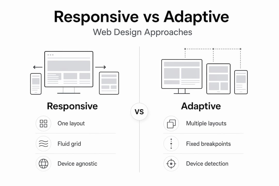
Adaptive web design serves distinct fixed layouts based on device detection. The server identifies what device is making the request and delivers a pre-built layout tailored to that device type. Responsive design uses a single flexible layout that reflows based on the available viewport.
| Factor | Responsive design | Adaptive design |
|---|---|---|
| Layout approach | One fluid layout for all devices | Multiple fixed layouts, one per device class |
| Development cost | Lower. One codebase to build | Higher. Multiple layouts to design and build |
| Maintenance effort | Simpler. Changes apply across all devices | More complex. Updates needed in each layout |
| Page speed | Good when optimised correctly | Can be faster per device with precise control |
| SEO | Preferred by Google. Single URL structure | More complex. Risk of duplicate content issues |
| Best suited for | Most business websites and content sites | High-traffic e-commerce with strict performance needs |
Adaptive design can outperform responsive design in page load speed and accessibility compliance for high-traffic e-commerce sites, trading complexity for control. For most small and medium-sized businesses, however, the additional development and maintenance cost of adaptive design is difficult to justify. Responsive design is the more practical and cost-effective default, and it is what Google recommends.
User experience and accessibility benefits
Responsive design is an architectural commitment to accessibility, ensuring consistent function regardless of the hardware or connection quality a user brings to your site. That framing matters. Accessibility is not a feature you add at the end of a project. It is a quality that emerges from how the site is structured from the start.

Accessibility and inclusivity are integral to responsive design philosophy, influencing usability for all users. This means people using screen readers, users on low-powered devices, and visitors on unreliable connections all benefit from a site built with responsiveness as a core principle.
One UX consideration that is frequently overlooked is mobile ergonomics. Designing for the thumb zone places interactive elements like buttons and calls-to-action within the lower two-thirds of the screen, where thumbs naturally rest. The top corners of a phone screen are the hardest to reach. A contact form or booking button placed there will see fewer taps, regardless of how attractive the design looks on a desktop. Improving website UX for mobile users is one of the most direct ways to increase conversions without changing a single word of copy.
The business case for responsive design comes into sharp focus when you consider the SEO connection. Responsive design supports improved SEO rankings through fluid grids, flexible images, and media queries that make content accessible to search engine crawlers across all device types. A single URL structure also means that backlinks and social shares all point to one page, concentrating your site’s authority rather than diluting it across separate mobile and desktop URLs.
“A mobile-friendly website is not a luxury for small businesses. It is the baseline expectation of every visitor who finds you through a search engine.”
The connection between website redesign and lasting SEO growth is well established. Sites that prioritise responsive, accessible design consistently outperform those that treat mobile as a secondary concern.
Best practices for implementing responsive design
Getting responsive design right requires more than applying a CSS framework and hoping for the best. The following steps reflect how it is done properly.
- Start mobile-first. Write your base CSS for the smallest screen, then use
min-widthmedia queries to add complexity as the viewport grows. This produces less code and forces you to prioritise what actually matters on screen. - Use relative units throughout. Set widths in percentages, font sizes in rem, and spacing in em or rem. Avoid fixed pixel values wherever possible outside of borders and very small UI details.
- Choose breakpoints based on content, not devices. Do not target the iPhone 14 specifically. Instead, resize your browser and add a breakpoint wherever the layout starts to look uncomfortable. This future-proofs your design against new device sizes.
- Make images and media flexible. Apply
max-width: 100%to images so they never overflow their container. Use the<picture>element orsrcsetattribute to serve appropriately sized images to different screens, reducing unnecessary data transfer on mobile. - Test across real devices, not just browser emulators. Browser developer tools give a useful approximation, but real devices reveal touch target issues, font rendering differences, and performance problems that emulators miss.
- Audit your page speed on mobile. A layout that reflows correctly but loads in eight seconds is still a poor experience. Compress images, minimise render-blocking scripts, and consider lazy loading for images below the fold.
Pro Tip: Use Google’s free PageSpeed Insights tool to assess your site’s mobile performance score. Pay close attention to the Largest Contentful Paint and Cumulative Layout Shift metrics. These directly affect both user experience and your Google search rankings.
For business owners working with a developer, these web design tips for 2026 provide a practical starting point for understanding what questions to ask and what to look for in a finished build.
My take on responsive design and real business results
I have worked on enough websites to know that responsive design is where projects either succeed or quietly fail. The gap between a site that technically passes a mobile test and one that genuinely works for a mobile user is wider than most people realise.
The most common mistake I see is treating mobile as a resizing exercise. A developer shrinks the desktop layout, checks it in Chrome’s device emulator, ticks the box, and moves on. The result is a site where buttons are too small to tap, text is crammed into 320 pixels because the desktop font size was not adjusted, and users abandon the page inside ten seconds. That is not responsive design. It is a responsive failure.
What I have found actually drives conversions on mobile is attention to ergonomics and load speed in equal measure. A beautifully designed site that takes five seconds to load on a 4G connection will underperform a plainer, faster one every time. And a fast site where the call-to-action button sits in the top-right corner, out of thumb reach, will still see poor results.
My recommendation for business owners is straightforward. When briefing a developer or agency on a new site or redesign, ask specifically how they approach mobile-first design and what they do to test thumb zone ergonomics. The answer will tell you very quickly whether they treat responsive design as a principle or just a checkbox. A well-designed business website is your most effective salesperson. It needs to work for every visitor, on every device, without exception.
— tibor
Get expert help with your responsive website
If this article has highlighted gaps in how your current website performs across devices, Fyldedigital can help. As a full-service digital marketing agency based on the Fylde Coast, Fyldedigital builds responsive business websites that are designed to attract visitors and convert them into enquiries.

Every website Fyldedigital builds starts with mobile-first principles, is tested across real devices, and is built to support your SEO from the ground up. Whether you are starting from scratch or looking to improve an existing site, the team can assess what is holding your current site back and show you exactly what a properly built, conversion-focused website can do for your business. Request a free website review today and find out where your site stands.
FAQ
What is responsive web design in simple terms?
Responsive web design is a development approach where a single website layout adapts fluidly to any screen size, from desktop monitors to mobile phones. It uses flexible grids, scalable images, and CSS media queries to adjust the presentation of content automatically.
How does responsive web design differ from adaptive design?
Responsive design uses one fluid layout that reflows based on the viewport size, while adaptive design serves separate fixed layouts based on device detection. Responsive design is simpler to maintain and preferred by Google for SEO, whereas adaptive design offers more precise control at higher development cost.
Why does responsive design matter for SEO?
Responsive design supports SEO because it uses a single URL structure, making it easier for search engines to crawl and index your content. Google recommends responsive design as its preferred approach to mobile-friendly websites.
What is a mobile-first approach in web design?
Mobile-first means writing CSS starting from the smallest screen size and layering additional styles as the viewport grows. This produces cleaner, more performant code and prioritises the most constrained environment first, ensuring the core experience works before adding complexity.
What are the main benefits of responsive web design for businesses?
Responsive design improves user experience across all devices, reduces bounce rates, supports better SEO rankings, and makes your site accessible to a wider audience. For businesses, this translates directly into more enquiries, more leads, and a stronger online presence.